A few months ago I received an intriguing email from researcher and activist Regan Boychuk. For the past 15 years, Boychuk has been studying the oil-and-gas industry in Alberta (Canada) and he wanted to know if I would join his project. I immediately said yes.
Some backstory. You can think of Alberta as the Texas of Canada. Alberta is endowed with a vast trove of oil that it has been exploiting for the past 75 years. And like Texas, Alberta’s politics are dominated by the oil industry.
Oh, and Alberta is where I grew up.
Back to Regan Boychuk’s work. Boychuk has a vision for an Alberta in which the oil industry goes extinct by being forced to clean up its own mess. As it stands, Alberta has about 300,000 oil-and-gas wells waiting to be cleaned up at the oil companies’ expense. The problem is that oil companies are not forced to save for the clean-up expense, and accounting tricks allow them to make the clean-up liability look negligible in their corporate accounts.1 It’s an open secret (implicitly endorsed by the Alberta government) that defunct wells will never be cleaned up. If they were, the oil industry would go bankrupt.
And that’s exactly what Boychuk wants. His dream is to kill 3 birds with one stone:
- Show that the oil-and-gas industry is insolvent;
- Clean up every well in Alberta;
- Fund full employment and a transition to a sustainable Alberta economy.
To hasten this big-picture goal, Boychuk asked me to help by estimating production curves for every oil-and-gas well in Alberta. After much head scratching and many lines of code, that’s what I’ve done.
I’m calling the analysis ‘a case study of oil-and-gas depletion’. In this post, I’ll analyze oil extraction like you’ve never seen it before — resolved down to the individual well. The results give a fascinating window into how humans exploit fossil fuels.
Alberta’s oil-and-gas party
I was raised in the small prairie town of Stettler, Alberta. As a child, I remember staring out the window during family car trips, counting the oil pumpjacks that dotted the landscape. I thought nothing of it. I had no idea that I was growing up during an ephemeral party.
Alberta’s exploitation of oil got started during World War I (when it was a major supplier to Britain), but was sporadic until after World War II. Then in 1947, Imperial Oil struck black gold near the town of Leduc. The ensuing oil boom transformed Alberta into Canada’s fossil-fuel hub. But like all parties, this one didn’t last forever. By 1998, Alberta’s conventional oil-and-gas production had peaked. Figure 1 tells the story.

Figure 1: Historical production of conventional oil and gas in Alberta. This is my estimate of Alberta’s conventional oil-and-gas production, derived from well-level estimates. It excludes oil produced from the Athabasca tar sands. [Sources and methods]
The caveat to Figure 1 is that it excludes the growing quantity of non-conventional oil extracted from the Athabasca tar sands. (Bitumen from the tar sands now constitutes the majority of Alberta’s oil production.) When the tar-sands party will peak, nobody knows.
Something to watch for, though, is how rapidly Alberta’s natural gas production declines. That’s because extracting oil from the tar sand requires profligate amounts of natural gas.2 (The gas is used to heat water, which is then pumped through the sand to extract the oil.) If Alberta’s natural gas production collapses, much of the tar-sands deposit may prove unrecoverable.3
Preying on oil
Unless you happen to live in Alberta, you probably don’t care much about the peak and decline of its convention oil-and-gas production. Sure, your lifestyle may depend on oil … but it doesn’t matter to you where that oil comes from.
If you feel this way, let me assuage your myopia. The trends in Alberta are a microcosm of the trends everywhere. For the last century, humanity has thrown a party built on abundant crude oil. It’s now past midnight, and the festivities grow closer to last call. It behooves us to understand what’s ahead.
Interestingly, a good place to start is with simple population biology. Yes, humans may be the smartest animal that has ever lived. But when it comes to our exploitation of fossil fuels, we’re behaving like every other predator: we’re gorging ourselves until the prey is gone.
In a recent paper, physicist Ugo Bardi and materials scientist Alessandro Lavacchi teased out the implications of this idea. They argue that humanity’s extraction of fossil fuels is a special case of predator-prey dynamics. To make their case, Bardi and Lavacchi start with the famous Lotka–Volterra model, which simulates boom-bust cycles between predators and prey. Bardi and Lavacchi then show that if the prey population is ‘non-renewable’ (as is the case with fossil fuels), the Lotka–Volterra model doesn’t create a boom-bust cycle. It creates a single boom and bust. And that, they argue, is how we should model humanity’s extraction of fossil fuels: as the one-time exploitation of a non-renewable prey.
If the prey is fossil fuel, do humans literally eat it? In a sense, yes. Today, close to half of the world’s population eats food that was fertilized with synthetic nitrogen— nitrogen created using the fossil-fuel-dependent Haber process. So in a sense, humans literally eat fossil fuels. That said, when Bardi and Lavacchi apply the Lotka-Volterra model, they have in mind a less direct form of predation. Instead of humans eating fossil fuels, they imagine that it is our technology that does so.
Here’s how it works. Humans build technology to extract fossil fuels. Then we use a portion of the bounty to build more technology that we use to extract more fossil fuels. This cycle is what engineers call a ‘positive feedback loop’. It leads to exponential growth … but only for a while. Eventually the prey (fossil fuels) gets depleted. Then, no matter how much technology we build, resource extraction begins to decline. And when it does, the stock of resource-harvesting technology follows suit.
The result, Bardi and Lavacchi observe, is that the stock of resource-harvesting technology ought to rise and fall with resource extraction … but with a slight delay. And that seems to be exactly what happens. Looking at 19th-century whaling, for instance, Bardi and Lavacchi find that the number of whaling ships rose with the whale harvest, and then peaked about a decade after this harvest began to decline. They find a similar pattern for South African gold extraction, and for the US harvest of oil.
The same pattern holds for the extraction of oil and gas in Alberta. Figure 2 tells the story. In the top panel, I’ve plotted Alberta’s historical production of conventional oil and gas, which peaked in 1998. In the bottom panel, I’ve plotted the number of active oil-and-gas wells. During Alberta’s post-war oil boom, the number of wells exploded. But when oil-and-gas production peaked, the number of active wells followed suit a decade later in 2009. Both trends fit well with a simple Lotka-Volterra model (grey line) in which oil and gas is the prey and oil-and-gas wells are the predator.

Figure 2: Preying on oil and gas. In this figure, I fit Bardi and Lavacchi’s version of the Lotka-Volterra model to oil-and-gas production in Alberta. The top panel shows my estimate for conventional oil-and-gas production (blue) and the fitted Lotka-Volterra model (grey). The bottom panel shows my estimate for the number of active oil-and-gas wells in Alberta (red) and the fitted Lotka-Volterra model (grey). [Sources and methods]
Looking to the future, the Lotka-Volterra model envisions an Alberta that is very different from the one I grew up in. By 2100, the model predicts that Alberta will be mostly devoid of active wells. So it seems that the pumpjack-dotted landscape of my childhood was but a fleeting moment in history.
Exponential depletion
Continuing our exploration of Alberta’s fossil-fuel extraction, let’s zoom out to the big picture. If you had to choose one word that describes human history since the industrial revolution, what would it be?
I’d vote for ‘exponential’.
Over the last two centuries, so many things have grown exponentially that it’s hard to keep track. Less discussed is the corollary of exponential growth, which is exponential depletion. The two dynamics go hand in hand. When one thing grows exponentially, another thing must deplete exponentially. This fact follows from simple conservation laws. If you want your stock of A to grow, you must deplete your stock of B. There is no alternative.
Since the industrial revolution began, humans have been expanding our stock of technology by depleting the Earth’s stock of fossil fuels (among other resources). We typically look at this depletion at the aggregate level, as I’ve done so far for the province of Alberta. (In Figures 1 and 2, I looked at the sum of oil-and-gas production across the whole province.) But we can also look at fossil-fuel depletion on smaller scales … scales down to the individual well (or mine).
Let’s do that now.
From the data that Regan Boychuk provided, I’ve estimated production curves for about 310,000 Alberta oil-and-gas wells that were drilled between 1904 and 2018. When we look at these curves, we see exponential depletion on the small scale.
Before we get to the data, though, let’s review the math behind exponential dynamics. When something grows exponentially, it obeys the following formula:
y=(1+r)t
Here, t is time and r is the fractional rate of growth. If we let time roll, y will grow exponentially.
Exponential dynamics occur whenever a rate of change is proportional to the thing that is changing. Population growth is the classic example. Every year, a certain portion of humans procreate. The consequence is that population growth is proportional to population itself. If we let this dynamic play out, we get exponential growth (at least for a while).
To get exponential depletion, we make the growth rate negative:
y=(1−r)t
Oil extraction follows this negative dynamic. When you drill a new well, the oil is easy to get out. But as you exhaust the reserve, the oil flows more slowly. The result is exponential depletion.
Let’s look at this depletion among Alberta’s oil-and-gas wells. Of the roughly 300,000 wells in my dataset, about half are depleted. (The oil industry uses different language, classifying the wells as either ‘abandoned’ or ‘suspended’.) In Figure 3, I’ve plotted the average depletion trend across all of these wells. The results are a case study in exponential dynamics.
The blue line in Figure 3 shows the average depletion curve for my sample of wells. The curve indicates the portion of the ‘reserve’ that remains as a function of operation time. (I use scare quotes here because I’m defining the ‘reserve’ as the lifetime production of the well, not the size of the oil formation.)4 The main panel uses a linear scale on the vertical axis, which accentuates how rapidly most wells deplete. (The average well drains 50% of its reserve within a few years of being drilled.) The inset panel uses a log scale, which highlights the exponential dynamics at play. On this scale, exponential depletion appears as a straight line.

Figure 3: Exponential depletion among Alberta’s oil-and-gas wells. This figure shows the average depletion curve for roughly 145,000 Alberta wells that are presently abandoned or suspended (meaning they will likely never produce again). For each well, I define the ‘reserve’ size as its lifetime production of oil-and-gas, measured in barrels of oil equivalent. (This definition is different than the geological notion of ‘reserve’, which refers to the size of the actual oil formation.) The blue curve shows the percentage of the reserve remaining as a function of operation time, averaged over all wells. The inset panel shows the same depletion curve, but uses a logarithmic scale on the horizontal axis. The red line shows constant exponential depletion at a rate of 14% per year. [Sources and methods]
Every year, it seems that Alberta oil-and-gas wells drain about 14% of their remaining ‘reserve’. If that doesn’t seem fast to you, think about the millions of years it took to build each formation of oil. Think of the billions of organisms that lived and died to create it. Industrial humans can suck up one sixth of that reservoir in a single year. We are a force of nature.
Depleting the low-hanging fruit
Switching gears, let’s look at another principle of resource extraction — the fact that we deplete the easiest-to-get resources first. Journalist Richard Heinberg calls this behavior the low-hanging fruit principle.
To visualize the low-hanging fruit principle, picture the difference between the oil wells of today, and those of a century ago. In the early days of humanity’s oil boom, wildcatters discovered gushers by poking shallow holes in the ground. Today, oil companies search for new reserves in mile-deep water. The easy-to-get oil is gone.
If we were to measure the ‘easy-to-getness’ of an energy source, how might we do it? A popular approach, developed by biophysical economist Charles Hall, is to measure the ‘energy return on investment’ of a resource.5 The energy return on investment, or EROI, is the ratio of the energy gained from a resource relative to the energy used to harvest the resource. The greater the energy return on investment, the easier the resource is to get.
Studies of EROI tend to confirm the low-hanging fruit principle. Looking at the EROI of US oil discovery, Megan Guilford and colleagues estimate that in 1919, oil companies discovered about 1200 barrels of oil for every barrel they put into searching for new reserves. By 2007, that value had fallen drastically: 1 barrel of oil returned a discovery of only 5 barrels.
The low-hanging fruit is gone.
Draining puddles
Energy return on investment is not the only way to measure the easy-to-getness of a resource. Another option is to look at the size of the reserve being exploited.
Let’s use water to illustrate the principle. Consider the difference between the following scenarios:
- Collecting a million gallons of water from a lake;
- Collecting a million gallons of water from puddles.
The lake is an easy-to-get source of water. To suck a million gallons from it, a single pipe would do. But how would you drain the same amount of water from a million puddles? Perhaps you could do it. But the effort involved would be stupendous. Puddles are hard-to-get ‘fruit’.
The same principle applies to the extraction of oil and gas. The low-hanging fruit consists of the enormous reserves that can be tapped with a single well. The hard-to-get fruit(s) are the tiny reserves that are numerous yet diffuse. According to the low-hanging fruit principle, we ought to tap the biggest reserves first.
To see the low-hanging fruit principle in action, let’s return to the Alberta oil-and-gas data. Figure 4 shows how the average lifetime production of Alberta wells has changed as a function of drill date. The trend is obviously headed South.
 Figure 4: The declining lifetime production of Alberta oil-and-gas wells. This figure looks at the lifetime production of oil-and-gas wells that are, as of 2018, either abandoned or suspended. The blue line plots the average lifetime production of wells as a function of the year they were drilled. (Note that the vertical axis uses a log scale.) The red line shows an adjustment for sample bias, attempting to correct for the fact that as we get closer to the present, many recently drilled wells are still operating. The dashed vertical line marks when Alberta’s production of conventional oil and gas peaked. [Sources and methods]
In Alberta, the lifetime production of wells has clearly declined with time, just as we expect from the low-hanging fruit principle. Oil companies exploited the biggest, easiest-to-get reserves first. Then they moved on to the puddles. Importantly, the decline in lifetime production began long before Alberta’s oil-and-gas extraction peaked in 1998. In other words, the low-hanging fruit principle rears its head (almost) from day one of resource extraction.
The caveat to the analysis in Figure 4 is that it becomes increasingly incomplete as we get closer to the present. That’s because many recently drilled wells are still active and their lifetime production is unknown. When we analyze only the depleted wells (as I’ve done here), we introduce a bias as we approach the present: we select for the smallest reserves.
This time bias is likely why the blue curve in Figure 4 heads South so rapidly after 2000. We’re looking only at short-lived wells. The only foolproof way to remove this time bias is to wait until all wells are depleted. So by the 2040s, we’d probably have an accurate picture of the lifetime production of wells drilled in the 2010s. Thirty years, however, is a long time to sit on our hands.
The alternative to waiting for foolproof data is to try to guess the size of our bias. My stab at it is shown by the red line in Figure 4. (The method is a bit complicated, so I won’t explain it here. For details, see the Sources and methods.) What matters is that the bias adjustment doesn’t alter the downward trend in the lifetime production of Alberta oil-and-gas wells. Instead, it straightens the bend that appears in the 2000s.
In Alberta, it seems that the big (conventional) oil-and-gas reserves are gone. What remains are fossil-fuel puddles.
Living the half life
Let’s move on to a different way to quantify the easy-to-getness of a resource. Rather than measure the quantity of the resource being harvested, we can instead measure the time to harvest the reserve. The idea is that the bigger and easier-to-get the reserve, the longer it ought to last.
How should we measure this depletion time? One option would be to measure the time it takes to drain the reserve completely. I think a better option, however, is to measure the time to deplete half the reserve — a period known as the ‘half life’.
When it comes to oil-and-gas extraction, the half life is appropriate because we are dealing with exponential dynamics (as shown in Figure 3). For pure exponential depletion, every half life cuts the remaining reserve in half. (The classic example of such dynamics is radioactive decay.) In mathematical terms, this halving of the reserve can continue indefinitely. But in the real world, it eventually stops. For oil wells, the process ends when production gets so low that the well is abandoned.
Although there can be many iterations of the half life (many halvings of the remaining reserve), for simplicity, I’ll look only at the first one. Thus, I’ll define a well’s half life as the time between the start of operation and the date when 50% of the reserve is gone.
Back to the principle of low-hanging fruit. If the principle holds for the extraction of oil and gas, then the half life of oil-and-gas wells ought to decline with time. Such a trend would signal that we’re depleting the large, easy-to-get reserves first, before moving on to the small, hard-to-get ‘puddles’.
To test the low-hanging fruit principle, let’s return to the Alberta oil-and-gas data. When discussing the average depletion dynamics of Alberta wells (Figure 3), I mentioned that I’d calculated depletion curves for every well that was, as of 2018, out of production. Let’s now have a look at these depletion curves — all 145,000 of them.
Figure 5 shows the data. I’ve plotted here the portion of the ‘reserve’ remaining (vertical axis) as a function of the number of years the well has been in operation (horizontal axis). Each line in Figure 5 represents the depletion curve of an individual well. There are so many curves, though, that only the outliers (the very long-lived wells) are discernible individually. The vast majority of depletion curves are mashed into a contiguous lump. To help differentiate the various curves, I’ve colored them by their respective half lives. From the color, you can see that most wells are short lived, with half lives that are less than a decade.

Figure 5: Depletion curves for 145,000 oil-and-gas wells in Alberta, colored by half life. This figure shows depletion curves for all Alberta oil-and-gas wells that are, as of 2018, either ‘abandoned’ or ‘suspended’. I assume that these wells will never produce again, meaning their cumulative production to date (measured in barrels of oil equivalent) indicates their lifetime production of oil and gas. For simplicity (and I know petroleum geologists will protest), I’m calling this lifetime production the ‘reserve size’. The horizontal axis shows the number of years the well has been in operation. The vertical axis shows the percentage of the ‘reserve’ remaining. I’ve colored wells by their respective half life — the time taken to drain 50% of the ‘reserve’.
Note: to show as much information as possible, I’ve made the color spectrum repeat every decade. Given this repetition, here’s how you match the color with the appropriate half life. On the depletion curve(s), look at the color as the curve crosses the 50% reserve threshold, indicated by the dashed horizontal line. From this intersection, look straight up to the color spectrum, where you will find the appropriate half life. [Sources and methods]
From the analysis in Figure 5, we can tell that half life varies significantly between different oil-and-gas wells. What we cannot tell, however, is if this variation follows some sort of pattern.
To look for a pattern, let’s see how the average half life of Alberta wells varies by the date they were drilled. Figure 6 shows the trend, which is unmistakably downward. Wells drilled in the early 1930s had an average half life of about 20 years. But by the 2000s, Alberta wells had an average half life of only 2 years.

Figure 6: The declining half life of Alberta oil-and-gas wells. This figure analyzes the half life of Alberta wells that are, as of 2018, either abandoned or suspended. I assume that these wells will never produce again, meaning their cumulative production represents their lifetime production. (For simplicity, I call this lifetime production the ‘reserve size’. The half life is the time taken to drain 50% of the ‘reserve’.) The blue curve plots the average half life of wells as a function of the year in which they were drilled. (Note the log scale on the vertical axis.) The red curve attempts to adjust for sample bias, caused by the fact that many recently drilled wells have not yet been depleted, and so are excluded from the analysis. The dashed-vertical line indicates the date when Alberta’s oil-and-gas production peaked. [Sources and methods]
The caveat to the trend in Figure 6 is that it becomes biased as we approach the present. That’s because we exclude an increasing number of long-lived wells that remain active. The only sure-fire way to remove this bias is to wait until all wells drilled in year x are depleted.
The alternative to waiting is to try to estimate the time-based bias by looking at past trends. The red line shows my attempt at such an adjustment. (See the Sources and methods for details.) What’s important is that the bias adjustment doesn’t alter the long-term trend of decreasing half life. Instead, it removes the bend that appears starting in the 2000s.
What this declining half life means is that oil companies are becoming increasingly manic. Today, the half life of Alberta oil-and-gas wells is so short that prospectors must be constantly searching for the next puddle to drain.6
The drilling crunch
Moving on, let’s look at one more aspect of the low-hanging fruit principle — something I’m calling the ‘drilling crunch’.
The idea behind this crunch is that as the large, easy-to-get reserves are depleted, there is a rush to sustain oil-and-gas production by frantically drilling new wells. The consequence is that a larger share of production comes from recently drilled wells.
How we define ‘recently drilled’ is, of course, arbitrary. But let’s pick a nice round number of 1 year. We’ll measure the drilling crunch by quantifying the portion of current oil-and-gas production that comes from wells drilled within the preceding year. If that value is 0, it means the oil industry is sitting on its laurels, relying on the output of old wells. If the value is 100%, it means the industry is frantically drilling new wells.
Figure 7 shows how the drilling crunch has played out in Alberta. The grey line measures the portion of monthly oil-and-gas production that comes from wells drilled during the year prior. The blue curve shows the average trend.
 Figure 7: Alberta’s drilling crunch. This figure measures the portion of Alberta’s monthly oil-and-gas production that comes from wells drilled within the preceding year. Monthly data is shown in grey. The blue curve shows the long-term trend using a 5-year trailing average. [Sources and methods]
When Alberta’s oil-and-gas bonanza got rolling in the 1950s, the vast majority of production came from new wells. That makes sense, since at the time, hardly any old wells existed. By the 1960s, however, a trove of enormous, long-lasting reserves had been tapped. The consequence was that the portion of oil and gas coming from new wells dropped precipitously. Let’s call this period the drilling ‘bang’. It was the one-shot exploitation of big reserves that will never happen again.
What followed was a more gradual drilling ‘crunch’. By the 1970s, the big reserves had all been exploited. And so oil companies filled the void by drilling more wells. The result was that the portion of oil-and-gas production coming from new wells crept upwards.
In the future, this trend will surely continue. The drilling crunch will mean that every year, an increasing fraction of oil-and-gas production will come from new wells. In the end, the Alberta oil industry will die much like it started: with a trickle of oil coming from wells drilled within the last year.
Peering under the Hubbert curve
Having looked at the details of Alberta’s oil-and-gas exploitation, I want to return to the big picture. And when it comes to fossil-fuel depletion, the big picture means the ‘Hubbert curve’.
The curve owes its name to the geologist M. King Hubbert who, in 1956, predicted that oil extraction ought to roughly follow a bell curve. Production would rise exponentially, then plateau, and eventually collapse. Of course, real-world trends are always messier than Hubbert’s tidy bell shape. Still, the idea that oil production would peak and decline proved to be prescient. Looking at the state of affairs in 2014, John Hallock and colleagues found that in most countries, conventional oil production had already peaked.
That is certainly true for the province of Alberta. In Figure 1, I showed you Alberta’s Hubbert curve for conventional oil-and-gas production. (The peak came in 1998.) What I want to do now is peer under the curve.
Here’s what I mean.
Think of the Hubbert curve as a mountain. From the outside, a mountain looks like one cohesive object. But if we were to drill underneath it, we’d see that it is composed of many layers of rock, each of which contributes imperceptibly to the mountain’s large-scale shape. The same is true of the Hubbert curve. If we were to peer under it, we’d see that the curve is built from the oil and gas produced by individual wells, each of which contributes slightly to the aggregate trend.
Continuing the analogy, we know that drilling through a mountain constitutes looking back in time. Each layer down represents an older epoch of Earth’s history. We can imagine something similar for the Hubbert curve. If we built the curve by stacking the production of individual wells according to the date they were drilled, we’d find layers of stratification much like within the Earth’s crust. ‘Drilling’ down through the Hubbert curve would take us to wells that date farther in the past.
We’ll get to the whole Hubbert curve in a moment. But first, let’s illustrate this line of thinking by looking at a single moment of Alberta’s oil-and-gas production. I’ve chosen the month of January 1998, which by my estimate, is the month that Alberta’s conventional oil-and-gas production peaked.
In Figure 8, I’ve visualized the month’s production as a column of oil and gas. The column is built by adding layer upon layer of production from individual wells. We start at the bottom with the oldest wells that remain active. (Color shows the date each well was drilled.) As we move up, we stack the production from wells that were drilled more recently. The result is a series of stratification layers much like we’d find within the Earth’s crust. As we ‘drill’ down from the top of the oil-and-gas column, we find relics of the past — wells drilled a half-century ago.
 Figure 8: Stratified layers of oil-and-gas production in Alberta, January 1998. This figure visualizes Alberta’s conventional oil-and-gas production during the month of January 1998 (my estimate for the date of peak production). On the vertical axis, I sum the production of individual wells by ascending order of drill date (where drill date is indicated by color). The result is a series of ‘stratification layers’, much like what we’d find within the Earth’s crust. As we ‘drill’ downward from the surface, we find wells that date farther back in time. [Sources and methods]
Continuing our geological analogy, Figure 8 represents a narrow column of our Hubbert-curve ‘mountain’. The pattern that emerges is smooth and orderly. But as we zoom out to the whole Hubbert curve, we expect the trends to become more complicated. When we look under real mountains, for instance, we find that the stratification layers are intricately folded, a remnant of the mountain’s tumultuous formation. The layers under the Hubbert curve should show similar turbulence — a relic of the oil-and-gas industry’s raucous history.
Figure 9 shows this history in full glory. What you’re looking at here is the stacked production curves of roughly 310,000 Alberta wells drilled over the last century. (To give you a sense of scale, the production column shown in Figure 8 appears here as the thin dashed line.) The strata under our Hubbert curve look like the twisted layers of rock we’d find under a mountain. Once horizontal, the veins have been distorted by geological forces. Of course, that’s not what’s going on here. Still, the metaphor of tectonic forces is fitting. The exploitation of fossil fuels has made humans a force of nature.

Figure 9: Peering under Alberta’s Hubbert curve. This figure shows stacked production curves for roughly 310,000 Alberta oil-and-gas wells drilled over the last century. The monthly production of each well is stacked according to drill date, which is indicated by color. The result is Alberta’s Hubbert curve, resolved to the individual well. For the most part, however, specific wells cannot be distinguished. The exception is when small white gaps appear in the contours, indicating wells with particularly large production. For reference, the column of oil-and-gas production shown in Figure 8 is marked here by the vertical dashed line.Note: the color spectrum repeats every 2 decades. To find the appropriate spot on the color legend, pick a point on the top of the Hubbert curve. Then, look directly down to the horizontal axis and note the year. Find that year on the color legend. [Sources and methods]
The simplest way to interpret the trends in Figure 9 is to think in terms of counterfactual history. The ‘surface’ of the Hubbert curve shows the real-world production of oil and gas — how history actually played out. The contours under the curve, in contrast, indicate how history would have played out had drilling stopped in the given year.
For instance, if new drilling had ceased in 1970, Alberta’s oil-and-gas production would follow the contour shown in blue. (Yes, there are several blue contours. I’m talking about the one that emerges around 1970.) With no new drilling, Alberta’s oil-and-gas production would have peaked by the mid 70s and then gradually declined. The same is true for any other date. If we counterfactually halt new drilling, we find that oil-and-gas production soon declines.
Note, however, that as we approach the present, the counterfactual decline becomes steeper. For instance, had drilling stopped after the peak of production in 1998, Alberta would have experienced a 90% decrease in production over the next two decades (shown by the light-blue contour). Since then, the decline contours have steepened even more. In other words, it’s only by frantically drilling new wells that Alberta has staved off a collapse of oil-and-gas production.
The future of Alberta’s depletion game
If you stare at Figure 9 for long enough, you realize that the stratified Hubbert curve encapsulates all of the low-hanging fruit trends that I’ve previously discussed. As time passes:
- Wells produce less oil;
- Wells are depleted more rapidly;
- A greater share of production is met by recently drilled wells.
Supposing these trends continue (and we have good reason to think they will), we can imagine how Alberta’s oil-and-gas depletion game might play out. Figure 10 shows my projection for the next century of conventional oil-and-gas production.
 Figure 10: Alberta’s Hubbert curve — past and possible future. This figure shows how the future of Alberta’s conventional oil-and-gas production might play out. The projection assumes that well-level depletion trends continue — namely, that the lifetime production and half life of individual wells continues to decline. The only added assumption is that the total number of active wells is equivalent to what is predicted by the Lotka-Volterra model shown in Figure 2. For details about the projection, see the Sources and methods.
On the whole, we expect Alberta’s future Hubbert curve to look like … a Hubbert curve. Having already peaked, there’s nowhere for conventional oil-and-gas production to go but down. So Alberta’s future will be marked by exponential depletion. Of that, we can be more or less certain.
More interesting (and more uncertain) is what might happen under the Hubbert curve. Figure 10 shows what will occur if the low-hanging-fruit trends (decreasing lifetime production and decreasing half life of wells) continue into the future. Essentially, the depletion contours become steeper and steeper until they are nearly vertical. In other words, long-lasting reserves become a thing of the past. In the future, Alberta oil-and-gas production will come almost exclusively from wells that are only a few years old.
What this means is that the Alberta oil industry has no long-term future. Of course, we already knew that. But Figure 10 is a pretty way of looking at it.
Beyond numbers
In a sense, the analysis that I’ve done here is the easy part. Yes, it took me a few months to crunch the numbers for Alberta’s exploitation of oil and gas. But at least conceptually, the science of fossil-fuel depletion is grade-school simple. Humans are exploiting a non-renewable stock of energy. It won’t last forever. End of story.
The more difficult part is understanding how fossil-fuel depletion will affect society in the long run. Of course, for individual countries, trade can solve the problem. (The United States didn’t collapse after its oil production peaked in 1970. It just imported more oil.) But on the global scale, trade won’t work. So what then?
The short answer is that nobody knows. Visions for a fossil-fuel descent range from catastrophic collapse to an ecotopian paradise (and everything in between).7
In the game of future envisioning, fossil-fuel depletion is the ‘known known’. We know that fossil fuels are finite, and that we will run out. Existing renewable technologies are the ‘known unknown’. We know they work, but we don’t know if they (alone) can support our current industrial society. And the ‘unknown unknowns’ are … everything else.
In the end, the most certain thing we can say about the future is that it will involve less energy from fossil fuels. The rest of the story has yet to be written.
Further Reading
Bardi, U., & Lavacchi, A. (2009). A simple interpretation of Hubbert’s model of resource exploitation. Energies, 2(3), 646–661.
Boychuk, R. (2010). Misplaced generosity: Extraordinary profits in Alberta’s oil-and-gas industry. Parkland Institute.
Boychuk, R., Anielski, M., Snow, J. J., & Stelfox, B. (2021). The big cleanup: How enforcing the polluter pay principle can unlock Alberta’s next great jobs boom. Alberta Liabilities Disclosure Project.
Guilford, M. C., Hall, C., O’Connor, P., & Cleveland, C. (2011). A new long term assessment of energy return on investment (EROI ) for US oil and gas discovery and production. Sustainability, 3(10), 1866–1887.
Heinberg, R. (2005). The party’s over: Oil, war and the fate of industrial societies. Gabriola Island, B.C.: New Society Publishers.
King, C. W. (2020). The economic superorganism: Beyond the competing narratives on energy, growth, and policy. Springer Nature.
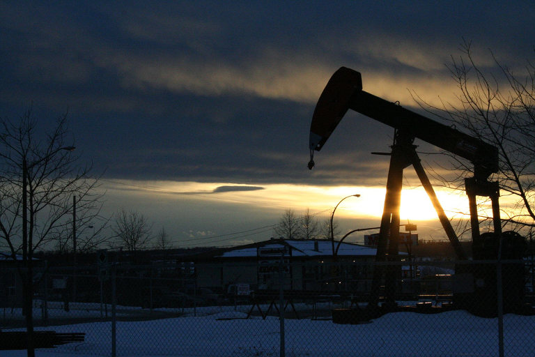
Teaser photo credit: By Schnits at English Wikipedia, CC BY 2.5, https://commons.wikimedia.org/w/index.php?curid=38065768