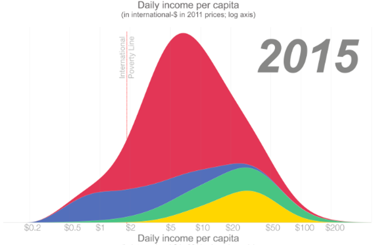
There is a powerful infographic that has been circulating on social media for a couple of years now. It illustrates a dramatic transformation from a “two hump world” in 1975 to a “one hump world” today. It was created by Hans Rosling and Gapminder, and has been reproduced and circulated by Max Roser and Our World in Data. Take a look:

Red is Asia/Pacific; Blue is Africa; Green is North/South America; Yellow is Europe. Incomes are PPP.
It is an astonishing image. In his post on inequality, Roser uses this graph to conclude: “The poorer countries have caught up, and world income inequality has declined.” Hans Rosling went further, saying that thinking about inequality in terms of North and South is no longer a useful way of viewing the world, as the South has caught up to the North. More recently Duncan Green wrote that Income inequality is no longer about a divide between nations or regions of the world, but rather between social groups within the global population as a whole.
Indeed, the graph gives the impression that all of the world’s people are basically in the same income bubble: whether you’re in Europe, Asia or the Americas, we’re all in the same hump, with a smooth, normal distribution. Clearly globalization has abolished that old colonial divide between North and South, and has worked nicely in favour of the majority of the world’s population. Right?
Well, not quite. In fact, this impression is exactly the opposite of what is actually happening in the world.
There are a few things about this graph that we need to keep in mind:
First of all, the x axis is laid out on a logarithmic scale. This has the effect of cramming the incomes of the rich into the same visual space as the incomes of the poor. If laid out on a linear scale, we would see that in reality the bulk of the world’s population is pressed way over to the left, while a long tail of rich people whips out to the right, with people in the global North capturing virtually all of the income above $30 per day. It’s a very different picture indeed.
Second, the income figures are adjusted for PPP. Comparing the incomes of rich people and poor people in PPP terms is problematic because PPP is known to overstate the purchasing power of the poor vis-a-vis the rich (basically because the poor consume a range of goods that are under-represented in PPP calculations, as economists like Ha-Joon Chang and Sanjay Reddy have pointed out). This approach may work for measuring something like poverty, or access to consumption, but it doesn’t make sense to use it for assessing the distribution of income generated by the global economy each year. For this, we need to use constant dollars.
Third, the countries in the graph are grouped by world region: Europe, Asia and the Pacific, North and South America, Africa. The problem with this grouping is that it tells us nothing about “North and South”. Global North countries like Australia, New Zealand and Japan are included in Asia and Pacific, while the Americas include the US and Canada right alongside Haiti and Belize. If we want to know whether the North-South divide still exists, we need a grouping that will actually serve that end.
So what happens if we look at the data differently? Divide the world’s countries between global South and global North, use constant dollars instead of PPP, and set it out on a linear axis rather than a logarithmic one. Here’s what it looks like. The circle sizes represent population, and the x axis is average income (graphics developed by Huzaifa Zoomkawala; click through for more detail):

Global North: US, European Union, Canada, Australia, New Zealand, Russia, Switzerland, Iceland, Israel, Greenland, Norway, Japan
Suddenly the story changes completely. We see that while per capita income has indeed increased in the global South, the global North has captured the vast majority of new income generated by global growth since 1960. As a result, the income gap between the average person in the North and the average person in the South has nearly quadrupled in size, going from $9,000 in 1960 to $35,000 today.
In other words, there has been no “catch up”, no “convergence”. On the contrary, what’s happening is divergence, big time.
This is not to say that Rosling and Roser’s hump graphs are wrong. They tell us important things about how world demographics have changed. But they certainly cannot be used to conclude that poor countries have “caught up”, or that the North-South divide no longer exists, or that income inequality between nations doesn’t matter anymore. Indeed, quite the opposite is true.
Why is this happening? Because, as I explain in The Divide, the global economy has been organized to facilitate the North’s access to cheap labour, raw materials, and captive markets in the South – today just as during the colonial period. Sure, some important things have obviously changed. But the countries of the North still control a vastly disproportionate share of voting power in the World Bank and the IMF, the institutions that control the rules of the global economy. They control a disproportionate share of bargaining power in the World Trade Organization. They wield leverage over the economic policy of poorer countries through debt. They control the majority of the world’s secrecy jurisdictions, which enable multinational companies to extract untaxed profits out of the South. They retain the ability to topple foreign governments whose economic policies they don’t like, and occupy countries they consider to be strategic in terms of resources and geography.
These geopolitical power imbalances sustain and reproduce a global class divide that has worsened since the end of colonialism. This injustice is conveniently elided by the one-hump graph, which offers a misleadingly rosy narrative about what has happened over the past half century.