
I still shudder at the thought of report cards. When I was a child, I dreaded them because my teachers used them to tell my parents I spent too much time daydreaming and clowning around.
I guess that’s the point. Report cards make you accountable for behaviors that need to change.
So when I heard that university researchers had put out a report card on sustainable food systems, I immediately thought somebody was going to be called to account for not getting down to work, playing well with others, or making progress.
THINK GLOBALLY. REPORT LOCALLY!
Get excited! We have the statistics to make our case!!
It’s high time we think in terms of sustainability report cards on food issues, because report cards bring responsibility and agency into our mindset.
Responsibility and agency are the missing ingredients in most reports we get on global warming, the environment and social trends. It’s as if these results are just facts, not results that were caused by someone, or the responsibility of someone. As a result of agency-free reporting, we’re all left with the impression we’re all to blame; there’s nothing specific that someone in particular has done or should do. That leaves us feeling guilty but powerless. We act accordingly, and go on feeling guilty about doing nothing, as before. “Keep calm and carry on feeling guilty” seems to be the slogan.
By contrast, a report card says that we live in a world where someone’s results don’t pass, and some people have to pay attention and improve their behavior and up their game, or they’ll be reported again next year.
That sets the right tone for numbers designed as preparation for action.
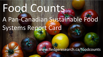 A fledgling project to set the bar for measuring food system progress
That’s why I’m a big fan of the new 100-page publication, Food Counts: A Pan-Canadian Sustainable Food Systems Report Card. It’s been issued by FLEdGE, a research partnership hosted by Wilfrid Laurier University’s Centre for Sustainable Food Systems.
Although the information is entirely about Canada, the report card sets the bar for report cards everywhere. Think globally, report locally!
If people in food movements are serious about making progress, we need a baseline on how well governments, community groups, businesses and individuals are doing. The baseline serves as a compass providing directions actions need to move in. Baselines also allow us to measure progress or lack thereof. Although report cards gather information about the present, they focus attention on actions to improve the future.
Report cards are an important tool to promote transparency and focus future efforts.
The authors of this FLEdGE report card — Charles Levkoe, Rachael Lefebvre and Alison Blay-Palmer — have produced a model of what can be done with limited resources. We can each build this model out in our own way.
The report’s authors should be proud of humble results. We are just beginning. All our reports will be works in progress, not final truths. The longest journey starts with the first step, and all that jazz — it’s all true.
This work-in-progress approach turns necessity into a virtue by achieving results that money can’t buy. We can enlist students doing Honors BA papers or post-graduate papers. One student can do a project that provides us with the number of local faith organizations engaged in promoting fair trade. That will help us build up our section on indicators about the treatment of food as a sacred matter. A graduate student in education can do a class assignment on elementary schools that do and don’t use school gardens to enrich the curriculum. That will help us with our section on food literacy. And so on.
This way, we not only gather research we need, we contribute to community-engaged learning and higher education, and to the preparation of the next generation of food professionals.
There are many examples of what can be done with intensive surveys and extensive statistical skills. I have just read an excellent article on different kinds of food policy councils. It answers some very difficult questions pretty definitively by using elaborate statistical tools.
The strength of the FLEdGE report, by contrast, is that it covers a lot of ground with basic statistics and statistical methods, making the model accessible to groups with modest resources.
CAN FOOD COUNTS BE USEFUL? LET ME COUNT THE WAYS!
When officials ask for numbers, it’s a sure sign that they’re giving serious consideration to a possible food project. Talk about an indicator!!
We need to learn from used car salespeople in this regard. When potential customers kick the tires, the salespeople give them lots of space. They leap to attention when the potential customer raises an objection. There’s not enough room in the back, the potential customer complains. The salesperson now knows that the potential customer has actually pictured owning and using the car! They’re no longer kicking tires. They’re talking numbers: how much room is in the back.
Brian Cook, a senior food researcher with Toronto Public Health, has a test question for advocates who come to him with a good idea. What would success look like, he asks. I apply the same test to food counts. What’s your picture of what becomes possible when you collect your numbers?
Picture four positive changes that will follow from putting good numbers together. By visualizing the purposes your numbers will be put to, you can work backwards from there, and identify the numbers you will need. The quality of the numbers you use in your report will come from balancing the numbers you need against the numbers you can afford to generate, given your resources.
- In my first picture of success, I see me and my colleagues being grilled by the numbers guys who believe they can’t manage what they can’t measure. The numbers guys are the gatekeepers of our era. So when they ask to see our data, we’re on their radar.
Business leaders watch numbers like a hawk. We can learn from that.
When they ask for a project’s business case, they’re asking for numbers. How do we guard against “more squeeze than juice?” That’s the test question of one Toronto-based venture capitalist who works in the food space. He wants to know what measurable outcomes come out of what measurable inputs.
There’s a snippet here on the revival of sales and profits at McDonald’s in 2017. It shows how numbers lead to action in the food space.
By raising quality and lowering prices, McDonald’s won back 500 million (is that an impressive number???) customer visits that they had lost in the years leading up to 2012.
CEO Steve Easterbrook says the increase in customer visits is “a milestone.” He has to keep his eyes on this number because he knows the gains come from previous customers who came back to McDonald’s when quality went up and prices came down. The increase did not come from new customers checking out low-cost, high-quality fast food. It’s strictly a market share fight, says Easterbrook. “Our gain will result in pain being felt elsewhere,” among competitors.
Good food advocates need to mull over these numbers and observations. Can we pass the quality and price tests to compete against the unhealthy fast food industry? Can we connect to the people who are not attracted to any of the old-style fast food providers? This sizable group is blocking the growth of all fast food businesses. It is forcing monopolies in the fast food sector to fight among themselves for growth. These businesses are fighting among themselves, not against us. Do we know who is in the group that’s not attracted to conventional fast food? Do we know what they want, and where we can meet them?
Can we also look at what Easterbrook didn’t count? When he talks about pain, he is thinking of his fast food competitors. He does not keep track of the pain registered by cost increases to the healthcare system, or pain imposed on underpaid food producers, or pain imposed on the environment or sentient animals. They don’t make customer visits, and aren’t in his field of vision.
 These are numbers that fast food chains don’t track. It’s up to good food advocates to track them.
Those are the numbers public interest groups need to collect. Old-style business leaders need numbers to guide their actions. We need numbers to guide ours. Some of our numbers might show that Big Food could do better by selling healthier, more local and sustainable food. Other numbers might show the true costs (with numbers) to the public and environment — as is done here.
Once made visible with numbers and an infographic, the pain to customers and the environment might become the subject of public discussion and policy. When that happens, we will all be talking the same numeric language.
ICYMI, McDonald’s had our number some time ago, as this article shows. They knew when and where they could move into wide open and unregulated spaces. Public health, the real competitor to junk food, wasn’t in the running. It didn’t have the numbers it needed to make the case it needed to make.
My picture of success shows us having the numbers when our turn comes around again. Working backward from this picture, we need to collect numbers that build our business or economic case. We have to document the cost of doing nothing about problems, and the opportunity of saving or making money from doing the right thing.
2. The second success I picture is that we will get the bureaucratic go-ahead to prepare a proposed strategy that can deal with food on an across-the-board food system level.
Innovators (that’s us!) almost always have to show their cards before they can play. They have to prove they know what they’re doing before they’re allowed to do it. It’s the same as banks demanding a business plan before giving a loan for a business start-up. A PhD committee requires a detailed proposal before giving permission to start the PhD dissertation. Building officials want engineering drawings before saying a construction project is “shovel-ready.” Policy bureaucrats are the same with policy entrepreneurs.
 Before this report was done, lots of numbers had to be collected
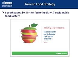
That’s the way it worked with Toronto’s food strategy. Adopted by the city in 2010, it’s proven to be one of the more dynamic local food strategies in the world, if I do say so myself. (I was a senior writer for it.) It was a classic overnight success, three years –and counting — in the making.
Toronto’s Medical Officer of Health needs no permission to do a public health strategy. But the MoH needs permission to proceed on a city-wide strategy. Dr. David McKeown, the MoH, cooked up numbers to show food’s impact on the whole city in a 2007 report.(temporarily unavailable on the TPH website) Dr. Brian Cook supplied numbers on food’s impact on the city’s economy, environment, culture, community and poverty.
The report has 24 pages. Eight pages are compulsory paraphernalia. Three pages are argument. There are 8 pages of statistics, and 5 pages of jam-packed footnotes and references. Of the 24 pages, 16 carry a simple message: “these guys know what they’re talking about, and earned our trust to go ahead.”
Never mind about hitting the ground running at the starting gate. Without strong numbers, they don’t show you where the starting gate is.
Work backwards from this picture. You need a range of numbers to make the case for a broad, system-wide perspective on problems and opportunities that arise with food system changes.
3. The third success I picture is a well-placed news item on our numbers research. Mainstream newspapers, magazines, radio and TV are broadcasting it. Social media are narrow-casting it. My friends are calling to congratulate me!
Statistical reports are rarely the hottest stories to cross a journalist’s desk. But if it’s a slow day for murder, mayhem, and Trumptweets, statistics-based report cards will make the cut. Attach convincing numbers to an interesting trend, and the media will pick it up and there will be a public buzz.
News outlets seldom report the views of public health or environmental leaders. It doesn’t matter how important, well-conceived or brilliant their ideas are. Ideas aren’t news and they aren’t interesting to most people. If you doubt this, post a story about a brilliant theory on Facebook and see how many “likes” you get.
People arouse the interest of people. People magazine and half the magazines sold at supermarkets have a person on the front cover. Some restaurant locations are hot because they’re places for people-watchers. Numbers that tell a people story are also interesting. They promise a more detached form of people-watching. Reporters can work with numbers by adding a people angle. Reporters find someone who’s an example of the trend, and creates a “human interest” story. Human interest? Imagine having that as a purpose of high-minded research!
Credible numbers are the price of admission to public conversation. Of course, you can pay to get your story out by buying ad space. But good statistics get good media coverage for free. Such coverage is often called “earned media.” That’s a good way to put it. Someone earned it. Survey and statistical research is an investment. The Return on Investment is public education that leads to policy adoption.
Some people describe food as a co-production. The food is not a commodity from the farmer. It is a product of the relationship between farmer and customer, or chef and farmer. In the same vein, research on statistical trends is a co-production. Researchers need to know the needs of the people who will use them. In effect, they need to act as if the public good is a “customer-facing” business. Researchers worth their salt don’t gather rosebuds as they may.
A release to the media must meet media needs for stories of a certain kind. They like human stories with drama to them, for example. The stats need to help tell that dramatic story. That’s the condition of getting coverage. You have to be relevant to the media audience, not to policy wonks. The chief qualification of policy wonks is disinterest in people stories. Don’t put them in charge of your communications division.
I polished my thinking about media needs over the last year as I worked to improve headlines on my blog. Did you know you can win or lose 80 per cent of your readers with a good or bad headline?
Here’s an exercise. If you understand headlines, you will understand the needs of the media. Mainstream or social media doesn’t matter. If the story doesn’t meet media needs, it won’t get picked up.
Headlines that win readers’ attention have identifiable features.
Some promise usefulness, as in How to….. One survey counted 8961 readers for stories under headlines that promised useful tips. By contrast, 1060 people read stories with headlines describing what happened next. So think …How to boost math skills of Vancouver students… How to make Seattle tops in food waste reduction…..How food retailers can banish traffic jams.
Do you know the use of your numbers to a story? If not, don’t count on getting much attention!
Successful heads also appeal to curiosity …the surprising reason why…. If there’s nothing surprising in your report, don’t show surprise if no-one takes an interest.
Successful headlines also feature superlatives — the best of, and worst of. Negative superlatives get 30 per cent more attention than positive superlatives.
There are many stories about Toronto as the child poverty capital of Canada, for example. By contrast, I almost never see a story about Toronto as a global leader in municipal food policy. I’m looking forward to the headline telling me Toronto No Longer Worst City for Child Poverty. But then Toronto Food Waste Worst in Ten Years could supersede it. If someone trashes Toronto, it’s a surefire guarantee that media will find space to report it.
Another category of successful headlines deals with explanations. Think…Why Toronto Food Waste Keeps Getting Worse. ….Why Hunger Rates Are Getting Worse in New York.
Curiosity may kill cats. But it never kills interest in finding out what’s behind the curtain of whatever seems to be happening.
Research has a purpose. One purpose is to arouse interest in the general public. Barry Martin of Hypenotic says the top rule of social media posts is to be “shareworthy.” Work backwards from that thought. How will numbers make your story share-worthy. Then go get those numbers.
4. The fourth picture I see showing success is an active advocacy effort in the midst of a municipal election campaign. It is hitting its stride, thanks in part to its use of good numbers.
Food advocates need to change their political, cultural and economic address. They have to move out of the marginal neighborhood for “early adopters.” Their new digs will be with the “early majority.” (For a brief intro to these terms, see here.)
Good numbers are crucial to making that transition. There’s a very good reason for that. The emerging majority wants to see solid information and perspective provided by numbers.
Early adopters need to walk a mile in the shoes of someone in the emerging majority. They also need to get that person to walk a mile in the shoes of a beneficiary of the advocacy campaign. Numbers are key to both processes.
Think of a campaign en route from early adopter to early majority. Take the example of campaigns to raise social welfare rates and minimum wages. The campaign will boost incomes enough to overcoming food insecurity. That’s Step One from food insecurity to food security, from a negative spiral to a virtuous circle.
Listen to the concerns of people in the early majority. They have good hearts. They don’t think people who work hard at menial jobs should live in poverty. They get sick at the thought that innocent children go without food.
But they are insistent that we answer their concerns with solid information. They want to hear from accredited experts. They want proof that careful shopping or cooking won’t put nutritious food on the table. Can people on such low incomes afford nutritious food if they cook their meals from scratch? Can they stretch their budget by relying on frugal choices? Can they substitute sardines for salmon, lettuce for arugula, hamburger for steak? What is the total yearly cost of the proposal? Can taxpayers afford higher taxes to increase social assistance rates? Can small employers survive if they pay higher wages? Does a helping hand today lead to better parents, citizens and wage-earners? Is there a social or economic return on the investment? Do experiences elsewhere show these programs work?
Credible answers are available for all these questions. Why not prepare for these questions? Why not gather the info? Why not test to see if the information convinces the kind of people who will form the new majority? Why not set up media interviews with people who showcase the positive results? Why not develop a list of experts who will testify to the truth of the advocacy argument?
The demand for “evidence-based decisions” is universal. But there is a big difference between availability and accessibility. It’s the same difference as between food being available (produced) and accessible (affordable). The information is likely scattered in hundreds of places. Google has links to some, but not all, of them. Some info is and is not known outside the tiny circle that produced it. Nor are many people aware of what all this information looks when assembled on one chart.
The calling of food counters is to make this information both transparent (on which, see this example) and accessible. Sometimes, as is the case with racialized income inequalities that foster food insecurity (as reported here), the job of collecting such statistics belongs with government. Demands that such info be collected by governments, as part of their human rights enforcement obligation, should be pressed vigorously.
To win over the emerging majority with information, we need Food Count-style report cards in all cities and regions.
FOOD SOVEREIGNTY MAKES NUMBERS COUNT FOR SOMETHING
My first instinct was to feel leery about the Food Counts using food sovereignty, the slogan of a peasant protest movement based in the Global South, to frame its indicators on food-related activities.
There are seven pillars of food sovereignty, the authors argue, and each of these pillars leads to a set of indicators that can be measured. On reflection, I agree that the pillars do a stand-up job. (I would, however, prefer the term window, which is the real function performed by said pillars.)
Compare the alternatives, and you will see the unique merits of indicators inspired by food sovereignty principles.
Food security is one alternative. It is usually defined in terms of access to adequate amounts of safe, nutritious, personally acceptable food for a healthy and active life. That definition focuses on food consumers, and leaves out food producers, a majority of the world’s population. Food security, at least as commonly understood, also excludes a wide range of issues unrelated to food access. Sustainability comes to mind as an issue that gets neglected if a food security framework prescribes all the indicators.
Worse than food security are typical government-issue reports based on agricultural, fishery and nutrition statistics. They actually don’t get the point of food.
Food, as distinct from agriculture and nutrition, has been identified by Laurette Dube and her Montreal co-workers, as a “whole-of government, whole-of-society,” enterprise. Agriculture, fishery and nutrition, by contrast, offer a “part-of-government, part-of society” view of the world. If the parts added up to the whole, there might be some validity to this approach. But since the whole of food is much more than the parts of agriculture, fisheries and nutrition, government-issue reports are obsolete.
Food sovereignty is the one term capacious enough, or stretchable and bendable enough, to include the whole nine yards of food relationships, as explained in this review of the term.
Let’s start by reviewing the seven pillars or windows. Then I’ll give some of my own comments and suggestions on their treatment of these seven pillars, before concluding with an appeal to go forth and multiply the number of food sustainability report cards.
SEVEN PILLARS OF FOOD SOVEREIGNTY
Pillar 1 is the directive to center programming around the human development of people. That sounds like a cliché, but it really means that food policy needs to become self-consciously people-centered.
Food is no longer to be measured by yields going up or down, or commodity prices going up or down, but by peoples’ needs being met. That’s an consequential driver for food policy.
Pillar 2 is that it builds knowledge and skills. That means capacity building for both individuals and communities. Together with Pillar 6 about local control, its adds up to empowerment or enabling of local communities. These two pillars align well with Pillar 1, which puts human development at the forefront. I call this “people-centered food policy.”
Pillar 3 goes beyond environmental sustainability. As I read them, the directions specify regeneration and resilience, more than sustainability. Very ambitious.
Pillar 4 says to value food providers. Indicators for this start with respect for the work of food providers, which isn’t often the case, either in terms of the pay or status of food producers. But another indicator specifies support for sustainable livelihoods. Again we see the people-centered focus. It’s not just the work that is to be respected and paid reasonably. The livelihoods of food producers must also be sustainable.
Pillar 5 sets out localizing food systems. The word is localize. Localize is an action verb. It is not an adjective that describes where the food came from. It’s not about distance the food has traveled. It’s about distance between producers and consumers, which is about relationships, not miles. It’s also about resisting “dependency on remote and unaccountable corporations.” Nothing here to suggest hostility to newcomers or strangers, or sticking with the old-time religions and customs.
Pillar 7 says food is sacred. Food is to be seen as a gift that is not to be wasted, which is right in line with current concerns about food waste being ethically unacceptable. And it says food should not be treated as if it were only a commodity.
Many people say the same about health, housing, education, and other essential life-supporting services. Though we don’t all live up to the idea, most people agree that access to essential needs should not be denied to people who can’t pay cash on the line. Instead of specifying anti-hunger measures, this food sovereignty pillar specifies a positive ethical commitment.
Unfortunately, Food Count didn’t provide any indicators under the sacredness of food. I think we should start such a list. I think we can count up the number of faith organizations that provide food as a charitable offering to the poor. I think we can count up the number of faith organizations that support and promote fair trade goods. I think we can count church dinners. I also think we should count all the multicultural faith-sponsored holy days that feature either fasting or feasting. Food that brings people together in fellowship should be recognized as spiritual.
An excellent article in the Economist refers sneeringly to parking lots as “sacred spaces” for cars, the sacred object. Perhaps we could adapt this and refer to picnics under cherry blossoms in Japan a sacred gathering. Perhaps a Slow Food banquet could be identified as a sacred experience. We should open our minds and hearts to the possibilities here.
OTHER FOOD SOVEREIGNTY CONSIDERATIONS
In the end, I’m persuaded that food sovereignty offers useful indicators to judge food trends by.
I concede there’s a lot missing. Explicit references to health equity, food literacy and mechanisms for citizen engagement in food policy are missing. Having said that, there’s no one-page description of anything that can fit everything in. So I’m keeping an open mind.
The use of food sovereignty as a guideline for reporting on food also provides an interesting example of a positive trend in today’s world. People in the Global North are no longer thinking that all progress in the world flows from the Global North down to the Global South. The Global South is where food sovereignty comes from — fitting enough given that anti-colonial struggles are recent memories for many people there. It’s an idea worthy of export.
It’s worth noting that the Food in Cities project of Euro Cities, associated with both the European Union and the Milan Pact, sets out six areas for civic innovation. Number 1 is community buy-in. Number 2 is popular participation in governance. Number 3 is local empowerment. Number 4 is shorter supply chains. Number 5 is systems thinking. Number 7 is trans-localism — working together and sharing among cities around the world, even when not trading products.
That listing is quite compatible with elements named under the Food Counts framework of food sovereignty.
Here are four examples of how this Food Counts report card tickled my imagination.
WASTED FOOD
Packaging should be counted as part of food waste, which holds processors and city waste departments accountable.
One hot indicator now is food waste. The authors set a baseline for future report cards by reproducing a chart produced by Value Chain Management International on the distribution of Canada’s food waste in 2014. The chart tallied $31 billion in food wasted, a staggering amount.
I have some problems with this particular chart. First, I don’t like the term “food waste.” Waste should be understood as a verb, not a noun. The correct term is “wasted food.” People do the wasting by turning something with a potential into a waste product. I don’t like missing the opportunity to remind people of their responsibility or potential agency.
I also question how this chart categorizes waste. It blames consumers for 47 per cent of wasted food, for example. Food processors are blamed for 20 per cent, and government services show up as blame-free.
Huge percentages of plastic waste ends up in rivers, lakes and oceans, where drinking water, irrigation water and fisheries are compromised — all important food issues.
WHAT THE F (DON’T BLUSH! THIS IS A REPORT CARD F!!!)
Food packaging should also be included in food waste. If we don’t keep an eye on that, we could end up with a counter-productive “solution,” such as smothering perishable foods in plastic wrap, rather than localizing food production to reduce perishability. The first strategy would increase toxic waste (plastic packaging), and waste fossil fuels used to make plastic. The localizing strategy, by contrast, would reduce wasted food and wasted byproducts used up by long-distance food.
Can this waste really be blamed on consumers?
To make local food relevant, we need to highlight plastic packaging, which should be understood as the fellow traveler of long-distance food. Shippers prefer plastic because they can jam more food into one truck by reducing the weight and space taken up by packages made from reusable glass, wood or crop residues. The big saving for the long-distance shipper comes from externalizing the cost of their packaging choice onto local taxpayers, who pay most of the bill for recycling and landfilling useless plastic packages.
To add insult to injury, the plastic-wrapped goods may well ruin a local supplier, who uses a reusable or recyclable package. That’s how dairies and beer companies used to work. They used heavy bottles that were reused many times; the empties were picked up when the new filled bottles were delivered, and taken back to the processor in the emptied truck — a minimal waste solution.
My bet is that local governments pay more to handle the throwaway bottles that come with sales of bottled water than the pittance governments get for leasing out water to bottling companies.
To boot, plastic packaging has become a prime food security problem. Plastic waste in lakes and oceans actually outweighs fish, and jeopardizes both the health of fish and the safety of humans eating them. This risk is especially important in low-income countries, where fish have long been the most affordable form of healthy protein.
Any report card worth its salt would give an F to this giveaway to global corporations at the expense of local taxpayers and the littered local environment. It would not ignore this processor-generated decision leading to wasted food.
Aside from packaging, processors are responsible for many other wastes. They are often the ones to discard off-sized and off-shaped fruits and vegetables that don’t meet their canning or bagging requirements. They make the call to waste parts of animals or fruits and vegetables being processed. For example, slaughtering houses no longer ensure that all animal bones and hides are reused for other products. Such waste should not go unrecorded. If it’s not recorded, it’s not redlined for corrective action.
Waste is a verb, not a noun, Clivus founder Abby Rockefeller used to say.
A wider lens on food waste would also suggest that what is called “human waste” (excrement) is also part of the food waste story. Pee and poo, both loaded with critical plant nutrients that can be rendered perfectly safe during careful composting, are wasted by government infrastructure that transports humanure to the nearest river or lake, thereby degrading the habitat for fish and aquatic life — adding wasted fish to wasted fertilizers, and proving once again that “waste is a resource that’s been put in the wrong place.” Again, this mistake needs to be recorded so it can be seen and corrected.
Waste is also the all-too-common fate of what is called “grey water” — dishwater and bathing water, often rich in soil nutrients which could fertilize and irrigate backyard gardens if proper piping were provided.
In the coming era of circular economies, practices and technologies that only use a resource once need to be defined as wasteful.
Specifically, report cards need to save a separate place to note the waste caused by municipal policy failure.
I don’t want to minimize waste caused by sloppiness of individual consumers. Indeed, I’ve been upset by this for a long time.
In our 1999 book, Real Food for a Change, Lori Stahlbrand, Rod MacRae and I argued that “consumptivity” needs to be classed on par with productivity in terms of wise use of resources.
Productivity measures the value of the output per worker per hour. Well, some similar notion could apply to consumers. What outcomes do they have per hour, given the materials they use they use and the labor embedded in those materials.
The standard portrayal of wasted food is misleading because it blames consumers, rather than a consuming culture and set of technologies, for low rates of consumptivity.
I believe (and would like to see somebody gather stats on) that the consumptivity of consumers has gone down due to lack of food literacy, lack of experience in the kitchen, lack of access to basic tools and materials, and reliance on materials embedded with extravagant amounts of energy.
Report cards have to be issued to the right people, and that includes the people and institutions responsible for drastic declines in consumptivity.
FARMERS AS AN ENDANGERED SPECIES
Quite appropriately, given the centrality of food production in the food system, the report card uses several indicators reflecting the well-being of farms and farmers. One major purpose of a report card is to measure and reveal progress or backsliding over time, and the discouraging results are there for all to see.
Farms are put on the chopping block, and rural communities and towns are put at-risk.
Canada had 280,043 farms in 1991 and had 205, 730 in 2011. If that rate of decline continues, farmers would be extinct in 80 years. Should someone be concerned about the policy and process responsible for this trend?
To make matters worse, the land which once belonged to a disappeared farm family has not been left vacant, available for a new farmer to give the land a try. It has been purchased by a larger farmer. As a result of this process, another chart shows, the number farms with over 2880 acres has gone up, while the number with 180 to 2879 acres has declined.
There are at least three stories behind these numbers. I hope upcoming report cards can confirm or deny my suspicion about the story line.
My first suspicion is that it is not just individual farmers who are calling it quits. It is farmers of the middle, the very farmers best positioned to produce both the quality and the quantity needed by local urban populations, who are most vulnerable. By contrast, the mega- farms are best positioned to meet the needs of global corporations that want bulk purchases of one or two food commodities or food inputs.
If I’m right, the prospects for localized food systems are declining as fewer farmers own bigger tracts of land.
My second suspicion is that the farms that are left will rely more and more on equipment, and less on the skill and knowledge of people working the land. That suspicion is confirmed by another chart showing a marked decline in agricultural employment, from over 331,500 in 2010 to 314, 600 in 2016. If this trend continues, there will be no agricultural employees in about 30 years.
Huge farms with huge machines mean less of the best fertilizer on any field — a farmer’s footstep.
The likely explanation that people are being replaced by machines is suggested by another chart on total farm capital, which increased by $200 billion between 1991 and 2011. That level of investment, which more or less sets the price for how much it costs to produce food from a highly mechanized environment, also suggests that new farmers filled with the traditional farmer assets of blood, sweat and tears will be out of the picture.
Nor is it likely that new farmers will be found among newcomers to the country. At present, another chart shows, fewer than 10 per cent of Canadian farmers were born outside Canada, at a time when half of Toronto’s population was. How are we to produce foods and food marketing relationships for a multicultural society if we fail to recruit multicultural farmers?
The barriers to entry for new farmers are forbidding, at the very same time, another chart shows, as the age of farmers is rapidly going up. In 1991, the average farm operator was 47.5 years old; by 2011, half of farm operators were over 55.
Farmers are getting older, a sustainability danger sign governments aren’t responding to.
I remember what it was like to weed and harvest on vegetable farms when I was a mid-50s “woofer.” It wasn’t a pretty picture. But it was prettier than the trend this chart reveals — that farmers and their children see no future in farming.
Report cards can be useful in giving us a sense of the deadlines we’re working to. Should someone in government be alarmed, or someone in opposition be issuing alarms by how quickly these negative and unsustainable trends are moving?
It is my view that this section of the report card needs to be brought to the attention of some sharp lawyers, who know how to sue governments for failure to conduct their due diligence with respect to the food security and food sovereignty of the people they claim to lead.
Maybe lawyers can get governments to pay attention?
When I suggested that the report card was generative, that’s one example of what I meant — a new food policy tool, the report card, generates a new food policy action, the lawsuit. Suit up!
EMPLOYMENT POSSIBILITIES
The 40th indicator in the report card (there are 61 in total) features jobs in food service, retail, distribution and processing. There are now over a million such workers in Canada, making food the largest employment sector in the country.
To fully appreciate the significance of policy in this matter, it will be useful (however time-consuming) to develop a chart in the future which reveals how much the government invests in protecting and enhancing food employment — compared to how much they invest in car or airplane manufacture or fossil fuel pipelines, to give examples of industries that are closer to the government trough (to borrow a farm metaphor).
Another way of framing this chart is to indicate that employment in food is tied almost exclusively to the production and movement of goods for money, rather than services provided for love or money.
There is of course, no employment of parents providing food for children or their own parents, because this work isn’t paid employment, even though it plays a vital role in society.
There is almost no steady employment in the food sector that is designed to prevent disease — animating children’s gardens, for example, to nurture a culture of activity rather than couch surfing, and to develop a culture of appreciating nutritious food, as well as personal agency and empowerment.
Governments mostly keep stats on workers who make or move commodities, not those who provide a service, such as health promotion.
As well, horticulture is not highlighted in terms of its considerable employment numbers, even though that is part of the future of urban agriculture — which will increasingly be linked to recreational and scenic amenities and to resilience of green or plant-based infrastructure. Plants, which may well include food-bearing plants, are proving themselves to be much more resilient and cost-effective than conventional concrete and steel infrastructure when it comes to floods, heat waves and other mishaps of the climate change era.
A good report card should also indicate where no assignments were handed in on this subject, which usually warrants a grade of F.
WORKING WITH NATURE
The section on “works with nature,” adapted from a fundamental principle of food sovereignty, indicates some progress that was surprising to me.
The definitive example of failure is in application of commercial fertilizers, herbicides, pesticides and fungicides, all of which have increased significantly since 1991.
If this chart were placed beside a chart on the use of genetically engineered foods (standard in soy, corn, and feedlot cattle operations, for example), my guess is that the trend lines would match, putting the lie to any sales propaganda to the effect that genetic engineering leads to environmental protection.
Notwithstanding this backsliding, there are signs of improved conservation practices by working farmers.
Drip irrigation techniques are reducing the amount of water that farmers waste.
Farmers are increasingly using techniques to conserve water and use it judiciously. Almost half of farmers now try to water crops in the evening or early morning, when evaporation is low, and also integrate compost into their soil as a way of increasing its water-holding capacity. As a result of such conservation practices, farmers and food industries used less water in 2013 than they did in 2009. However, the quality of the water released after food and ag use declined, another chart records.
The proportion of farmers using organic production methods doubled to 1.8 per cent of farms between 2001 and 2011, which is encouraging, though the number of organic farmers is quite a bit below the percentage of organic food sales, which means that this sector relies disproportionately on imports.
Farmers increasingly see the value of trees, and are cutting back on farming “fencepost to fencepost.”
Although agriculture is the industry most responsible for deforestation (a finding that will surprise most report card readers), the rate of deforestation slowed considerably, from 42,100 hectares in 1990 to 12,000 in 2014. Many farmers are using trees for windbelts and buffer zones around waterways.
Soil quality also improved from 1990 to 2011.
LOCALIZING FOOD DEMOCRACY
Engagement is the behavior most ignored by food system commentators, but that’s not the case with this report card, which has a section on localizing food systems.
The chapter is slim, as are the sections on building knowledge and skills, and on respect for the sacredness or spiritual side of food.
A food system centered on commodities downplays engagement and conviviality.
This deficiency is not the fault of the scholars who produced this report. The absence of information reflects the bias of the food system.
In a commodity-centered food system, consumers are only useful if they consume. Personal engagement and participation at the household level reduce the demand for highly processed “convenience” foods. Engagement and food literacy at the societal level only complicate the delivery of corporate messaging — the less, the better, which is probably why there is virtually no government support for civil society organizations.
The same goes for the historic relationship between food and conviviality, which is being eroded by people eating alone at their desk, alone in their car, or at the table with friends or family, mobile at the ready.
Government and industry programs to encourage agency by eaters are scarcer than hens’ teeth. There is virtually no representation of consumers or rural residents in any government departments or ministries of agriculture and food. In Canada, more so than other countries, ag and food operates as a department of the ag and food industry.
Some way should be found to depict such information in a future report card.
THE HIGHEST FORM OF FLATTERY
I have pinpointed my comments on challenges. My aim has been to show how the information in the report card generates information to stir the pot of needed public discussion.
Transparency opens many doors, as well as many windows.
That’s where this report excels. It’s why it deserves the highest form of flattery, which is imitation — the production of report cards from many other jurisdictions and organizations.
This report card is one of the most generative tools in the food policy toolkit.
(Just to be clear about my organizational standing, I am an unpaid volunteer on the International Advisory Committee of the Wilfrid Laurier Centre for the Study of Sustainable Food Systems, which hosts FLEdGE, the organization that published the report card. Thanks, Wayne)