For someone who believes, as I do, that decreasing availability of cheap fossil fuel will eventually make the transportation of food over long distances economically unfeasible, the phrase “local food” acquires a special meaning beyond the usual lifestyle implications. It’s less about maintaining moral purity and more about whether we’re going to have enough to eat. Since I live in the state of New York, the question becomes: could New York feed itself on what it produces?
A couple of years ago, I attempted a back-of-the-envelope sort of calculation to answer this question from a “peak oil” standpoint. To model the worst case, the one in which it takes more energy to extract fossil fuel than the energy we can get out of it, I put the question this way: if New York State produced what it did a hundred years ago, before the arrival of gasoline- and diesel-fueled equipment, could it feed its present population?
The answer, based on New York State agricultural statistics from the 1900 U.S. census, was rather depressing. Despite the fact that New York back then was an agricultural powerhouse — being, for example, far and away the number one state in potato production — its 1900 output of food would barely keep its current population alive.
Carbs weren’t so bad; assuming, in round numbers, a state population of 20 million (a little more than the current estimate), NYS 1900 could annually provide each resident with 87 pounds of corn and wheat and 114 pounds of potatoes. But protein was another story. NYS 1900 could provide each current resident with just 16 pounds of beef and pork, 37 eggs, and half a chicken per year. Dairy production, a historical strength in the state, would provide each person now living here just 39 gallons of milk per year, including an average six pounds of butter and seven pounds of cheese. This is probably enough animal protein to sustain life, but not remotely what we’re used to.
NYS fruit wouldn’t take up much of the slack, either; apples, grapes, peaches, pears, and berries put together would only amount to about 75 pounds per person. New York invented beans as an article of commercial North American agriculture (the first commercial bean crop on record was grown in 1836 in the Town of Yates, in Orleans County), but each person in our current population would only get about four pounds of them a year, plus a little less than a pound of peas. The problem, of course, is that in addition to cutting the fossil fuel input (including all the natural gas we turn into fertilizer), we would be trying to feed almost three times the number of people today that we supported in 1900.
Obviously this calculation was based on some very pessimistic assumptions about available fuel. But it also contained some extremely optimistic assumptions as well — most importantly that we still had substantially more arable land than we actually do now and also that we still had the vastly greater resources of animal power available a hundred years ago.[1] While suggestive, it wasn’t a very precise way of assessing our current resources.
The Cornell studies
Unknown to me, teams at Cornell University under the direction of postdoctoral researcher Christian Peters were engaged in sophisticated studies that would answer a more immediately interesting question — not what would happen if the energy inputs failed, but what the state’s carrying capacity is now, given current rates of production, and what our distribution system would look like if food miles were reduced as far as possible.
The work undertaken so far by Peters et al. has been described in two articles published in the journal Renewable Agriculture and Food Systems. The first piece, from 2006,[2] investigated the influence of diet on the demand for agricultural land and, secondarily, the ability of New York State to reduce environmental impacts by supplying food locally. The second study, from 2008,[3] focused more closely on local food by developing and applying a method for mapping NYS foodsheds. While preliminary, the results of these studies pose serious questions for those who seek to relocalize our diet, and they raise some significant issues for planners attempting to grapple with the contraction of agricultural supply chains due to rising fuel prices. The purpose of this article is to make the key findings of these seminal studies available to a larger audience.
The relatively short list of products actually produced in our climate suggests that the answer to the question of how much of our food needs can be supplied locally depends to some extent on what kinds of foods we plan to eat. The 2006 study approaches this issue by using USDA data to define 42 different nutritionally complete diets supplying 2300 calories a day, calculating the agricultural land requirements for each diet, and then calculating the potential ability of NYS to supply that diet to each resident based on recent estimates of available agricultural land (not land currently in production, but land that could be). Each of the 42 diets is nutritionally complete but contains different proportions of meat and eggs at rates from 0 to 12 ounces per day and different proportions of calories from fat ranging from 20 to 45 percent of total calories. The average U.S. diet contains 5.8 ounces of meat or eggs per day and 41 percent of calories from fat; Figure 1 shows where this average diet falls in the six by seven matrix formed by the two variables.[4] While obviously incomplete, the model does represent the range of common American food consumption patterns from low-fat lacto-vegetarian to high-fat, meat-rich omnivorous.
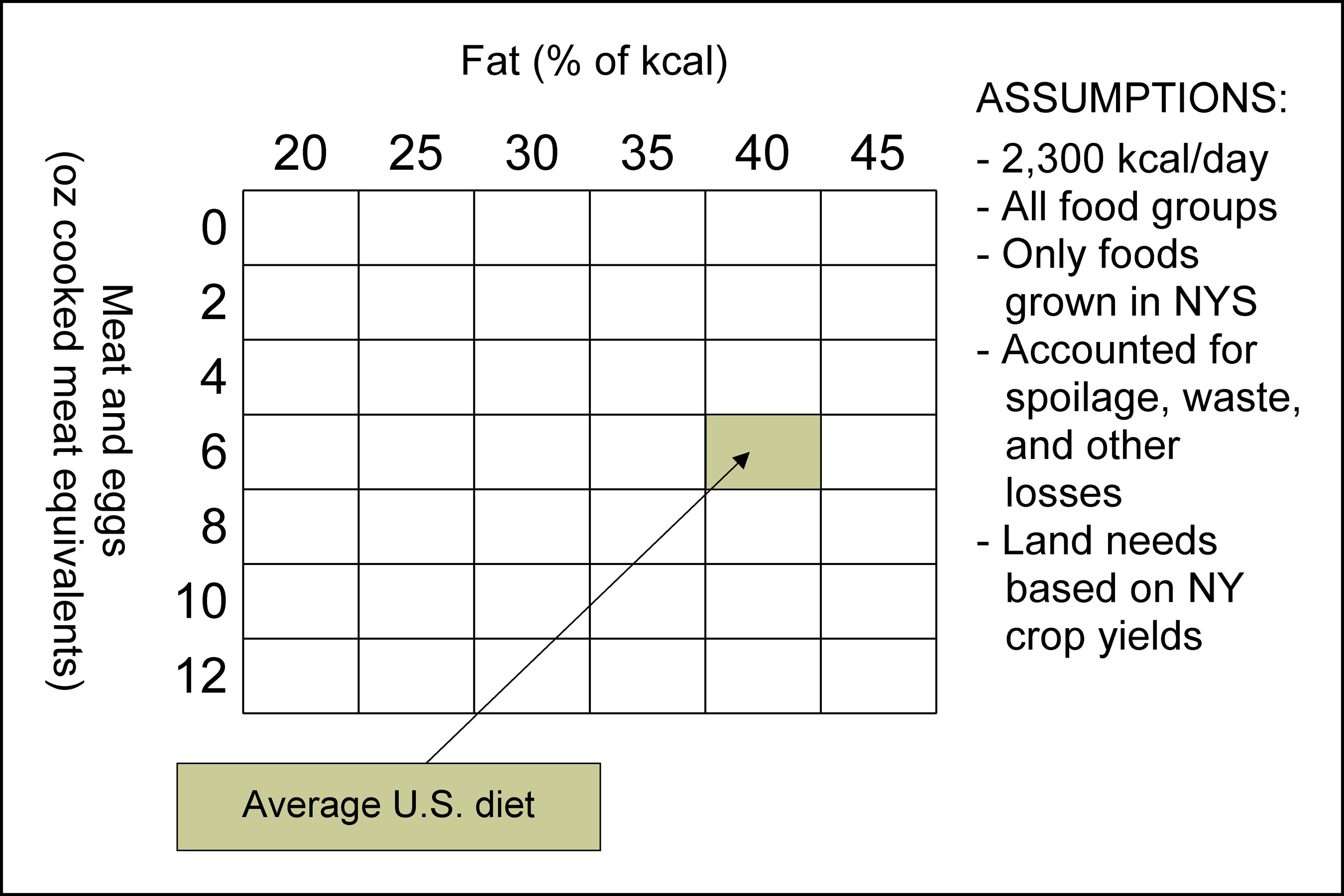
Figure 1. Matrix of 42 complete diets. (Click for larger image.)
Land requirements for each diet are based on a division of available agricultural land into three categories: harvested cropland, cropland pasture, and permanent pasture.
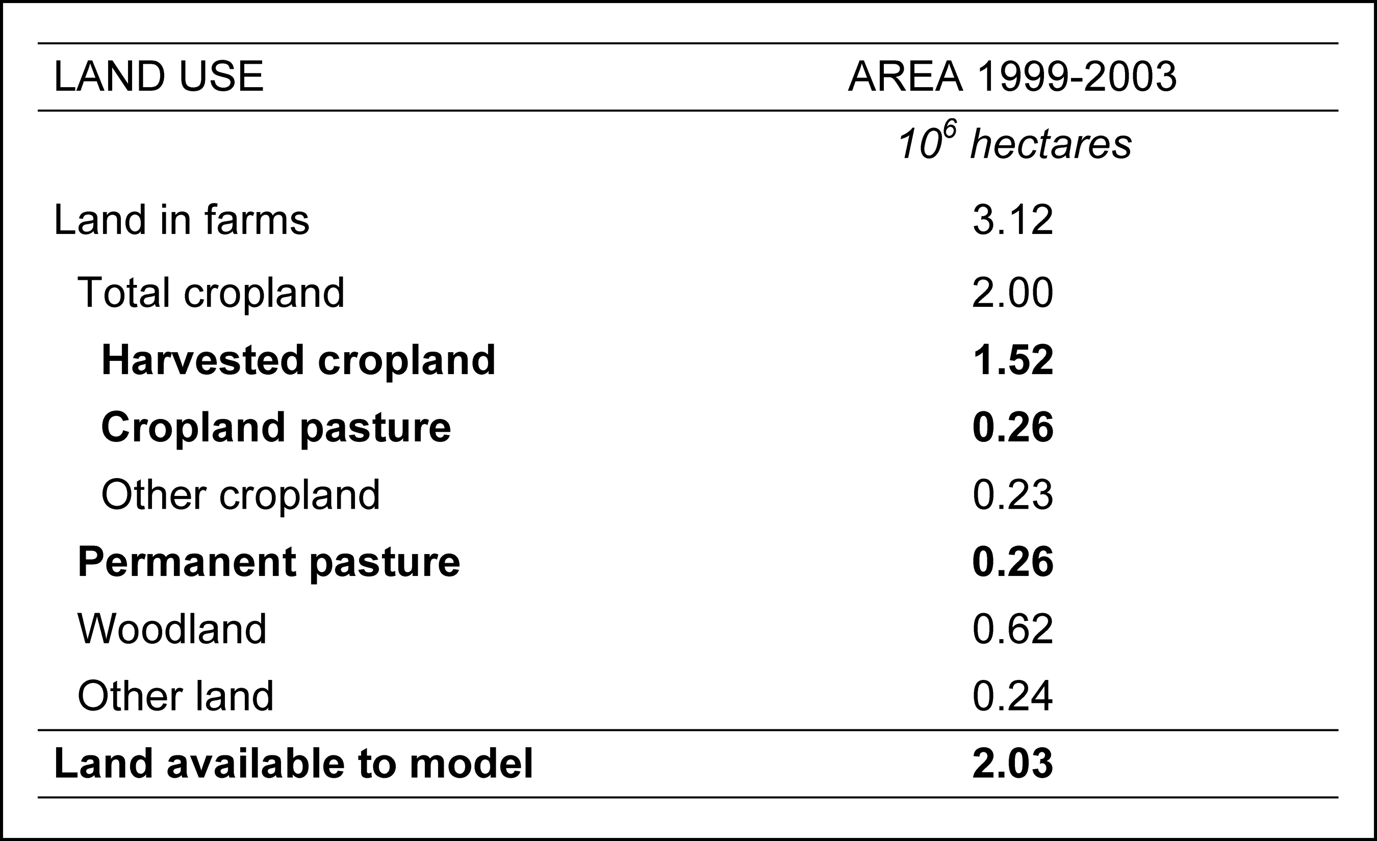
Figure 2. Available agricultural land in New York State. (Click for larger image.)
Further methodology, detailed in the study, addresses the interdependencies between perennial crops (grown mainly on grassland) and annual crops (grown mainly on cultivated land), and the calculation of carrying capacity employs a conditional equation that determines which category of land is limiting to food production. Figure 3 shows the results, with the seven levels of meat consumption displayed across the bottom and the six levels of fat consumption grouped within each meat consumption level. For example, someone who ate 190 grams (6.7 ounces) of cooked meat equivalents per day would require somewhere in the neighborhood of 0.45 hectares (about 1 1/8 acres) of combined annual and perennial NYS crops for their sustenance if their entire diet came from within the state.
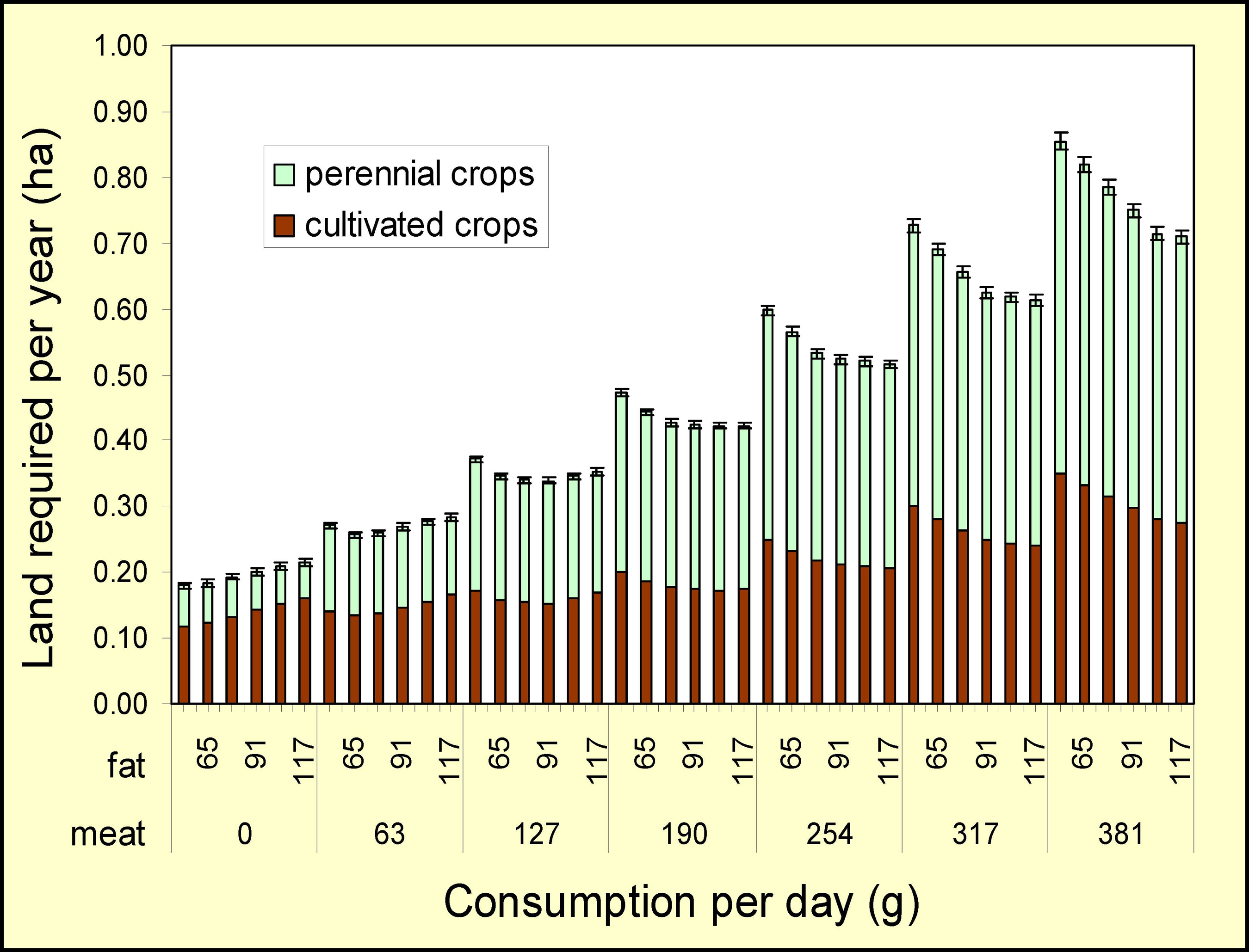
Figure 3. Land requirements of complete diets. (Click for larger image.)
Effect of diet on carrying capacity
Not surprisingly, the results show a nearly fivefold difference in the amount of land needed per capita depending on the diet, from 0.18 ha (0.44 ac) for a diet of 0 g meat and 52 g fat to 0.86 ha (2.12 ac) for a diet of 381 g meat and 52 g fat. As most TCLocal.org readers are aware, animal products require much more land per unit of edible energy than grains; in NYS this amounts to 3.3 to 6.3 times as much total land required for the animal products other than beef and a whopping 31 times as much for beef.
On the other hand, as shown in the figure, much of the difference is in the amount of land devoted to perennial crops rather than cultivated crops. If we consider just cultivated land requirements, the clear animal products winner is whole milk (1.2 square meters of cultivated land per 1000 calories). This is just slightly above the figure for grains (1.1 square meters per 1000 calories) and actually below the requirements per 1000 calories for oils (3.2 square meters), pulses (2.2 square meters) and even vegetables (1.7 square meters).
Beef is always presented as the bad boy in discussions of agricultural requirements, but this seems to depend on where you are. The fact is that a lot of the NYS agricultural land base is not suitable for the production of annual crops but is great for forage, which provides most of a ruminant’s nutritional needs. Grassland (I will note) also requires much less in the way of fertilizer and energy inputs and helps to conserve topsoil and nitrogen. Most other foods, including most other animal products, require annual crops, the land for which is more limited in extent and is therefore the limiting factor in the total NYS food supply. Using NYS production figures, the study finds that beef (all cuts) requires 5.3 square meters of cultivated land per 1000 calories, whereas pork (all cuts) requires 7.3 square meters and chicken (all cuts) 9.0. The energy implications of these findings are not brought to the fore in the articles under review here, but clearly the effect on total production and energy requirements of including various kinds of meat in the diet is to some extent location-specific and not as straightforward as it’s often assumed to be.
Another nonobvious outcome that can be seen by studying the different fat proportions for each meat consumption level in Figure 3 is that increasing the amount of fat in the diet somewhat reduces the amount of land required. As a result, the difference in carrying capacity due to differences in diet is closer to threefold rather than the fivefold difference suggested by Figure 3. This is summed up in Figure 4, which shows the potential carrying capacity of the NYS agricultural land base for each of the 42 diets. In general, the population supported by NYS decreases with increasing fat in the no meat diet, reaches a peak and then declines in the 63 and 127 g meat diets, and increases with increasing fat in the 190-381 g meat diets. As indicated by the grey shading, some diets with low to modest levels of meat feed equal or greater numbers of people than lacto-vegetarian diets with moderately high levels of fat.
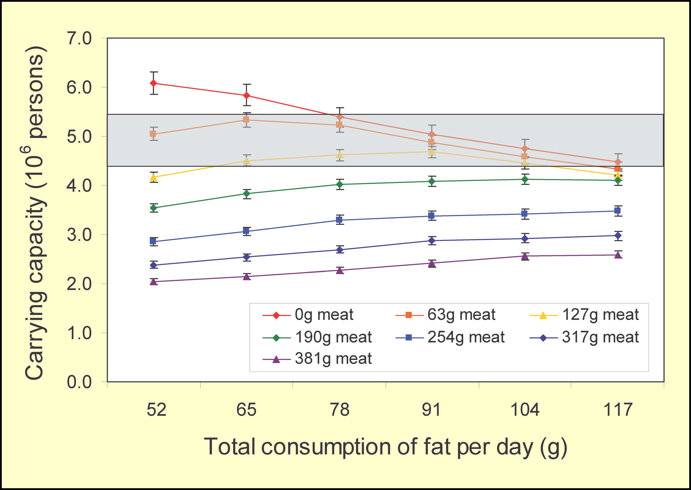
Figure 4. NYS carrying capacity according to diet. (Click for larger image.)
One possibly unexpected implication of the study is that a vegan diet does not support the maximum number of people, at least not in the state of New York: “[W]e conclude that the inclusion of beef and milk in the diet can increase the number of people fed from the land base relative to a vegan diet, up to the point that land limited to pasture and perennial forages has been fully utilized.” Figure 5 shows what’s meant by this; even the diet with the highest proportion of meat still doesn’t exhaust the land available for forage.

Figure 5. Use of available NYS agricultural land by diet. (Click for larger image.)
In a passage sure to provoke some of our readers, the authors continue: “[T]he higher populations supported by lower fat, non-vegetarian diets relative to higher fat, [lacto-]vegetarian diets support the claims by animal scientists that the inclusion of animal products in the diet can increase the amount of humanly edible calories available in the food supply. Indeed, more substantial differences may have been observed had a vegan diet been included among the diet scenarios.” The authors hasten to add that this is not an endorsement of the average American diet: “Nonetheless, it is critical to note that the area of overlap observed occurs between 63 g (2 oz) and 127 g (4 oz) of meat, far below the 163 g daily consumption of the average American.”
Beyond these details, Figure 4 also provides the answer to my original question: Can NYS feed itself? The answer is an unequivocal No. Assuming that everyone gets a complete, balanced daily diet that includes 190 g of meat and contains 30 percent fat, the state could potentially feed about 21 percent of its current population. Given a radical change in the average diet, this proportion could, judging from Figure 4, rise to a little over 30 percent, but it’s clear that NYS will always be a net importer of food. Since the cost of transporting food from outside the state is certain to increase dramatically over the next couple of decades, the effect on food prices can readily be imagined. I think this also suggests that economic forces will push back into production some land no longer considered agricultural (golf courses, lawns, etc.).
A subsidiary but still interesting question for people living out here in Tompkins County is whether the situation just described is the same for all parts of the state; after all, a basic (if mostly tacit) assumption of relocalization is that things aren’t going to be the same everywhere. Peters et al. address this question in the second of the two articles reviewed here.
Foodsheds
The 2008 paper takes on the question of what we mean by “local” in an increasingly urban civilization. “To what degree can food be produced locally?,” the study asks. “Moreover, should the meaning of ‘local’ be context specific?” The method is based on a relatively recent reintroduction of the concept of a foodshed, first used by W.P. Hedden in 1929. Peters et al. define a potential local foodshed as “the land that could provide some [specified] portion of a population center’s food needs within the bounds of a relatively circumscribed geographic area,” or more simply, “the area of land that feeds, or could potentially feed, a population.” Foodsheds provide a framework for analyzing the capacity to produce food locally at the scale of an individual city, and a principal goal of the 2008 study is to develop standard methods for this kind of analysis.
The model created in support of this goal employs geographic information systems (GIS) to estimate the spatial distribution of food production capacity relative to the food needs of a given population center and then applies optimization tools “to allocate production potential to meet food needs in the minimum distance possible.” The software implementing the model also produces foodshed maps that aid in visualizing the geographic extent of a food supply.
Assuming a constant basis in the land use data from NYS, it’s apparent that studies of this kind will produce different results depending on the assumptions regarding nutritional requirements and the algorithms built into the foodshed optimization technique.
Since the focus in the second study is on foodsheds rather than dietary variables, it holds those variables constant by using just a single representative complete diet containing 6 ounces daily from meat and eggs and 30 percent of calories from fat. A number of other simplifying assumptions are needed to make it possible to do the spatial modeling; for example, because the concept of a foodshed is tied to population centers, rural NYS residents are assumed to get their food from the nearest center. Also, and crucially, the model seeks to find the minimum total distance food would optimally travel throughout the state rather than optimizing for an individual population center, since the most efficient allocation for the whole state might require that land near one population center be assigned to a more distant population center. Due to matrix size constraints imposed by the spreadsheet software, only 125 of the 132 statistical NYS population centers could be included in the model, resulting in the elimination of the seven smallest (totaling just 0.2 percent of the state’s population).
Even with these simplifications, the optimization model used to calculate foodsheds is quite complex, and I’ll have to refer readers who want more details to the published study itself.
A selection of the output produced from the model for the largest NYS population centers is shown in Figure 6.

Figure 6. Statewide maps of selected foodsheds. (Click for larger image.)
These maps show foodsheds for food from annual crops and fruits (on the left) and food from perennial forages (on the right) for the six largest consumption zones in New York State: Buffalo, Rochester, Syracuse, Albany, Poughkeepsie-Newburgh, and NYC. These six foodsheds, indicated by the different colors, are layered over greyscale shadings showing the capability of different areas of the state to produce food. For example, the completely black pixels in the map on the right show that the area represented by those pixels in the original model (not necessarily scaled the same as the pixels here) is potentially capable of producing 1200 to 1800 metric tons (Mg) of food products annually from perennial crops, chiefly pasture. HNE stands for “human nutritional equivalent,” referring to a complex submethodology for relating per capita nutrional requirements to combinations of farm products.
As can be seen from these maps, the presence of a population center much larger than the rest changes the shape of the other foodsheds. For example, on the perennial forages map, the Syracuse, Albany, and Poughkeepsie-Newburgh foodsheds extend farther to the north and west than to the south and east because the overall statewide food travel distance is shortened by ceding the land to the south of these centers to the NYC foodshed. This distortion takes an extreme form in the case of the Poughkeepsie-Newburgh foodshed (yellow), which extends from the population center as if it were being blown back by the enormous NYC food demand. Conversely, when a population center is relatively isolated, as in the case of Rochester and Buffalo, its potential foodshed spreads more evenly because it is limited by natural barriers rather than by competition with other cities.
This single example doesn’t begin to do justice to the resource provided by the model. I urge people interested in exploring the model further to check it out online:
http://www.cals.cornell.edu/cals/css/extension/foodshed-mapping.cfm
Our local foodsheds
Below are screen captures of two maps generated by the Cornell tool for the Ithaca foodshed, one map for cropland (annual crops) and one for grassland (perennial crops), with the outlines of the corresponding Syracuse, Binghamton, and Elmira foodsheds shown for comparison.
According to the model, in a distribution system that used all available NYS agricultural land, provided a certain balanced diet to everyone, and optimized statewide food distances, Ithaca’s food from cropland (Figure 7) would travel an average of just 11 miles, and its food from grassland (Figure 8) would travel an average of 25. In neither case, however, would that locally sourced food satisfy all the food needs of the Ithaca area population (estimated at 95,000 persons, which includes the Ithaca Urbanized Area plus nearby surrounding rural populations). The model shows that the optimized locally sourced food from cropland would fully supply the cropland component of the assumed diet for about 81 percent of the local population (76731/95000), whereas the locally sourced food from grassland would supply only about 19 percent of that dietary component (17965/95000). This illustrates in detail the conclusion reached in the TCLocal.org article that Dr. Peters published here in April: only about half of our food supply in Tompkins County would come from local sources if food was distributed in a way that minimized food miles for the entire state.
The effect of the immense NYC demand for food on the shape of our optimized foodshed is clear even at this distance from the city; both of Ithaca’s foodsheds lie entirely to the west and north of the population center, extending in the case of grassland across several adjacent counties. Also apparent from these maps is the basis of the model on potential agricultural land rather than the land that’s in production right now; anyone familiar with the areas included in these foodsheds knows that in fact much of the land shown as the potential source of our local food is not now actually in production. The need to preserve currently idle agricultural land north and west of Ithaca for future use has important implications for zoning and land use policy in in our area; as the cost of transportation grows, this is where much of our food will have to come from.
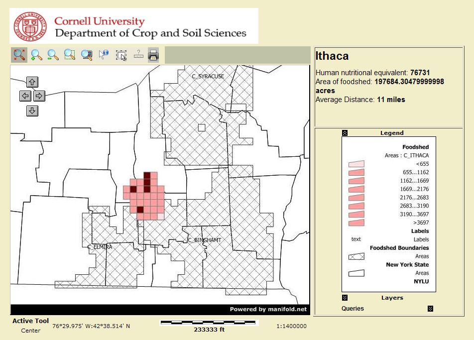
Figure 7. Potential optimized Ithaca cropland foodshed. (Click for larger image.)
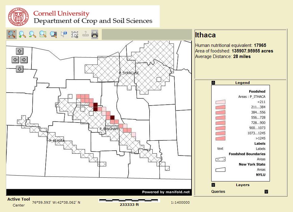
Figure 8. Potential optimized Ithaca grassland foodshed. (Click for larger image.)
Where to be a locavore
The table in Figure 9 below provides one answer to the question, “how much of New York’s food can be provided locally?” The answer is: it depends on where you live.
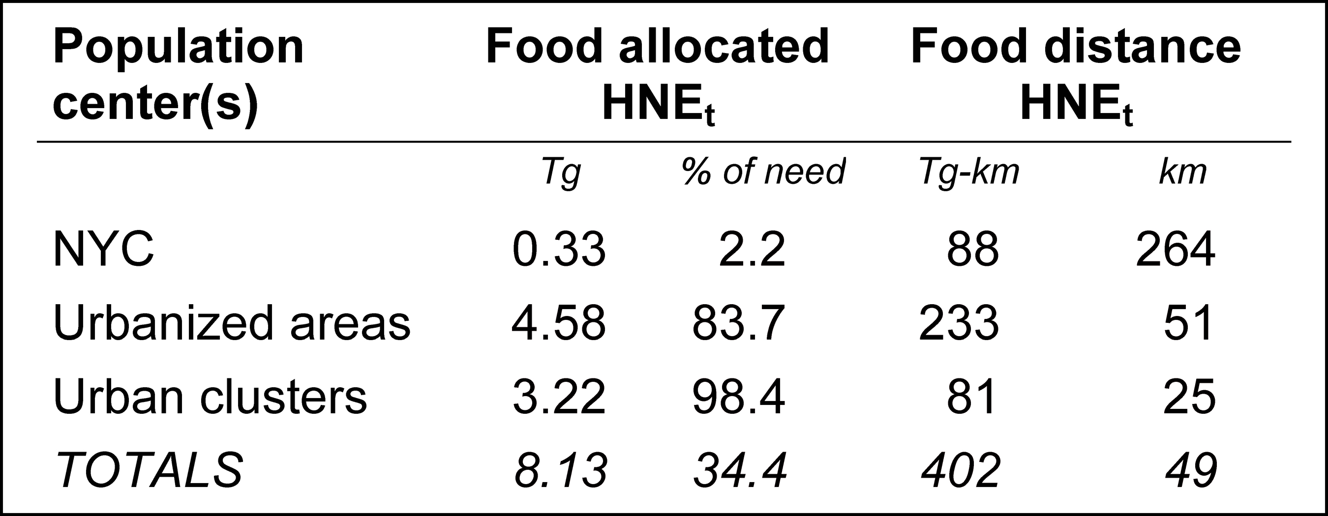
Figure 9. Summary of model output. (Click for larger image.)
The table lists three categories of NYS population centers (using terminology from the U.S. Census) in order of the amount of food in Tg (millions of metric tons) they receive within the model. First, of course, is New York City, which is in a category by itself. In this model — which, it must be remembered, optimizes food distances for the whole state — NYC would get just 2.2 percent of its total from food produced within the state, and that food would have to come from an average of 264 km away. The next biggest population centers, the “urbanized areas,” would get 84 percent of their food from inside the state, and that would come on average from 51 km away. And the smallest population centers (excluding the seven very smallest, as noted above), could get virtually all their food needs met from within the state, and the food could come on average from just 25 km away.
Bottom line for the state as a whole: Given the diet assumed for the study, if all agricultural land were in use, and food distribution were optimized to minimize the total distance that food travels, New York State could get 34 percent of its food needs met from within the state, and that food would travel an average distance of 49 km to each consumer.
You’ll notice that the 34 percent figure differs a little from the results of the 2006 study, due no doubt to differences between the two studies in assumptions and methodology. The difference isn’t enough to change the basic picture and in fact reinforces it by coming at it from a different angle, but it’s obvious that the results provided by a model like this depend to a large extent on a complex set of assumptions. The authors point out several ways in which the model does not take into account real-world factors(geographic limitations, agricultural specialization, details of the food processing workflow, economies of scale, etc.) and note that optimizing for food miles does not necessarily optimize for greenhouse gas emissions or energy inputs. Nevertheless, one conclusion stands out fairly clearly. Outside of the NYC area, most population centers in the state could meet all, or nearly all, of their needs from food produced within the state. But NYC, if it depended on food produced within the state, would go largely unfed.
The study boils the results down to what I would call the good news and the bad news. The good news is that “NYS may be able to significantly reduce the distance food travels” to an average far less than the 1300 miles often cited as the distance from farm to consumer in the U.S. The bad news is that “feeding big cities may require food to travel great distances.”
Peters et al. don’t draw out the implications of that last point, but I will: People living in NYC are going to be paying an awful lot more for food as we begin to move down the energy descent slope, and it would be better for them if they started to relocate back to the small towns upstate that have seen their populations decline over the last half century. To rephrase the old saying, NYC is a nice place to visit, but I wouldn’t want to try to survive there.
Notes
[1] Anyone who wants to check my figures or apply this method to other states can find a scan of the entire 1900 census abstract at http://www.ibiblio.org/tcrp/src/1900census.pdf (this 66 MB file is best downloaded before viewing).
[2] Peters, C. J., J. L. Wilkins, and G. W. Fick. Testing a complete-diet model for estimating the land resource requirements of food consumption and agricultural carrying capacity: The New York State example. Renewable Agriculture and Food Systems 22(2); 145-153.
[3] Peters, C. J., N. L. Bills, A. J. Lembo, J. L. Wilkins, and G. W. Fick. Mapping potential foodsheds in New York State: A spatial model for evaluating the capacity to localize food production. Renewable Agriculture and Food Systems 24(1); 72-84.
[4] Except for two screen shots (Figures 7 and 8), all the illustrations in this article come from a presentation given by Dr. Peters at the conference “Planning for Farms, Food, and Energy in Central New York” sponsored by the American Farmland Trust 25 March 2009 in Syracuse. I am indebted to conference organizer Judy Wright for a copy of the presentation slides. Most of the figures can be magnified for a better view.
Articles appearing at tclocal.org are published under the Creative Commons license and are owned and managed by the members of TCLocal as a group.