
Demonstrating that growth can’t continue on a finite planet has been a favorite sport of mine in the past (e.g., here, here, and here). But it’s child’s play, really: not a difficult accomplishment. Still, as blatantly obvious as it is, a surprising number of people are surprised to hear that growth can’t last. I guess that’s what happens when an entire system is predicated on growth’s continuance. Exposing the foundation to be shaky can come as seismic news.
But let’s say that we (collectively) were able to accept that growth is a no-go for the future. Fine. Let’s just stay here, then, shall we? Maybe we fashion a steady-state economy that continues to support the present scale of the human enterprise (perhaps redistributed for better equity) but without those nasty ills of growth.
In this post, I do the simple “math” of presenting graphs (Do the Graph?) to try and ascertain whether the ills stem primarily from growth, or primarily from scale.
Death by Hockey Sticks was a simpler precursor to this post, comparing exponential-looking trends side-by-side and making the simple observation that this moment is highly anomalous, exceedingly brief, and surely can’t continue. Here, we separate growth from scale to see who deserves more of the blame.
Separating Growth and Scale
My intuition going in was that scale is a more important driver than growth in effecting ecological harm, so that stopping growth only stops the acceleration, but not accumulating damage. However, one could try to make the argument that the extractive practices causing such harms represent a one-time “outfitting” of humans with the basic things they need in terms of metals, lumber, agricultural land, solar panels, etc. and can coast to a constant pace once steady state is reached (via circular economy notions, for instance). I don’t happen to think this can happen for practical reasons, but decided to see what “model” the present data prefers. As we’ll see, recent changes in growth patterns handily provide a handle by which to differentiate growth from scale.
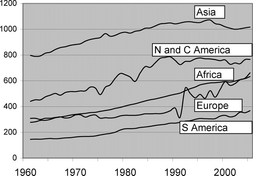
I focus on human population and global energy use as a means to characterize the physical scale of the human enterprise. Both are plotted below in terms of scale (left) and growth (right). In the growth plot, the fractional annual growth rate is shown in blue (binned in the case of energy to suppress distracting fluctuations), and the absolute growth (change in scale) as red circles (binned over periods of at least 10 years).
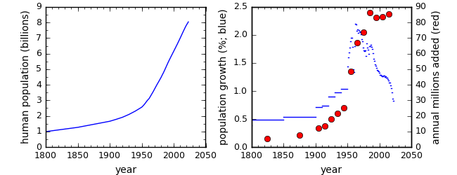
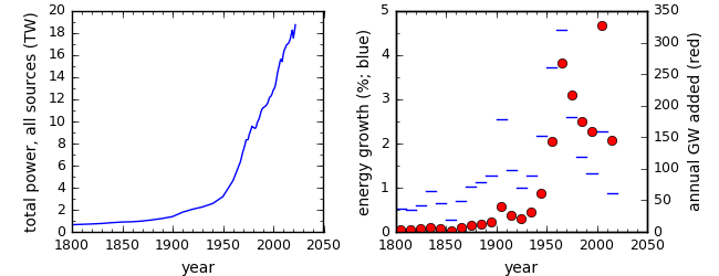
The growth rates for both measures peak in the decade between 1960 and 1970, then moderate from the peak by a factor of two or more (falling fast in the case of population). But the absolute growth is a product of rate and scale, so that declining population growth rate conspires with the continued overall rise to result in a nearly flat absolute growth, adding approximately 80 million people per year for the last four decades (though falling abruptly to 68 million per year averaged over the last few years). In energy, the absolute rate fell from the 1960s peak by approximately a factor of two, with the exception of a spike in the decade from 2000–2010—almost entirely due to a surge in coal use by China.
A key question in what follows will be: Does the metric in question rise like scale, lie flat like absolute growth in population, or fall by a substantial fraction like energy growth or population growth rates? In other words, is it a matter of “fitting out” an initial surge or of annual satisfaction of the scale.
Comparisons can be less than obvious at first glance, because some quantities are presented as rates (e.g., annual amounts), while some are total amounts (e.g., wildlife populations). Rate plots are easier to assess: has the rate stalled or declined in a way that is commensurate with growth trends since about 1960, or has it gone up in a way similar to the overall scale of population and energy? For cumulative plots, one needs to look at the evolution of the slope: is the thing getting worse faster or slower than it was 60 years ago?
Materials Use
This isn’t the order in which I looked at things, but it’s an easy place to start, and won’t interrupt the biodiversity focus to come. Compared to data on ecological health, it’s not too hard to lay hands on records of global resource use. One publication I ran across has some useful graphs for a few raw materials in common use. The first graph shows annual extraction of copper, zinc, and lead since 1900, usefully.
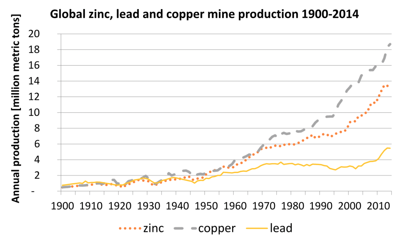
From Grandell & Höök, 2015.
All three are clearly higher today then they were at the peak of growth around 1960. In fact, all have at least doubled—not at all consistent with growth’s moderation by a factor of two, or stagnation in terms of annual addition of people. Meanwhile, the scale of energy and population did more than double in the same period.
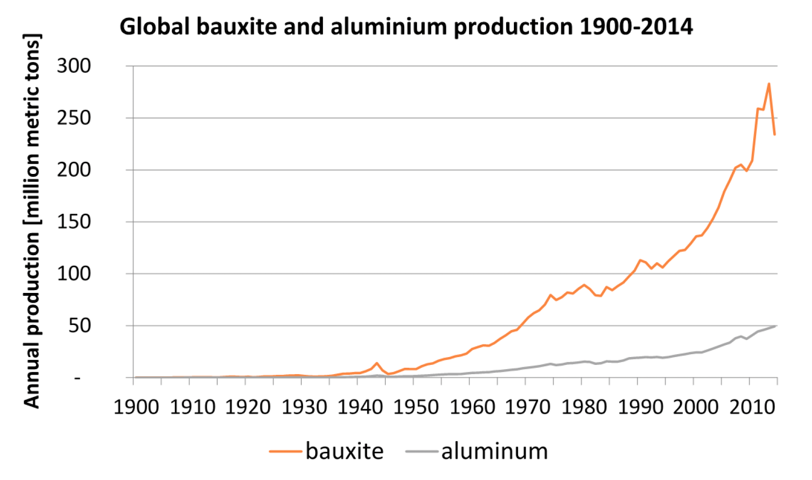
From Grandell & Höök, 2015.
The story is similar for bauxite and aluminum: the annual rate is clearly higher today than in 1960, not static or down to half the 1960 value.
Timber tells a similar story:
From Kirilenko & Sejo, 2008. Units are said to be billions of cubic meters of annual production.
From 1960 to 2005, in no region of the world did annual production of timber moderate alongside growth. The total global activity almost doubled (77% increase) over this interval rather than stagnating or tumbling by a factor of two as growth did.
The result for all of these resources is clear: scale is a more apt correlate than growth. The curves bear a family resemblance to the hockey-stick scale curves: far less resemblance to the peaking growth curves. A confounder in this is that per-capita resource extraction has also risen for many materials, in association with economic growth. That’s part of why I prefer ecological measures that are not directly driven by market activity. It’s also why I use a physical basis like energy as opposed to the more artificial measure of economic scale in this analysis.
Extinctions
My first instinct when conceiving this post was to compare the trends in scale and growth to extinctions, using the handy table of recorded (formalized) extinctions as reported on this Wikipedia page (which I also used in a previous post). But this approach has three problems. First, extinctions only become formally accepted sometimes decades after the last documented sighting, so the recent end tapers off, artificially. Second, extinctions represent the endpoint of a tragic population decline and thus can lag significantly behind the cause. Third, recorded extinctions are very conservative and likely the tip of the iceberg. Restricting the count to recorded extinctions suggests a loss of about 4 species per year, while the experts debate whether the actual total rate is 24 or 120 per day!
Nonetheless, since I took the time to make a plot and find some value in the visualization, here it is.
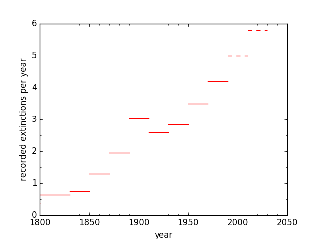
I “cheat” on the last two bars, fabricating a linear extrapolation to provide a visual impression of what is likely going on. After all, the latest research is not pointing to a reprieve in the sixth mass extinction, and population declines—extinction’s necessary precursor—appear to be as dire as ever. In any case, the extinction curve more likely resembles the upward trend in scale rather than the peak and fall in growth. But, it’s not the right dataset by which to judge whether scale or growth is the primary culprit, even if it is ultimately perhaps the most important consequence of modernity’s meddlesome ways.
In a Pinch
While the table of recorded extinctions might not be well suited to the task at hand, extinctions are so important that I don’t want to totally give up before moving to other measures. Noting that extinction rates are up some 100 to 1,000 times the background rate assessed over millions of years, we can compare these bracketing endpoints of extinction rate increase to the scale and growth rates of human population.
First exploring the hundred-fold case, in the 4,000 years since human population has increased one-hundred-fold, population growth rates have moved from about 0.05% per year to roughly 1% per year—thus a more modest factor-of-20. Already in this gentler case, it appears that scale is a closer match than growth to the increased extinction rates. In the case that the extinction rate is 1,000 times higher, we can go back 9,000 years when human population was one-thousandth what it is today. At that time, growth rates were not much different from the 0.05% per year that applied 4,000 years ago, so that again the scale would appear to be better able to match the change in extinction rate. In other words, growth rates don’t have the quantitative “oomph” that scale does, and can’t account for the large increase in extinction rates the way scale can.
Wild Spaces
Let’s take another “easy” swipe before getting to more detailed data. In a post from a couple years back I collected the numbers presented in a “witness statement” documentary by Sir David Attenborough, in which the percentage of wild territory remaining was periodically updated throughout the program. A subset of the table rows are replicated here, after interpolating two rows of the original table to present a value situated near the epoch of peak growth rate (bold font, here).
| YEAR | POPULATION | WILD SPACES |
|---|---|---|
| 1937 | 2.3 B | 66% |
| 1969 | 3.6 B | 59% |
| 1997 | 5.9 B | 46% |
| 2020 | 7.8 B | 35% |
The (approximately) three decades that ramped up to peak growth therefore saw a 7% decrease in absolute terms, while the following (roughly) three decades saw a larger 13% drop. In relative terms, the first interval decreased 11%, while the second decreased 22%: double the rate. The 23 years at the end (a shorter interval) shows 11% absolute and 24% relative decline. Since the last interval is shorter and the drop larger, the relentless trend is one of accelerating pressure on the world, not a moderation as growth stagnated or slowed. Wild spaces, by this accounting, better follow scale, not growth.
Deforestation
According to the Global Forest Watch, which uses satellite imagery to objectively assess forest cover (as opposed to official government reports whose classification of land may not match the evolving facts on the ground), it appears that the rate at which deforestation is occurring globally is on the rise over the last twenty years. Some pockets might experience reforestation (like the northeastern U.S.), but such “shell games” hide the impact of exporting environmental costs (resource extraction) overseas.
Since suitable satellite imagery does not extend back to 1960, it is not possible to get an assessment of the evolution over the whole period of growth moderation using a uniform methodology, but the fact that the recent trend in deforestation is opposite the longer trend in growth is inconvenient for those who might want to blame growth over scale.
Biodiversity
It is difficult to find data on biodiversity that would allow one to track various measures of ecological health across the twentieth century. Many of the measures start in 1970, which is at least something.
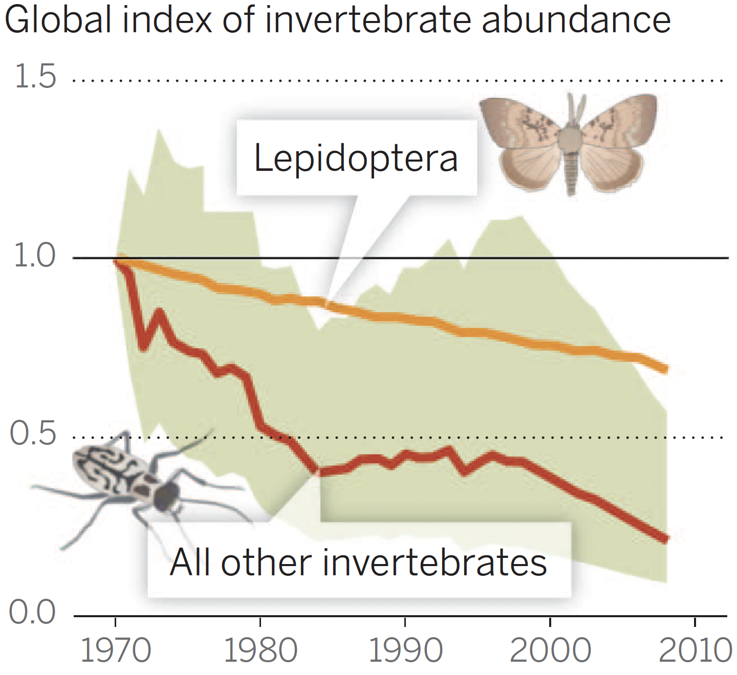
A figure from Dirzo et al. (2014) shows populations of invertebrates and a lepidoptera subset (butterflies and moths). Neither trend indicates any sign of moderation since 1970. The invertebrate data are noisy, but the recent trendline is completely consistent with the overall trend—and to the point: not half as fast, as one would expect if growth rates were the driver. Our use of energy, for instance, exacts ecological tolls, and those tolls might be expected to accumulate as long as the foot is on the gas pedal, whether accelerating or not.
Loads of other reports express alarm about population declines. Insects and birds are disappearing at rates of 1–2% per year. The U.S. and Canada have lost an estimated 3 billion birds since 1970. These statistics do not in themselves answer the question about growth vs. scale. But I will note that the latest messaging is best described by one of the following two choices (try to pick the right answer):
- Oh my: animals are disappearing at unprecedented rates, constituting a biodiversity emergency that may even signal a sixth mass extinction.
- Thank goodness: the high rates of animal disappearance that peaked in the second half of last century have moderated, so that we may be out of the woods and on the road to recovery.
I’m just sayin’. Things aren’t looking great, and the alarm bells are getting louder as the mounting crisis becomes ever-more apparent.
In gathering data to compare against scale and growth, I confronted a sad fact: for large population declines, absolute losses can appear to be moderating, but only because fewer critters are left to eliminate. Yay? Mathematically, in an exponential coast toward zero at a constant rate of decrease (like 2% per year), the losses appear to get smaller in proportion to the diminishing population, yet offering no cause for celebration.
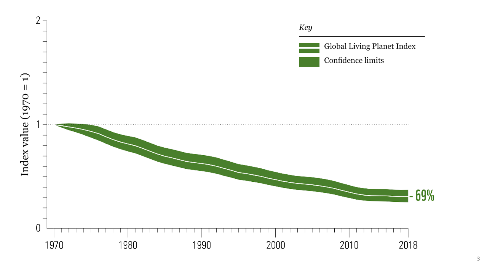
For instance, the Living Planet Index value tracking average decline of vertebrate populations dropped below its 1970 value by 37% over the first 20 years. In the last 20 years of the plot, the decline looks smaller, but starts from a smaller baseline. The recent decline is actually 39% of the 1998 level—faster than the earlier 37%.
Scale, not Growth
I should note that I did not cherry pick, here. I looked for available data on resources and ecological health that I deemed to be relevant and important, prepared to be surprised. Except, I wasn’t.
In principle, following the analog of a PID loop in control theory, the response can be Proportional to scale, sensitive to the accumulated (Integrated) effect of the past, or reactive to the rate of change (Derivative). Generally speaking, all can operate at once, and I imagine all play some role in ecological impact: scale (proportion) might dominate, but accumulation (integration) of pollution, degraded lands, and broken ecological interdependencies all contribute, as does some “one-time” surge activity associated with growth (derivative). So, it doesn’t have to be one and only one contributor. The key is that growth alone does not seem to be a very good metric for impact to our world, while scale (and the very similarly-behaving integrated effect) seem to account for what we witness more directly.
For reference, a purely exponential curve has a constant (flat) growth rate, but the scale, integral, and absolute growth are all exponential in character. Were it not for the break from exponential growth seen in the recent moderation, this exercise would be pointless, as all behave similarly. Also for reference, in a steady state situation, growth is zero (in both rate and absolute terms), scale is steady, and accumulated effects rise linearly.
It makes sense to me that scale—more so than growth—is what drives the system. An even better case might be made for cumulative (integrated) losses in the context of non-renewable exploitation and other long-lasting damages. Maintaining a steady 8 billion people on the planet in the mode of modernity would be accompanied by a constant flow of mined materials, used-up (degraded) land, accumulated waste and toxins, fragmentation of habitat, and inexorable, irreversible species loss as animals struggle to find the wild space and food they rely upon. The alarming rate of biodiversity loss is what we would expect to see as a result of inheritance-spending on a finite planet.
If the story was that a 20-year-old human acquired a certain amount of “inheritance” from the earth’s coffers, then needed no more non-renewable resources or generated no more harmful waste from that point forward—later passing these items to the next generation so they needed no new materials and created no new waste—then I could see the argument that we might heavily tax the earth in growing to our current scale, but thereafter could ease off and let the planet recover. But that’s not how things work. Adults in this world, living in modernity, extract and dispose a continuous stream of non-renewable resources (including aquifer water used to grow food). Maintaining scale amounts to a burn rate of non-renewable expenditure and harmful waste, and at a magnitude far too great for Earth, despite all her grace, to accommodate.
Appropriate Scale?
The obvious question, then, is what scale of human activity is Earth capable of supporting? Nobody knows. Already by 1800 Europe was demonstrably unsustainable—chewing through forests faster than they could be replenished. In fact, ecological trends have been essentially terminally downward since agriculture began, and the jury is still out on whether an agricultural mode can exist long-term in ecological balance (it hasn’t yet, importantly). If it can’t, it must fail, as nothing survives without an ecological underpinning.
So, don’t ask me. My sense is that we are currently orders-of-magnitude beyond a sustainable scale. The precautionary principle tells me that we ought to wind things down dramatically and hope it’s enough—rather than try to hold on in the face of loads of evidence that it’s not working out. Just halting growth is insufficient, as hard as even that is to accomplish by intent. Since we ultimately have no choice in the matter, growth will inevitably terminate, reverse, and continue contracting as long as it must before failing communities of life begin to recover and seek a new operating point. The best we can do is accept the ride down, in a spirit of humility, finding joy in something other than technology and modernity. Since we were able to do just that for 95% of Homo sapiens’ time on the planet, I think we’ve got the constitution to do so again.