
You may be aware that our food industry is heavily dependent on fossil fuels, to the point that it takes about 10 kcal of energy input to deliver 1 kcal of consumed food. The enormous energy multiplier is due to extensively mechanized plowing, harvesting, processing, and delivery of food; fossil-fueled fertilization (via methane feedstock); refrigeration and preparation; then of course food waste. In olden times, when all agricultural energy came from muscle power that needed to be fed, the system would collapse (i.e., starve and fail) if energy inputs exceeded energy ingested.
Some have phrased our current practice as “eating fossil fuels,” and in fact a 2006 book by Dale Allen Pfeiffer had this title. So what? More power to us—literally.
The problem, people, is that fossil fuels are finite. We have already consumed a fair fraction (roughly half?) of the accessible allotment. And before concluding that we therefore have a century or so before needing to worry about the consequences, realize that the inflection point happens around the halfway mark, wherein decreasing ease of access tends to result in ever-decreasing output rates in the second-half of the resource. We see this behavior in individual oil fields and in regional (country-scale) aggregations. The low-hanging fruit is taken first, sensibly, so that what’s left is more stubborn.
Because human population has been substantially boosted by fossil fuel input, we have put ourselves into a vulnerable position. What happens when fossil fuels begin to give out on us?
It’s been a while since I did any, you know, math for this blog, as I seem to be living my own worst nightmare and turning into an armchair philosopher (oh the shame). In this post, I return to something closer to math. It’s illustrative rather than quantitative, but helps frame the peril we have put ourselves into in a low-effort sort of way.
Population Models
Let’s start simply. A population given unlimited resources and no negative feedback mechanisms (e.g., predation, disease) will grow exponentially. The differential equation underlying this is
![]() Where “P-dot” is the time derivative of the population, P, and r is the rate of growth. A 1% rate would have r = 0.01, for instance. But I’m all about the actual limited world, so one step more realistic is a logistic (S) curve resulting from the previous differential equation modified by the amount of “breathing room” available:
Where “P-dot” is the time derivative of the population, P, and r is the rate of growth. A 1% rate would have r = 0.01, for instance. But I’m all about the actual limited world, so one step more realistic is a logistic (S) curve resulting from the previous differential equation modified by the amount of “breathing room” available:
![]() Here, Q is known as the carrying capacity, so that the ratio (Q−P)/Q reflects the fraction of the “full” space that is occupied. When P is much smaller than Q, the available room is near 1.0, and the equation simplifies to the earlier exponential-producing relation. As P approaches Q, the ratio becomes very small and suppresses population growth, bending the exponential over into a logistic curve gracefully approaching the carrying capacity: no drama. Of course the real world has delays in negative feedback, which can cause overshoot, oscillation, and other crazy dynamics. Chapter 3 in my textbook provides a more complete introduction to this sort of modeling.
Here, Q is known as the carrying capacity, so that the ratio (Q−P)/Q reflects the fraction of the “full” space that is occupied. When P is much smaller than Q, the available room is near 1.0, and the equation simplifies to the earlier exponential-producing relation. As P approaches Q, the ratio becomes very small and suppresses population growth, bending the exponential over into a logistic curve gracefully approaching the carrying capacity: no drama. Of course the real world has delays in negative feedback, which can cause overshoot, oscillation, and other crazy dynamics. Chapter 3 in my textbook provides a more complete introduction to this sort of modeling.
Non-Renewable Subsidy
A common reaction to models of human population is a belief that humans can’t (or shouldn’t?) be modeled as if analogous to a deer population: we have transcended the normal bounds of nature via technology. This is where Malthus was so, so wrong—the thinking goes. Indeed, Malthus missed a major new influence that was not on his radar at the time: fossil fuels. Then, why not throw into this simple model a finite resource that directly boosts population growth? Why not, indeed?
So I spent a few hours (fewer than three, but I did not run a stopwatch) creating a model on the afternoon of November 30—after a busy and productive day on unrelated tasks. I bring this up to emphasize that:
- this isn’t rocket science;
- useful insights can come out of a small amount of work;
- I have not fine-tuned or added bells and whistles to force a better match to data;
- One should not take the result literally: it illustrates a pattern, even if the details are sketchy
Let me defer the explanation of the model for a bit and just show the result. Then we’ll pick our way through the details.
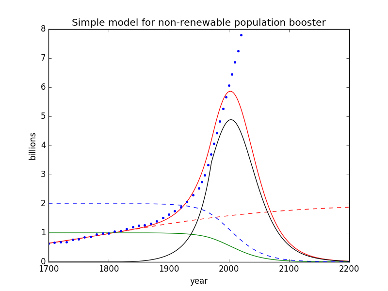
Simple model of population (red curve) in the context of a finite resource connected to food production.
Lots of curves on one graph! Here’s what each component is:
- blue dots: global human population (data)
- red dashed curve: logistic in the absence of the non-renewable finite resource
- red solid curve: modeled population accessing the non-renewable finite resource
- green solid curve: remaining supply of the non-renewable finite resource
- black solid curve: rate of resource extraction (arbitrary scale)
- blue dashed curve: degraded carrying capacity as resources are robbed and also used to damage the ecosystem in myriad ways
Okay, so now we backfill: what particular garbage went into producing this garbage output?
First, the red dashed curve is a logistic using r = 0.007 (0.7%), starting at the population in 1700, and setting (arbitrarily) a carrying capacity, Q, at 2 billion. Who knows if this is accurate or meaningful? Lots of ecosystem destruction (e.g., denuding previously forested areas) was already strikingly apparent in Europe and other places, so the carrying capacity was already being modified downward. But whatever: these (two) parameters do a decent job of following the population trajectory for almost two centuries, until fossil fuels began appearing at the table.
Next, I added a non-renewable finite resource (NRFR; i.e., fossil fuels), and began drawing it down in proportion to population. But not so fast—literally. We did not suddenly turn on the fossil fuel switch at full throttle. It took over a century to ramp it into widespread societal use. On a per-capita basis, I was able to get a reasonable match to data using a cubic function of time. Plotting on top of Figure 8.2 from my textbook, we get this red-line approximation:
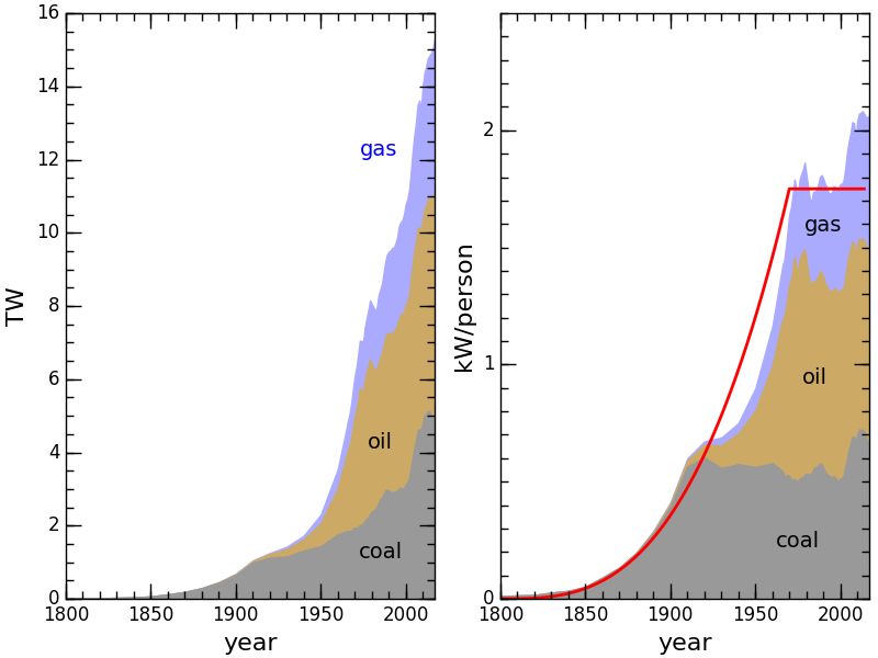
Fossil fuel use history; per-capita is on the right; approximate ramp-in model as red curve.
The curve is cubic until 1970, then flattens out (even though it has continued to rise, in truth). The rate at which we draw down the NRFR is therefore proportional to the population multiplied by this per-capita function, framp:
![]() I picked α to be 1/600, in the case where population, P, is measured in billions. The resource, R, starts at a value of 1.0, and the ramp function is normalized to saturate at a value of 1.0. This means, for instance, that in 1975 when the population was 4 billion and the ramp function was already at 1.0, the resource decline was −α×4×1.0 = −0.67% per year (a 150 year characteristic depletion timescale). The depletion rate is faster now, of course, having doubled the population since then.
I picked α to be 1/600, in the case where population, P, is measured in billions. The resource, R, starts at a value of 1.0, and the ramp function is normalized to saturate at a value of 1.0. This means, for instance, that in 1975 when the population was 4 billion and the ramp function was already at 1.0, the resource decline was −α×4×1.0 = −0.67% per year (a 150 year characteristic depletion timescale). The depletion rate is faster now, of course, having doubled the population since then.
How does this play into population? I assume that some (constant) fraction of fossil fuel extraction goes to food production and therefore feeds a growing population. This isn’t strictly true (that fraction has increased over time, as in the Green Revolution), but we’re not looking to nail it here—just exploring what kinds of behaviors can result. Specifically, I modified the population rate to add an influence from fossil fuels on top of the ever-present and patiently waiting ecological (logistic) piece:
![]() I picked β to be 1/(32α) to do a reasonable job matching the data—to a point. Note that R-dot is negative (since the resource, R is in decline), so that the first term serves to increase population. Meanwhile, once we’re “over our skis” and P climbs much higher than Q, the second term exerts a strong negative influence.
I picked β to be 1/(32α) to do a reasonable job matching the data—to a point. Note that R-dot is negative (since the resource, R is in decline), so that the first term serves to increase population. Meanwhile, once we’re “over our skis” and P climbs much higher than Q, the second term exerts a strong negative influence.
Why did I do it this way? If I left out the “corrective” logistic piece, then population would soar as the resource was depleted until one day the resource abruptly ran out (not how it works). Once the resource is gone, R-dot goes to zero and the first term above is just zero and population just hangs out at its peak forever more, even when the fossil–food spigot is turned off. Rather than “improve” the model with separate tracking of birth rates and death rates—which would bring in more uncomfortable assumptions—I just left the logistic piece in as the “natural” negative feedback influence. It makes a lot of sense in that once we are deprived of the non-renewable resource, we become dependent again on what the land itself provides. Having overshot the carrying capacity by a wide margin provides a sharp “corrective” agent in the equation.
Now, one final piece. Our fossil fuel bonanza has left our ecosystem in a perilous state. We have destroyed vast forests and habitat, polluted water and soil, kicked off a rapid climate trend that natural systems may not adapt to quickly enough, and basically overrun the planet. I keep coming back to two statistics that I think are vitally important and illustrative: 96% of mammal mass on the planet is now in the form of humans and our livestock, leaving a paltry 4% of wild mammals—land and sea. Roughly 70% of vertebrate numbers have vanished since 1970 (undoubtedly a higher fraction if the survey had started in 1700). Forests are also way down. See the post on Hockey Stick Curves for graphs of these declines.
As we destroy ecosystems, we lower the carrying capacity of the planet to support humans in the absence of “artificial” and temporary schemes. Therefore, our bonanza has costs, and I wanted to reflect this in the model. The simplest way to do so was to scale the carrying capacity (originally set to 2 billion) according to resources remaining. For reference, the model portrayed here leaves 38% of the NRFR in the year 2020, which is roughly commensurate with the scale of animal population loss—even a little less severe. Note that without downgrading Q, the population would still experience a peak/crash. At a population of 8 billion, the overhang from realistic carrying capacity numbers is severe whether we’re talking 0.5, 1, or 2 billion for Q. The present model uses up all the resource, sending Q to zero, but it’s easy to imagine a model tweak in which it does not go all the way down, so don’t waste time obsessing over this model “feature.”
Emerging Features
Having slogged through the details (which honestly took more time to write up and format than to implement in the actual work), what do we get? Let’s repeat the graphic for convenience.
Simple model of population (red curve) in the context of a finite resource connected to food production.
First, the red solid curve does a reasonable job following blue points (data) up to about the year 2000. Not bad, for such a simple low-investment model. Second, the black curve mimics the “most important plot ever“, which I have long used to provoke thought about the anomalous time we’re in and the phase change that awaits on the downside (incidentally, the artificial kink at 1970 shows up in this curve). As mentioned above, the remaining resource now is about 38% of its initial bounty in the model, which is not unreasonable.
But the big headline is the peak and rapid decline of human population. Granted, this model peaks too early, and can be rejected as an accurate model for humanity. But it’s not trying to be that. It’s trying to illustrate some basic real features:
- Propping up human population on a non-renewable finite resource is setting us up for a real sting of unprecedented scale;
- The exploitation of that same resource degrades the ecosphere and therefore Earth’s “natural” carrying capacity to support humans;
- These two act in concert to make the downside especially hard.
In fact, I could make an argument for this model being too optimistic, in that once fossil fuels begin to fail us, cold, hungry people will hack down what remains of forests and wild animal populations with reckless abandon. So the carrying capacity could drop even more precipitously than the gentle “civilized” blue curve indicates.
Flaws in the Model
Oh boy; where to begin? Simple models have their pros and cons. On the plus side, they can elucidate robust, important, big-picture features of a problem with little work. I intentionally decided not to try making the model ever-more realistic (i.e., more faithfully tracking data points) because to some degree the virtue of simplicity is sacrificed in doing so. On the negative side, it is not hard to point out lots of missing nuances. But be warned: these can go both ways in terms of making the situation more or less dire.
If I wanted to track the data more reliably, I might factor in the evolving agricultural capability. The simple model has a direct proportionality between resource use and population growth (parameter β). But in reality we have changed our practices over time—particularly in the form of the Green Revolution. Adding this “overdrive” feature could easily keep the red curve soaring up longer than it does in this case. But this does not change the fact that the NRFR is being drawn down (also resulting in degradation to the ecosystem). More importantly, the a more realistic treatment has an even larger overshoot and only makes the downward pressure more severe once the resource begins to wane.
As I mentioned before, a careful job might separately model birth rates and death rates, initially following typical demographic transition trajectories. But how to handle these in an uncertain and possibly chaotic future involves difficult decisions that are not particularly defensible. Do birth rates (per surviving person) go down as people starve and give up hope, or do they go back up to pre-demographic-transition levels to offset higher infant mortality, lack of birth control, and erosion of education? Death rates presumably climb in these dire scenarios, but what role might conflict play as we fight over scraps?
Keep it Simple, Stupid
For what it’s worth, all this has likely been done elsewhere, by others, long before. I could have checked, but that’s not how I roll: self-exploration has its own rewards. Also, something so simple would have trouble passing peer review because it lacks sophistication (bells and whistles)—which is perhaps its own kind of problem. Gotta love the blog channel!
Given the complexities hinted at above, I thought it better to avoid getting sucked into a detailed model that became increasingly fraught with assumptions and biases.
One doesn’t even need a model to put the main pieces together: human population has been significantly inflated by extensive exploitation of a non-renewable finite resource. Because the declining availability/use of that resource is inevitable (and likely near-at-hand), it stands to reason that present levels of population will be unsustainable—and that the necessary transition down from an overstuffed population will be very difficult to bear. The world left in the wake of our binge will be less able to support us than the one we inherited, exacerbating the hardship.
I think we have a tendency to be skeptical of “too simple” narratives for such a complex and special species (see post on human exceptionalism). We don’t trust ourselves to judge when a simple narrative is right. I ask you to allow yourself this one: fossil fuels allowed us to drastically overshoot the natural carrying capacity of the planet, and that bill will come due when the underlying resource inevitably dwindles. Sometimes simple is simply right.
Lest you be tempted to flee to the comfortable embrace of faith in technology, ask what it is that electricity can do to alleviate our agricultural challenges, because that’s what the renewables deliver. The resource impact of a massive infrastructure build-out on this scale, including adequate storage capacity, only escalates our assault on natural resources—meaning reductions in habitat, critter populations, and ultimate carrying capacity (see the Love Story post for more thoughts along this line). Also, a well-aligned article just hit as I was poised to publish this post (I was amused at some very similar language choices).
The Obvious Answer, Again
Sure, Malthus missed predicting this enormous surge in human population, not factoring in stored fossil energy. That doesn’t mean we should declare human population a mystery beyond our grasp and refrain from any attempt to understand its trajectory and future. This post sketches out the effects of a gigantic infusion of ancient energy storage. Up and down, the story goes. The burden of proof for why this won’t happen comes down to foretelling the next major inheritance on the scale of fossil fuels. Anyone? Are we feeling lucky?
The inarguable point is that we have made ourselves very vulnerable to a crash by overspending our inheritance as if it would never run dry. The lifestyle choices that we have made as a result will likely turn out to look foolish, in hindsight.
Rather than double down and insist that we need not make radical changes in our expectations—appealing to technology in a desperate attempt to keep our ecological wrecking ball in full swing—the obvious answer has been there all along. Give up on that particular dream of how humanity is to go. Blame the dream: it was never more than fantasy. Allow yourself to go through the stages of grief: deny, cry, throw tantrums—whatever it takes. It won’t change the harsh reality, and the sooner we get through it and arrive at acceptance, the sooner we can start calmly dismantling our many unsustainable practices and seek an existence that preserves the best parts of being human, without needing to destroy the natural world in the process. This train is heading nowhere good, despite all the hype and promises (that’s marketing for ya). It looks to me that it’s time to block the ads and prepare to leave.
Image by ariesjay castillo from Pixabay