Rapid progress towards clean energy is needed to meet the global ambition to limit warming to no more than 1.5C above pre-industrial temperatures.
But how are countries doing so far? In our Energy Revolution Global Outlook report, written with colleagues at Imperial College London and E4tech – and published by Drax– we rank progress in 25 major world economies.
Our report provides a league table of their efforts to clean up electricity generation, switch from oil to electric vehicles, deploy carbon capture and storage, eliminate fossil fuel subsidies and tackle energy efficiency.
The ten charts below compare these 25 countries today and their progress over the last decade.
Progress on clean electricity
Electricity has been the fastest sector of the economy to decarbonise as countries move away from coal and embrace low-cost renewables. Yet the average carbon intensity of electricity worldwide has fallen only 7% in the last decade to 450 grams of CO2 per kilowatt hour (gCO2/kWh).
The chart below maps the carbon intensity of electricity generation around the world and ranks the 25 major economies covered by our report. These countries include the G7 group of rich nations along with Brazil, Russia, India, China and South Africa (the “BRICS”) and others. These countries account for 80% of global population, 77% of global GDP and 73% of the world’s CO2 emissions.
Individual countries range from having virtually zero-carbon electricity (in the Nordics, France and New Zealand, left-hand columns in the lower chart) up to near-total reliance on coal (in South Africa and Poland, on the far right).
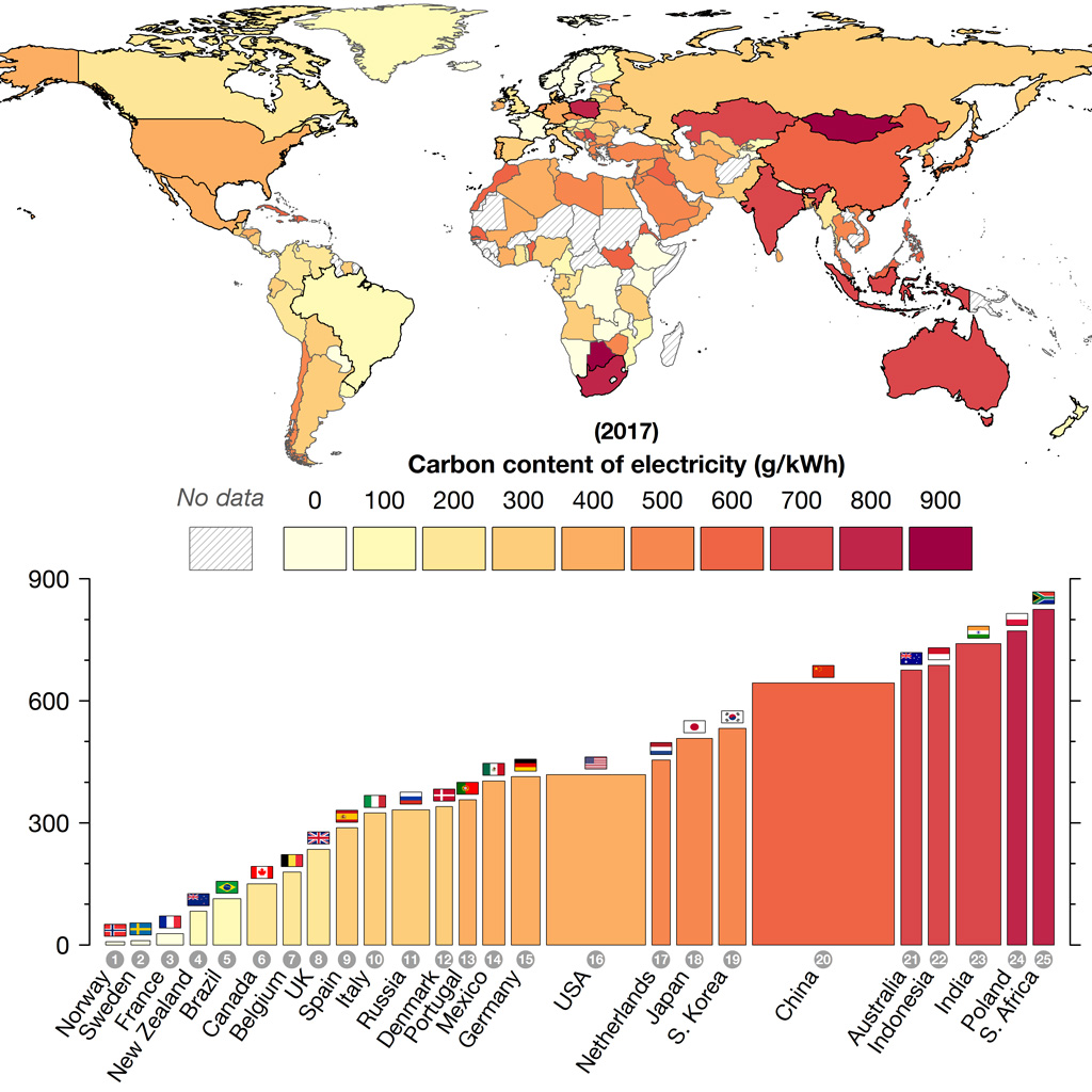
The carbon intensity of electricity generation during 2017, in grams of CO2 per kWh. The map includes all countries for which data is available. The bar chart ranks 25 major economies including all G7 and BRICS countries. Bar widths represent the amount of electricity consumed in each country, with a minimum width so that smaller countries are still visible. Source: Drax 2018.
Countries across Europe and North America have almost unanimously reduced the carbon intensity of their electricity over the last decade. They have done this by reducing their reliance on coal and increasing their share of renewables, as well as by reducing electricity demand in many cases.
On the other hand, several large Asian countries – Japan, South Korea, India, Indonesia – increased their carbon intensity as they now rely more heavily on coal. China is one of the only Asian countries to be cleaning up its power system, having reduced carbon intensity by one-sixth this decade. The US is also progressing faster than most, behind only the UK and Denmark as in the chart, below.
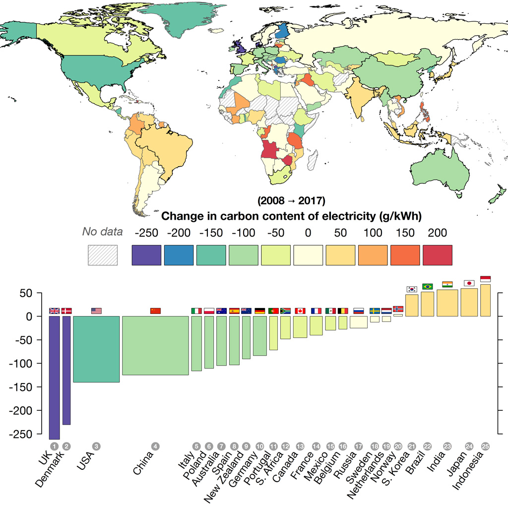
The change in carbon intensity of electricity generation over the last decade, in grams of CO2 per kWh. Shades of blue and green indicate reductions while yellows and reds are increases. Source: Drax 2018.
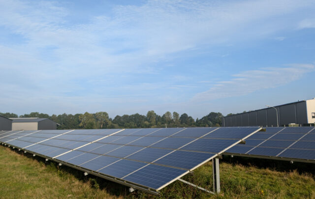
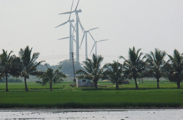
One of the main drivers in cleaning up power systems worldwide is the rise of renewable energy. In absolute terms, China is the clear leader, having both one third of the world’s installed wind capacity and one third of installed solar.
China’s near-130 gigawatt (GW) solar capacity is roughly equal to the next three largest countries put together: Japan, Germany and the US. For wind capacity, other notable high-fliers include fourth-ranked India and Poland in twelfth, which has a larger wind capacity than Denmark, as shown in the chart, below.
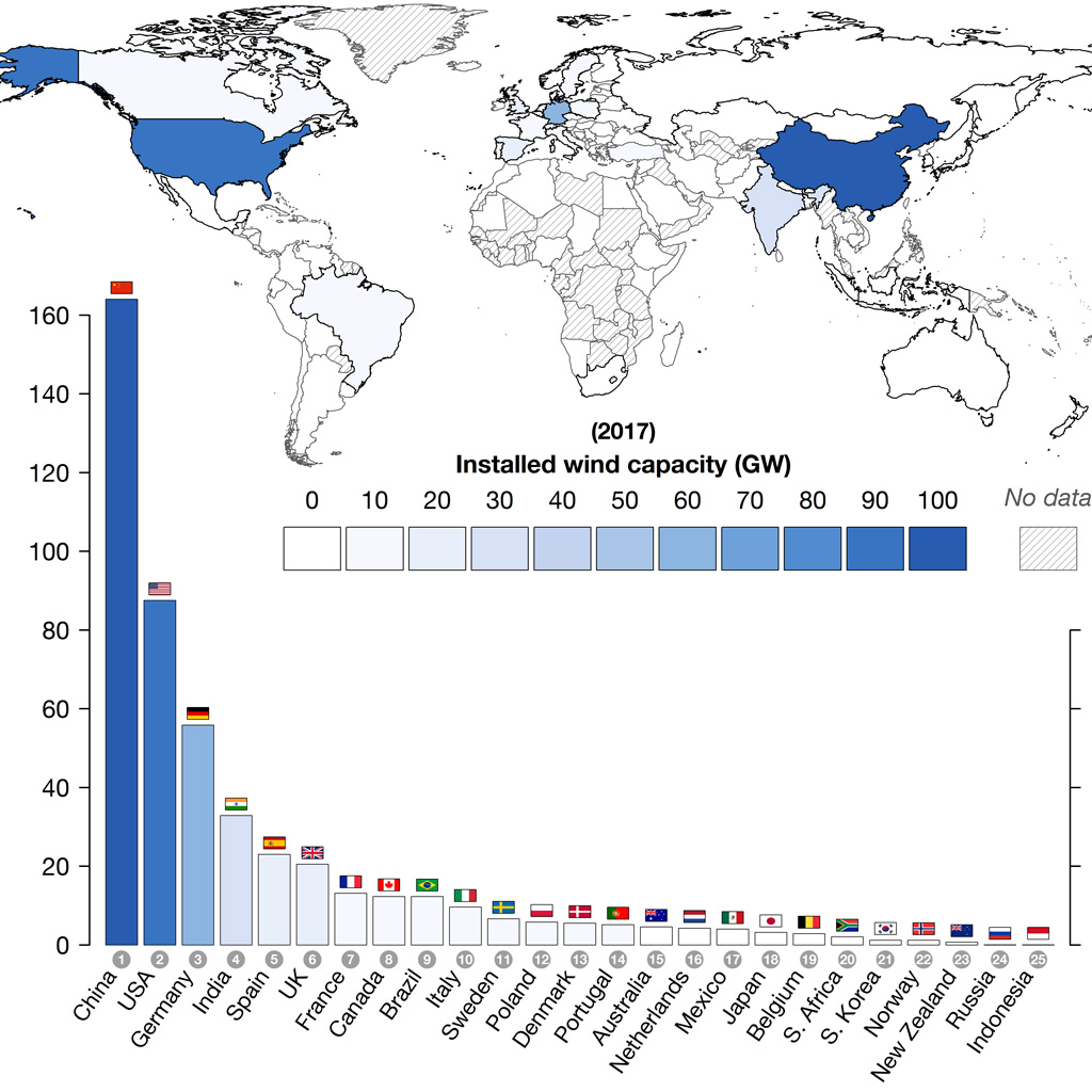
The installed capacity of wind power at the end of 2017, in gigawatts (GW). Source: Drax 2018.
However, on a per-capita basis, Denmark has the most wind, with 1,000 watts of capacity per person, and Germany the most solar at 500 watts per person.
Progress on clean transport
Clean electricity could move beyond homes and offices to power the way we move. Electric vehicles are rapidly coming down in price, and several countries are now legislating the demise of the internal combustion engine over the coming decades.
So far, some 4.5m electric vehicles have been sold worldwide, nearly half of which are in China, and a quarter in the US, as the chart below shows.
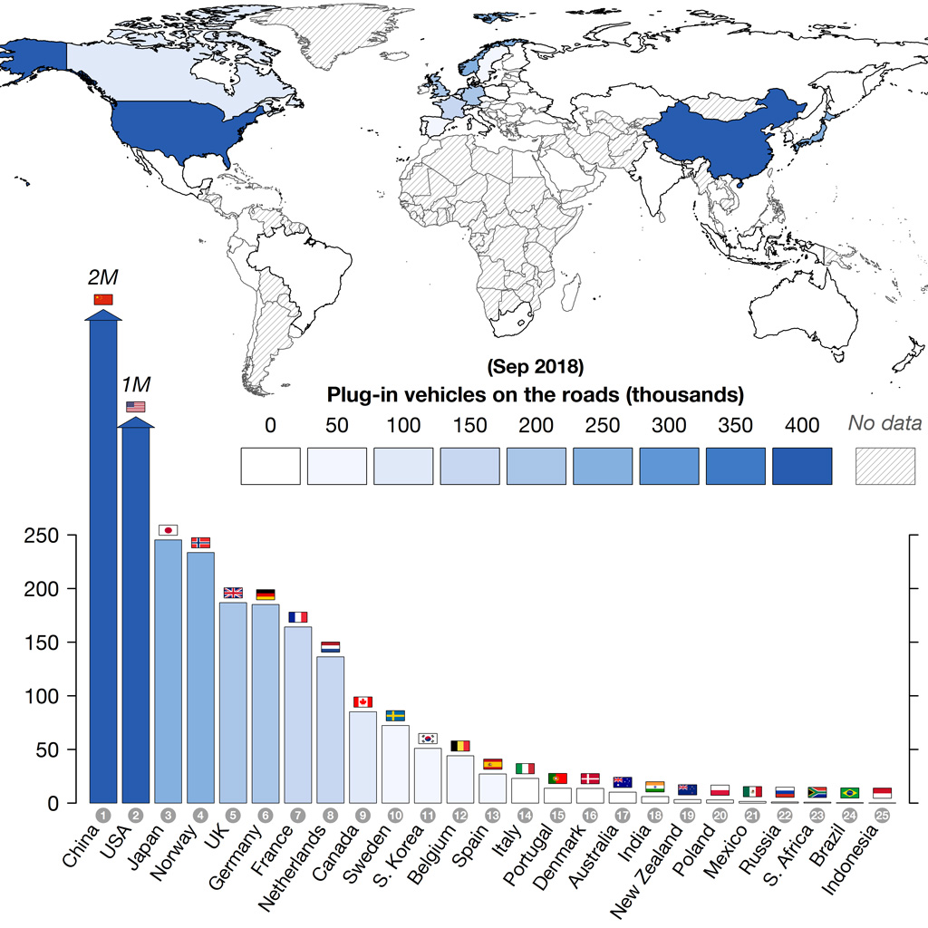
The number of electric vehicles on the roads (both battery and plug-in hybrid) as of September 2018. Source: Drax 2018 and EV-volumes 2018.
Several countries have reached a 2% market share for electric vehicles, meaning they make up 1 in 50 new cars sold. The rate in China is around double this, while Norway is well ahead of the pack with almost 1 in 2 vehicles sold now electric, as the lower chart below shows.
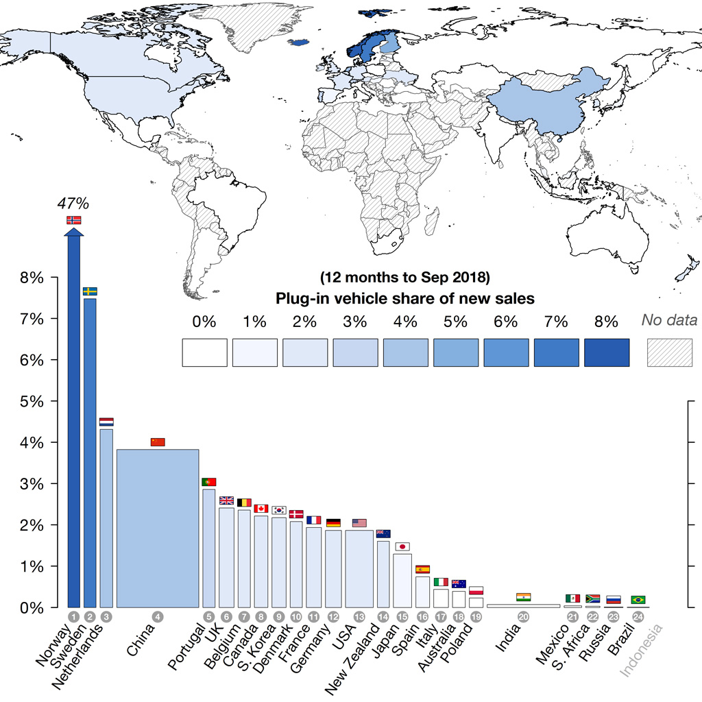
The share of electric vehicles (both battery and plug-in hybrid) within new car sales, for the 12 months to September 2018. Bar widths represent each country’s population. Source: Drax 2018 and EV-volumes 2018.
Cleaning up the transport sector does not just rely on new technologies, however, as people could travel less or using more efficient forms such as public transport. The amount of energy consumed per person on transportation varies greatly across the world, with the average American consuming 10 times more than the average Indian, as the charts below show.
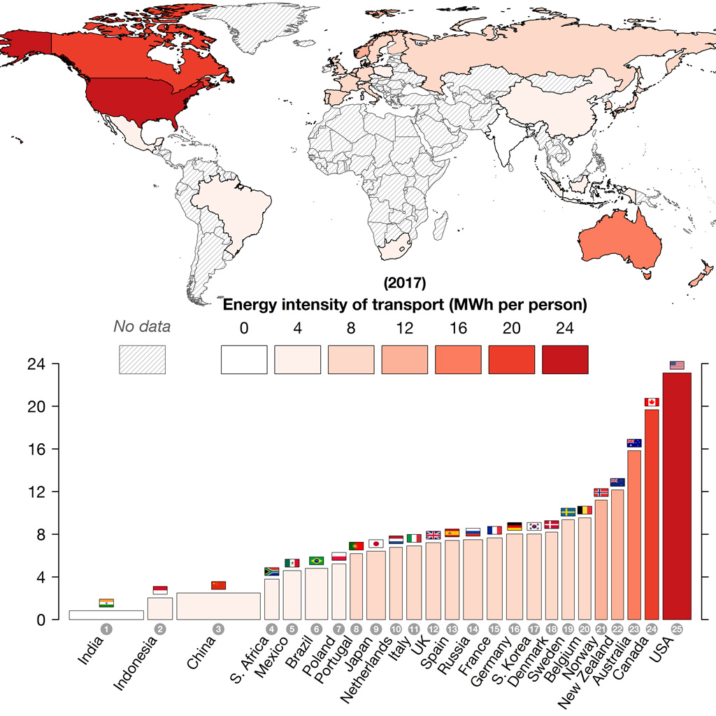
The energy consumed per person for transportation of people and goods, in megawatt-hours (MWh) per person per year. Bar widths represent each country’s population. Source: Drax 2018.
Large countries where people routinely fly between cities consume the most, but China and India are rapidly catching up as incomes rise. Their transport energy consumption rose 80% and 60% per person over the last decade, respectively. This has dwarfed the modest increases in transport efficiency seen across Europe and North America, as in the chart, below.
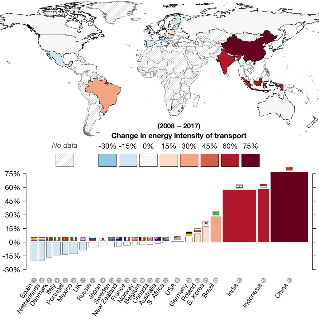
The change in energy consumed per person for transportation of people and goods over the last decade, showing the percentage rise (reds) or fall (blues) in MWh per person per year consumed. Bar widths represent each country’s population. Source: Drax 2018.
Progress on energy efficiency
Efficiency is not only slow to improve in the transport sector. Improving the energy efficiency of buildings worldwide is urgently needed to reduce the demand for carbon-intensive heating.
[slide-anything id=’3472166′]
Homes in most major countries are using less energy than they did a decade ago, per square metre of floor area. While some of this can be credited to improving building standards and more energy-efficient appliances, the gains may also be due to the residual effects of the global recession and the run of mild winters caused by rising global temperatures.
In some parts of the world, notably China and South Africa, improved living standards have lead to a rapid growth in household energy consumption, as the chart below shows.
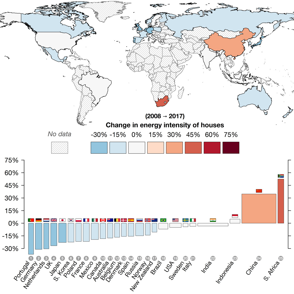
The change in energy consumed for heating and powering households over the last decade, showing the percentage rise (reds) or fall (blues) in MWh per person per year consumed. Bar widths represent each country’s population. Source: Drax 2018.
Progress on fossil fuels and carbon capture
Government support for fossil fuels is a perverse feature of many economies, holding back the transition away from coal, oil and gas.
The definition of fossil fuel subsidies is widely disputed. Yet according to the definition used by the Organisation for Economic Cooperation and Development (OECD) several major fossil fuel producing nations with relatively small populations, such as Norway and Australia, provide hundreds of dollars per capita per year, as the chart below shows. On this measure, the UK also gives large subsidies.
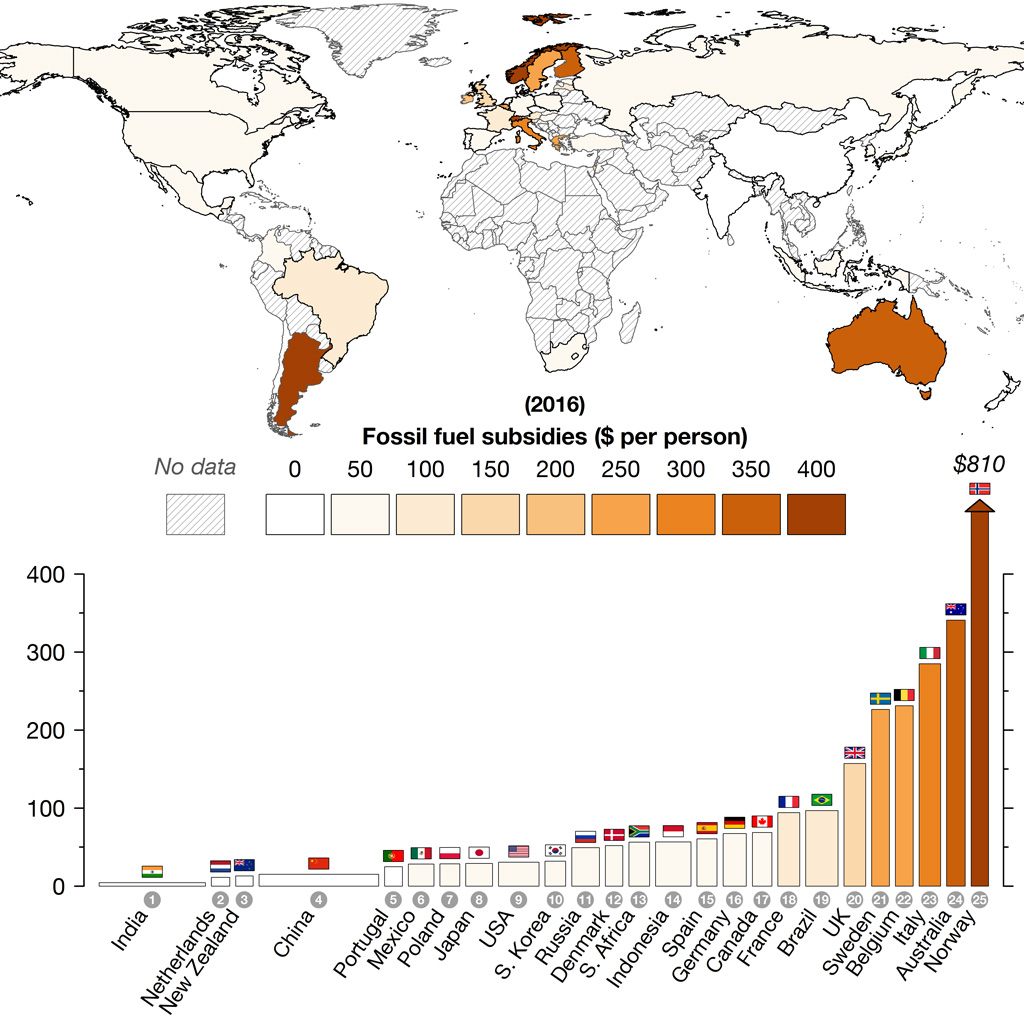
The level of subsidies offered to fossil fuels per person in 2016, including direct expenditures by government, forgone tax revenues and other fiscal concessions. Bar widths represent each country’s population. Source: Drax 2018.
One important feature of many pathways to 1.5 or 2C is to combine hard-to-avoid uses of fossil fuels, such as in steelmaking or cement, with carbon capture and storage. Today, however, there are just 18 large-scale carbon capture and storage (CCS) facilities around the world, concentrated in six countries with major oil and coal extraction industries, as the chart below shows.
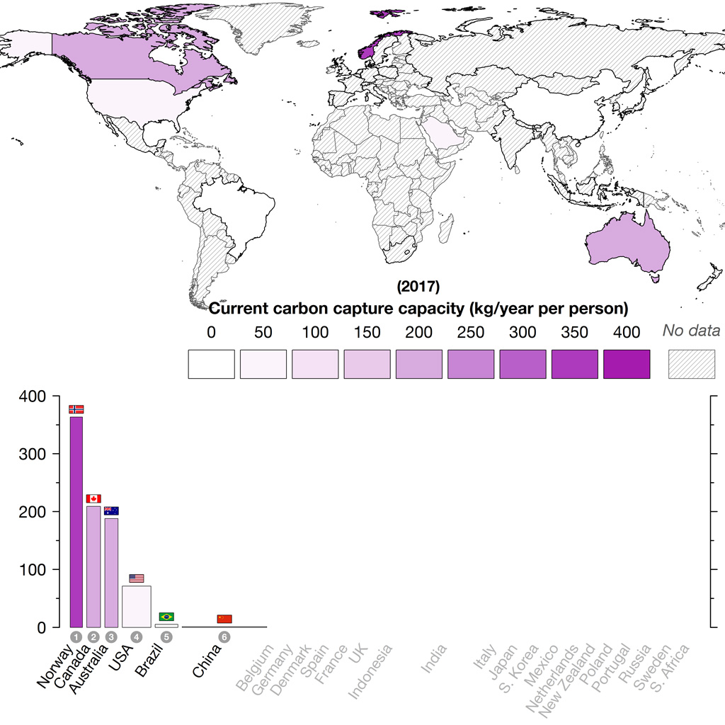
The installed capacity for carbon capture at large-scale CCS facilities as of the end of 2017, measured as kg of CO2 that can be captured per person per year. Actual level of capture may be lower, if facilities do not run at full availability. Bar widths represent each country’s population. Source: Drax 2018.
Together, these CCS facilities are capable of capturing 32 million tonnes of CO2 each year. This is less than one-tenth of one percent of the roughly 37 billion tonnes of CO2 produced each year by the world’s energy sector. If CCS does see widespread rollout over the coming decades, the potential for storing CO2 underground will not pose a barrier. The US alone could store all of the CO2 produced worldwide since the start of the industrial revolution.
Conclusion
All in all, progress towards clean energy around the world is mixed, with some countries pushing ahead on many fronts but others going backwards. Overall, our rankings show that the world’s nations are falling far short of what is needed and that progress over the next decade must be far stronger to avoid the worst impacts of climate change.
I. Staffell, M. Jansen, A. Chase, E. Cotton and C. Lewis (2018). Energy Revolution: Global Outlook. Drax: Selby.
Charts produced by Iain Staffell using R with data from the IEA, BP, Wilson and Staffell (2018), IRENA, EV-volumes, OECD, and GCCSI.
Teaser photo credit: By Yahoo! Blog from Sunnyvale, California, USA – DSC_2635 copy.jpg, CC BY 2.0