The Federal Reserve would like to raise target interest rates because of inflation concerns and concern that asset bubbles are forming. Part of their concern seems to arise indirectly from the rise in oil prices, relative to their low level in early 2016.

Figure 1. WSJ figure indicating likely reasons for rate hike.
A finite world does not behave the way most modelers expect. Interest rates that worked perfectly well in the past, don’t necessarily work well now. Oil prices that worked perfectly well in the past don’t necessarily work well now. It seems to me that raising interest rates at this time is very ill advised. These are a few of the issues I see:
[1] The economy is now incredibly dependent upon rising debt to prop up its spending. The pattern of total debt to GDP for the United States is shown in Figure 2.

Figure 2. United States’ debt to GDP ratios based on Federal Reserve Z1 data and BEA GDP data. The red line represents the increase over the latest three years.
There was a huge increase in debt in the period leading up to the 2008 crash. Every year between 2001 and 2008, the increase in debt was greater than four times the increase in GDP. In fact, for some years in that period, more than $8 of debt were added for every dollar of GDP added.
We now seem to be starting a new run up in debt. In 2015, the amount of debt added was $2.5 trillion ($66.1 trillion minus $63.6 trillion), while the amount of GDP added was only $529 million. This indicates a ratio of over 4.7 for the single year of 2016. (Figure 2 shows only three-year averages, because of the volatility of amounts.)
[2] The vast majority of the debt run-up since 1981 (Figure 2) seems to have been enabled by falling interest rates (Figure 3). Given how dependent we are now on large increases in debt to produce GDP, it would seem to be dangerous for the Federal Reserve to raise interest rates.
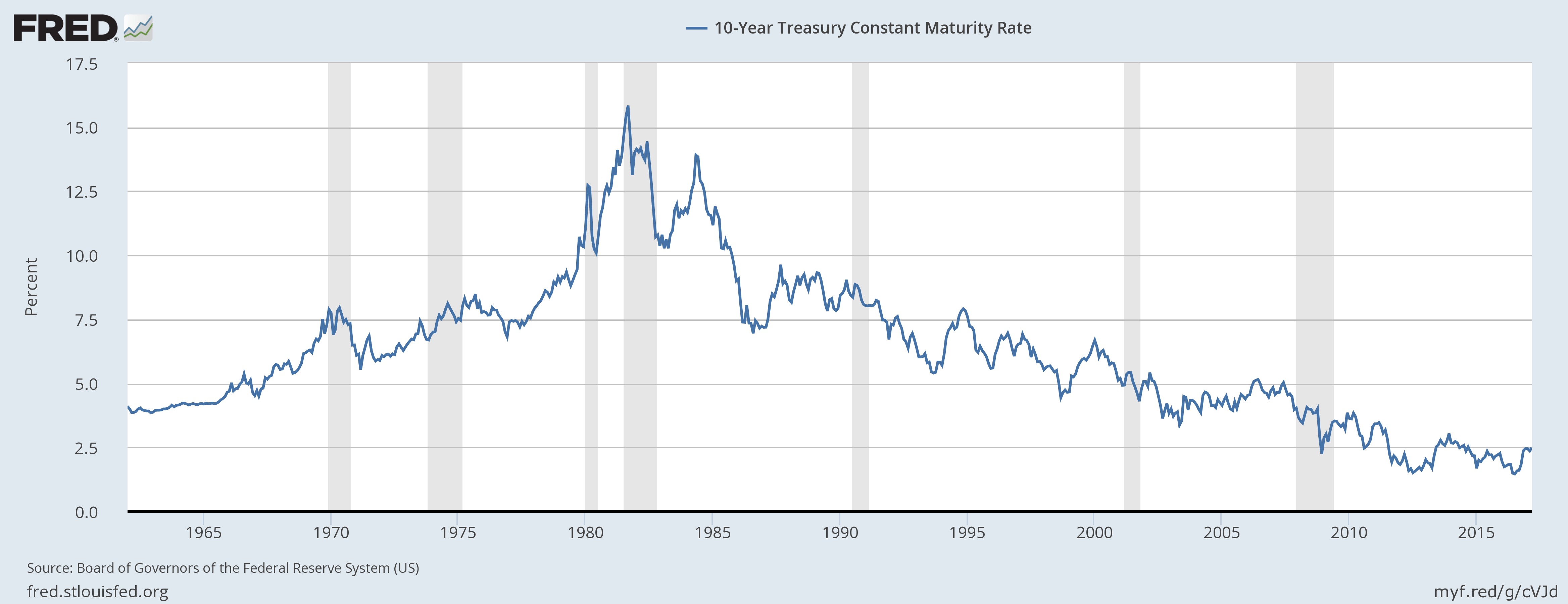
Figure 3. US Federal Bonds 10 year interest rates. Graph produced by FRED (Federal Reserve Economic Data).
With falling interest rates, monthly payments can be lower, even if prices of homes and cars rise. Thus, more people can afford homes and cars, and factories are less expensive to build. The whole economy is boosted by increased “demand” (really increased affordability) for high-priced goods, thanks to the lower monthly payments.
Asset prices, such as home prices and farm prices, can rise because the reduced interest rate for debt makes them more affordable to more buyers. Assets that people already own tend to inflate, making them feel richer. In fact, owners of assets such as homes can borrow part of the increased equity, giving them more spendable income for other things. This is part of what happened leading up to the financial crash of 2008.
The interest rates that the Federal Reserve plans to change are of a different type, called “Effective Federal Funds Rate.” These also hit a peak about 1981.

Figure 4. US Federal Funds target interest rates. Graph produced by FRED (Federal Reserve Economic Data).
[3] The last time Federal Funds target interest rate was raised, the situation ended very badly.
Figure 4 (above) shows that the last time Federal Reserve target interest rates were raised was in the 2004-2005 period. This was another time when the Federal Reserve was concerned about the run-up in food and energy prices, as I mention in my paper Oil Supply Limits and the Continuing Financial Crisis. The higher target interest rates were somewhat slow acting, but they eventually played a role in bursting the debt bubble that had been built up. In 2008, the amount of outstanding mortgage debt and consumer credit started falling, and oil prices fell dramatically.
It is ironic that the US government is again trying to bring down food and energy prices, when they are at a price level similar to the price level when they tried this approach the last time.

Figure 5. Monthly average Brent oil prices, with notes on regarding when the Federal Reserve changed its target interest rates.
The Federal Reserve looks at its favorite metrics, PCE inflation and PCE inflation excluding food and energy. From this high-level view, it is likely that they have no real understanding of exactly what energy price problems are causing the strange result. With this high level view, they do not realize that a big contributor to the rising costs is the increase in oil prices between the January to March 2016 period, when they were under $40 per barrel, and recent prices, which were above $50. (They are now back below $50 per barrel, but this would not be apparent from the metric.)
When this high-level view is used, it is easy to miss how low energy prices are today, relative to the needs of energy producers. Most people who have been following what is happening in the oil industry know that prices are not high, relative to the prices needed for profitability. Even if some US companies claim to be profitable at $50 per barrel, it is clear that, in general, the industry cannot withstand prices as low as they are today. At the current price level, investment is too low.
Part of the problem is that oil exporters need higher prices if they are to obtain adequate tax revenue to fund their programs. For example, Saudi Arabia has found that because of its falling tax revenue, it needs to borrow money to maintain its programs. This is a big change from being able to set aside money in a reserve fund, out of excess tax revenue. This is another place where the shift is toward more debt.
[4] The pattern the Federal Reserve seems to want to follow is the 1981 model, in which temporary high interest rates seemed to force energy prices down for a long time.
If we look at oil prices compared to US wages per capita (dividing total wages by total population), we find that oil “affordability” was at a low point in 1981. We saw previously in Figures 3 and 4 that interest rates were raised to a very high level at that time. The gray stripes in Figures 3 and 4 indicate that a recession followed.

Figure 6. Average barrels of crude oil affordable by US residents, calculated by dividing the average per capita wages (calculated by dividing BEA wages by population), by EIA’s average Brent oil price for each year.
Figure 6 shows that after interest rates fell, affordability rose until 1998. To a significant extent this was the result of falling prices, but it also was the result of a larger share of the population working, and thus contributing to rising wages.
There were many things that allowed this benevolent outcome to happen. One was the fact that we already knew about available oil in the North Sea, Mexico, and Alaska. When this oil came on line, oil prices were able to drop back to a much more affordable level. It is very doubtful that shale oil could play a similar role today, especially if it is likely that higher interest rates will drop oil prices from today’s $50 per barrel level.
One thing that helped improve affordability in the post-1981 period was improved gasoline mileage. There were also cutbacks in oil use for home heating and for electricity generation.

Figure 7. Average on road fuel efficiency by Sivak and Schoettle, “On-Road Fuel Economy of Vehicles in the United States: 1923-2015,” http://www.umich.edu/~umtriswt/
Figure 7 suggests that the earliest changes in fuel economy provided the biggest savings. In fact, overall savings after 1993 are quite modest.
One factor that helped reduce oil consumption both in the 1970s and in the 2008 to 2013 period was high prices. Now that oil prices are lower, we cannot expect as good a result. If oil prices drop back further, there is even less incentive to conserve.
[5] Adjustments made using Quantitative Easing (QE) (a way of producing low interest rates) appear to have had a rapid, significant impact on oil prices.
In late 2008, after oil prices had crashed, the US Federal Reserve implemented QE. Using QE created very low interest rates, which seem to have had an impact on world oil prices.
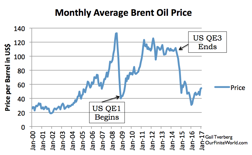
Figure 8. Monthly Brent oil prices with dates of US beginning and ending QE.
Clearly, lower interest rates encourage more borrowing, and discontinuing a program that gives very low rates would tend to have the opposite impact. Thus, we would expect the direction of the oil price changes to be similar to those shown on Figure 8.
One hypothesis regarding the rapid impact of QE was that it encouraged borrowing in US dollars, in order to purchase bonds in other currencies with higher interest rates (“carry trade”). When QE ended, the carry trade was cut off, reducing investment in countries with higher interest rates. Instead, there was more interest in investing in the US. These changes led to the US dollar rising relative to many other currencies. Since oil is priced in US dollars, these shifting relativities made oil more expensive in non-US dollar currencies. Thus, the affordability of oil declined for buyers outside the US. It was this decline in affordability outside the US that brought down oil prices. Figure 9 shows the shift in currency levels when the US discontinued QE in 2014.

Figure 9. US Dollar vs. Major Trade Weighted Currencies. Chart created by FRED (Federal Reserve Economic Data).
Increasing Federal Reserve target interest rates would seem to have the effect of further raising how high the US dollar floats compared to other currencies. If this happens, we would expect lower oil prices, and more problems with excessive supply.
[6] The way increased lending seems to move the economy along is by using time shifting to provide a “layer” of future goods and services that can be used as incentives for businesses to invest in making goods and services now.
The problem when making goods of any kind is that resources need to be purchased and workers need to be paid, before the finished product is available for sale.

Figure 10. Image created by author showing how goods and services are created. It also needs a “government services sector,” but it didn’t fit easily on the slide.
As a result, at the time goods and services are produced, there aren’t enough already-created goods and services to pay all of those who have contributed to the effort of making the goods and services. To work around this problem, debt or a product similar to debt is needed to pay some of those contributing to the process of creating future goods and services.
One way of thinking about the situation is that an increase in debt during a time period adds a layer of future goods and services that can be distributed to those contributing to the effort of making the goods and services (Figure 11). This significantly increases the amount of goods and services to be distributed above the level that would be available on a barter basis, based on goods that have already been produced.

Figure 11. Figure by author showing how the “increase in debt” effectively adds another layer of goods and services that can be distributed. (As with Figure 10, this chart should include a category for government services as well.)
[7] The spending ability of US citizens has been lagging behind, even with the huge amount of debt being added to the economy. If the Federal Reserve raises interest rates, it will tend to make the situation worse.
The biggest expenditure for most households is housing costs, either for an apartment or a new home. As with oil, we can compare affordability by comparing prices to per capita wages (total US wages/total population). On Figure 12, one amount shown is the median rent for unfurnished apartments in the US, based on US Census Bureau data; the other is The People History’s estimate of “new home” prices over the years. In general, affordability has been falling. Figure 12 shows that the fall in affordability of apartment rent is a relatively recent phenomenon. The fall in affordability of home prices is a long-term phenomenon, no doubt enabled by falling interest rates since 1981.

Figure 12. Comparison of new home prices from The People History and median non-subsidized rental asking prices based on US Census bureau data. These are divided by (total US wages/ US population) from the US BEA. The indexes are different for home and apartments, chosen so that two would show separately on the chart. If amounts shown are falling over time, housing is becoming less affordable.
Another product whose affordability is of interest is electricity. Electricity is an energy product whose affordability is important, because is it used in residential, commercial, and industrial locations. The affordability of electricity tends to be less volatile in pricing than oil, whose affordability was shown in Figure 6. Because the pricing of electricity is more stable, I have shown the affordability of electricity at three different spending levels:
- Per Capita Wages – Total US wages divided by total US population.
- Per Capita DPI – Total Disposable Personal Income (DPI) divided by total US population. Disposable Personal Income includes government transfer payments (such as Social Security and unemployment payments), in addition to wages. It also includes “proprietors’ income,”which is a relatively smaller amount.
- Per capita DPI+Debt – Total Disposable Personal Income, plus the increase in Household Debt during the year, divided by population.

Figure 13. Quantity of electricity that an average worker could afford to buy, using three different definitions of income. (Average wages are based on BEA total salaries and wages, divided by BEA total population, and Disposable Personal Income is defined similarly, using BEA data. DPI plus debt includes the change in Household Debt, from the Federal Reserve’s Z1 report, in addition to DPI in the numerator.)
Based on Figure 13, electricity was becoming more affordable until 2001 on a wages-only basis. Since then, its cost has been relatively flat.
On a DPI basis, electricity was considerably more affordable until 2004, after which it declined, and then rose again.
On a DPI + Debt basis, there was a much bigger jump in affordability. This big increase in debt corresponds to the housing bubble of the early to mid 2000s. Interest rates were lower and underwriting standards lessened, so that almost anyone could buy a home. This allowed a run-up in home prices. Homeowners could borrow this equity and use it for whatever purpose they chose–for example, fixing up their home, buying a new car, or going on a vacation. The big increase in DPI+Debt, relative to DPI, gives an indication of the extent to which the housing-related debt bubble in the early 2000s affected spendable income.
Which of these scenarios is really correct? It depends on the segment of the economy a person is looking at. For people of modest income, in other words, those who rent apartments, the wage-only scenario is probably the most representative. For people who have high incomes and own a home, the DPI plus Debt scenario is probably more representative.
[8] All income seems to ultimately derive in part from rising debt, and in part from energy consumption. If interest rates are too high, the required interest payment exceeds the benefit of time shifting.
We can see from Figure 13 that debt is very helpful in producing income for workers. Some of this comes from the government transfer payments, funded by debt. Some of this comes from the wages paid by businesses, funded in part by shares of stock, which are debt-like in nature. The currency with which workers are paid is, in fact, debt. A person can see the connection, by thinking of currency as being similar to “gift cards,” issued by a business. The business would need to record the value of these gift cards as a liability on its balance sheet.
The underlying problem giving rise to the need for debt is “complexity,” and the need to obtain the services of many trained people and of many types of tools, before goods and services can actually be created. All of this builds extra expense and delays into the system, in the manner described in Figures 10 and 11. Somehow, there must be interest payments to compensate for the time shifting that is necessary: the whole string of events that must lead up to producing the products that are needed. Tools must be made far in advance of when they are needed. In fact, there is a whole string of “tools to make tools” that takes place. Factory buildings need to be built, and roads need to be built. Workers must be trained. In order for the people and businesses involved in these processes to be compensated for their effort, and induced to delay their own consumption of goods and services, there need to be interest payments made for the time-delay involved.
Debt (together with shares of stock, which are debt-like) cannot operate the economy alone. Energy products are also needed to provide the physical transformations required. These include heat and transportation, and electricity to operate devices that use electricity. Of course, human workers are needed as well. The major pieces of the system, and the way they operate together, are shown in Figures 10 and 11.
It would appear that an economy can start “from scratch,” using only debt, plus available resources (including energy resources, such as biomass for burning), and some sort of government (perhaps a self-declared king). If the king sees a productive project that might be undertaken–perhaps building a bridge, or cutting down more trees for farmland–the king can impose a tax on the citizens, and use the tax to hire a group of laborers to use the available resources. Once the tax is imposed, it is a debt of the citizens. It can be used to pay the laborers who do the work.
The debt-based system seems to build upon itself. As more wages are available, these wages allow workers to take out loans, and allow businesses to create new goods and services that can be purchased using these loans. These loans are promises that can be exchanged for future goods and services. Since energy is used in creating all goods and services, these loans are more or less guarantees that the economy, and its use of energy products, will continue in the future.
The thing that connects debt to the rest of the system is the interest payments required for time shifting. When the system is relatively efficient, the return on investment is high, so interest payments can be high. As diminishing returns set in, interest rates need to be lower. We are now encountering diminishing returns in many areas: extracting fossil fuels, extracting minerals, producing enough fresh water for a rising population, creating an adequate supply of food from a fixed amount of arable land, creating new antibiotics as bacteria become drug resistant, and the cost of finding new drugs to treat diseases that affect an ever-smaller share of the population.
[9] It is relatively easy to make economic growth occur when energy products are becoming more affordable, relative to spendable income. When energy products are becoming less affordable, it becomes virtually impossible for economic growth to occur.
We know that historically, the cost of energy products has tended to fall over time. This has been described in more than one academic paper.

Figure 14. Figure by Carey King from “Comparing World Economic and Net Energy Metrics Part 3: Macroeconomic Historical and Future Perspectives,” published in Energies in Nov. 2015.
United Nations reports also shows the same pattern (the bottom two categories are energy related):
Figure 15. Figure from UNEP Global Material Flows and Resource Productivity.
The only way that energy costs can fall relative to GDP, at the same time that energy use is rising, is if energy products are becoming less expensive over time, compared to the incomes of the citizens. This falling price level allows more energy products to be purchased. As energy prices drop, it is possible for the economy to afford the increasing quantity of energy products required to produce even more goods and services.
There are many ways that energy products can become less expensive. For example, the mix can shift among different energy products, shifting to the less expensive products. Or new techniques can be found that make extraction less expensive. Finding more efficient ways to make use of energy products, such as the increasing miles per gallon shown in Figure 7, also contributes to the falling relative cost to workers. Of course, “falling EROEI” tends to work in the opposite direction.
Unfortunately, we are now running out of ways to truly make energy use cheaper over time. The ways we seem to be down to now are (a) paying energy companies less than their cost of extraction, and (b) reducing interest rates to practically zero.
We can see from Figure 6 that oil was becoming more affordable relative to wages between 1981 and 1998. Falling interest rates and rising debt seemed to play a role in this, as well as success in drilling for oil in places such as the North Sea, Mexico and Alaska. Since then, the only way that oil affordability could rise was by oil prices falling below the cost of extraction, starting in mid 2014.
The situation for electricity is shown in Figure 13. Electricity was becoming more affordable on a “wages-only” basis, until 2000. Since then it has plateaued. The economic push that would have come from falling electricity prices must come from elsewhere–presumably from adding more debt.
Affordability of electricity on a “DPI plus debt” basis rose considerably more, with a peak in 2004. Thus, adding more debt, in the form of transfer payments and rising debt for homes and vehicles, added considerable spendable income. But it has not been possible to regain the affordability of the 2004 period in recent years.
We are now reaching limits because we no longer are truly seeing a reduction in energy costs. Instead, we are seeing very low interest rates and oil prices lower than the cost of production. These seem to be signs that we now are reaching limits. Energy prices really need to drop for the economy to grow; the economy will make them drop, whether or not producers can profitably extract oil at the low cost that is affordable by the citizens.
[10] China seems to be cutting back on growth in debt now, at the same time the US is talking about increasing interest rates. Energy products, especially oil, are sold to a world market. If China cuts back on debt at the same time as the US raises interest rates, energy prices could drop dramatically.

Figure 16. UBS Total Credit Impulse. The Credit Impulse is the “Change in the Change” in debt formation.
UBS calculates a global “credit impulse,” showing the extent to which there is a trend toward increasing use of debt. According to their calculations, since 2014, it is China that has been keeping the Global Credit Impulse up. If China is cutting back, and the US is cutting back as well, the situation starts looking like the 2008-2009 period, except starting from greater problems with diminishing returns.
Observations and Conclusions
The economy looks to me like a type of Ponzi Scheme. It depends on both rising energy consumption and rising debt. Judging from the problems we are having now, it seems to be reaching its limit in the near term. Raising interest rates will tend to push it even further toward its limit, or over the limit.
Debt is used to pay participants in the economy using a promise for future goods and services. This allows the economy to appear to distribute more goods and services than are actually available. In a way, adding debt is like being able to manufacture future energy supplies that can be used to pay those who participate in making the goods and services we produce today. When energy products are high-cost to produce, and delayed in timing (such as wind and solar PV), the need for debt especially rises.
Part of our problem today is the extent of specialization of those analyzing our current problems with energy and the economy. This means that virtually no one understands the full problem. Bankers seem to think that debt, and interest rates on debt, can solve all problems. Energy analysts think that energy resources in the ground are all important. They both create incorrect analyses of the overall problem. Rising debt is needed, if energy products that have been created are to be absorbed by the world economy. The energy gluts we are seeing are signs of inadequate wage growth. A major function of growing debt is to add wages. Unwinding debt leads to the kinds of problems that we encountered in 2008.
It is tempting for world financial leaders to think that they can find a solution to today’s problems by using higher target interest rates to slightly scale back economic growth. I don’t think that this is really a good option. The world economy is operating at too close to “stall speed.” The financial system is too fragile. If any solution can be expected to work, it would seem to need to be in the direction of re-starting QE. Even if it produces asset bubbles, it may keep the world economy operating for a bit longer.