NOTE: Images in this archived article have been removed.

Paying for gas image via shutterstock. Reproduced at Resilience.org with permission.
Among the disappointments in the 2015:Q1 GDP figures was weak consumption growth, which was a little surprising given the extra cash most consumers have on hand as a result of lower energy prices. I wanted to take a look at how the recent consumer behavior compares with what we’ve seen historically.
The graph below plots the price of energy goods and services relative to the overall price consumers pay for other purchases. Real energy prices have fallen about 20% from where they had been last summer.
Many consumers buy the same number of gallons of gasoline each week regardless of whether the price goes up or down. Such behavior would mean that someone who used to spend 5% of their budget on energy would only need to spend about 4% if energy prices fell 20%. And indeed we see in the data that purchases of energy goods and services now account for only 4.4% of total consumer spending, down from 5.6% a year ago.
In 2007,
Paul Edelstein and Lutz Kilian studied the relation between energy prices and consumer spending using simple forecasting relations known as a vector autoregression. They summarized the effects on consumer budgets of energy prices by multiplying the monthly percent change in the relative price plotted in Figure 1 by the energy share in Figure 2– call this variable
xt. Thus for example if the energy share is 5% and the price increases 20%,
xt would equal 1, corresponding to the 1% loss of spending power described above. They then related
xt to the monthly growth rate of real consumption spending. They used data from 1970:M7 to 2006:M7 to estimate a pair of forecasting equations to predict
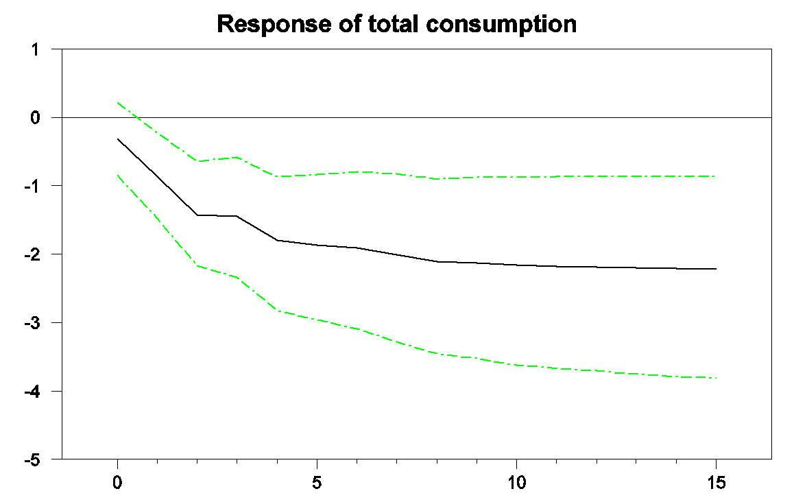
xt and real consumption growth based on observed values of the two variables over the previous 6 months. The black line in the graph below shows how an
n-month ahead forecast of real consumption in that system would change when
xt goes up by 1, a graph that economists describe as an “impulse-response function”. The green lines indicate 95% confidence intervals. Historically, an energy price increase that reduces consumer spending power by 1% would on average be followed within a few months by a 1% decline in real consumption spending and by closer to a 2% decline by the end of 6 months. One interpretation of why the latter effect is bigger than 1% is that it could reflect second-round macroeconomic multiplier effects of the lower consumer spending.
Horizontal axis: months after an increase in energy prices that would lower consumer spending power by 1% at time 0. Vertical axis: predicted percent change in real consumption spending between month 0 and month n. Source: based onHamilton’s (2009) replication of Edelstein and Kilian (2007).
In a paper published in the
Brookings Papers on Economic Activity in 2009, I looked at how much of the first-year’s downturn in consumption spending during the Great Recession could be accounted for by the sharp spike in energy prices that occurred at the time. The black line in the graph below plots real consumption spending between September 2006 and September 2008. It is measured as 100 times the
natural logof real consumption, so that a one-unit increase on the vertical axis corresponds to about a 1% increase in real consumption spending. The trajectory of the black line shows the drop in consumption spending that preceded the Lehman bankruptcy in September of 2008.
Black: 100 times the natural log of real consumption spending, 2006:M9 to 2008:M9, normalized at 100 for 2007:M9. Blue: forecast from the Edelstein and Kilian vector autoregression using only data as of 2007:M8. Green: forecast from the vector autoregression conditioning on observed energy prices over 2007:M9 to 2008:M8. Source: Hamilton (2009).
The blue line shows the predicted path for consumption based only on consumption and energy data available in September of 2007, while the green line shows the path predicted given the big increase in energy prices between September 2007 and July of 2008. The graph indicates that about half of the slowdown in consumption growth during the first three quarters of the Great Recession could be attributed to energy prices.
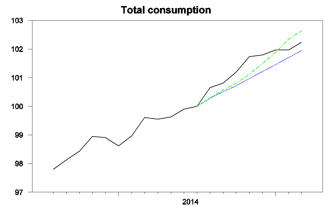
I was curious to update those calculations to take a look at the effects of the recent plunge in energy prices. I first re-estimated the Edelstein-Kilian vector autoregression using data from 1970:M7 through 2014:M7 and used the model to describe consumption spending since then. The black line in the graph below again shows the actual level of real consumption spending, this time for the period September 2013 through March of 2015. The blue line shows the forecast using data only available through July of 2014, before the big drop in energy prices. We would have predicted about a 2% increase in real consumption spending since July if there had been no drop in energy prices, compared with an actual increase in real consumption of 2.2%.
Black: 100 times the natural log of real consumption spending, 2013:M9 to 2015:M3, normalized at 100 for 2014:M7. Blue: forecast from an updated Edelstein and Kilian vector autoregression using only data as of 2014:M7. Green: forecast from the vector autoregression conditioning on observed energy prices over 2014:M8 to 2015:M3.
As before the green line indicates what we would have expected to see happen to consumption spending given the big drop in energy prices. Initially consumption was higher than predicted, with big gains in consumption spending coming before much of the decline in energy prices had actually reached consumers. But consumption since November has grown at a slower rate than would have been predicted even if there had been no drop in energy prices. Based on the historical relation between energy prices and consumer spending, we would have expected to see consumption today about 2.6% above where it had been in August rather than the observed 2.2% increase.
What’s different this time? Of course energy prices are just one of many factors influencing consumption spending and the differences highlighted above are modest. But the
Wall Street Journal last week reported on a survey by credit-card issuer Visa that 70% of American consumers expect gasoline prices to go back up. This time consumers don’t trust the windfall to stay in their wallets, and so haven’t been spending the extra cash as freely as in the past.
Whatever the explanation, the facts seem to be that, unlike what we usually observed historically, consumers have been using much of the gains from lower energy prices to bolster their saving rather than using it to increase spending on other goods and services.