This post is an update and continued expansion to my previous posts about tight/shale oil in Bakken/Three Forks in North Dakota (ND):
Is Shale Oil Production from Bakken Headed for a Run with “The Red Queen”?
Is the Typical NDIC Bakken Tight Oil Well a Sales Pitch?
This post documents:
- At present oil prices Bakken tight oil has the overall prospects of being profitable.
- Between 70-75% of the studied wells (well cost @9Million and oil price @$90/bbl) were found to have a prognosis for being at or above breakeven (being profitable).
- If (or rather when) average well productivity declines further, this will add a new meaning to the term tight oil.
- Developments in average well productivity.
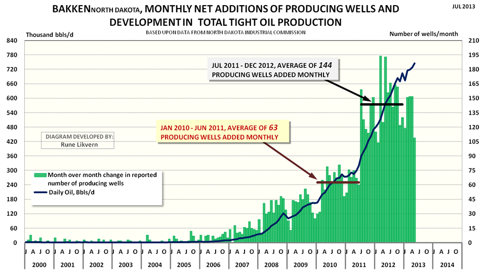
FIGURE 1: The chart above shows monthly net additions of producing wells (green columns plotted against the rh scale) and development in oil production from Bakken (ND) (thick dark blue line lh scale) as from January 2000 and as of May 2013.
In May 2013 production was 745 kb/d and between January 2013 and May 2013 average shale/tight oil production from Bakken/Three Forks was 716 kb/d.
This post presents statistical analysis about normal distributions of wells by productivity {first full 12 months (year 1) and 24 months (year 2) of total reported flows)}. Further it presents results from regressions, correlations, and moving averages analysis of the studied wells and an update on the simulations of production based upon number of actual wells added monthly and production data as of May 2013 from North Dakota Industrial Commission (NDIC).
Finally a little about well economics and some general observations related to how Net Present Value/Internal Rate of Return (NPV/IRR) and DEBT may shape companies’ strategies for future developments in tight/shale oil plays.
The attractiveness of shale oil (and gas) comes from the manageable and limited capital expenditures for a well and the short investment periods. Shale developments thus offer great flexibilities for CAPEX adjustments with movements in the oil/gas price, developments in cost and well productivity.
MODELED VERSUS ACTUAL PRODUCTION
The developments in total production from tight oil and gas in a short time span have been unprecedented and truly amazing.
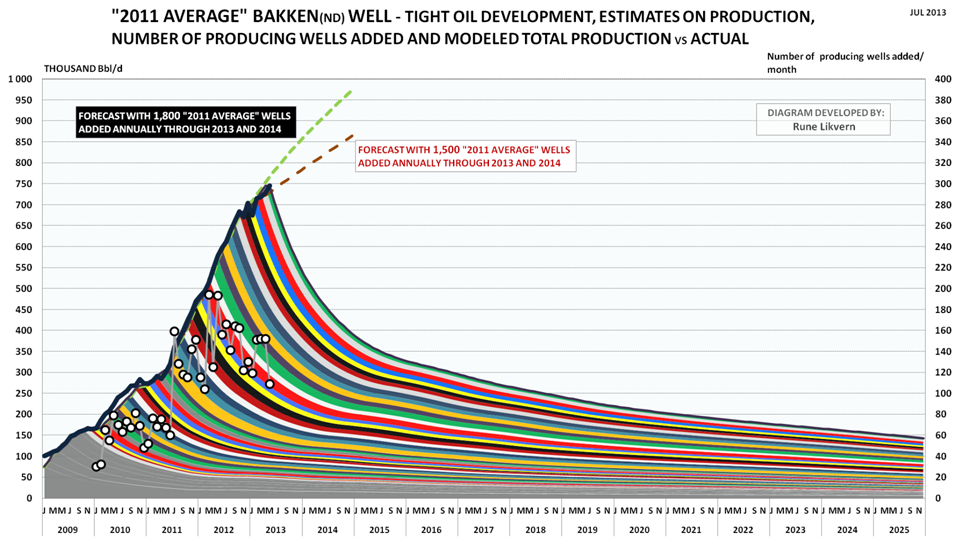
FIGURE 2: The colored bands show total production (production profile for the “2011 average”/reference well multiplied by net number of wells added during the month) added by month and its projected development (lh scale). The white circles show net added producing wells by month (rh scale). The thick black line reported production from Bakken (North Dakota) by NDIC (lh scale).
The chart also shows forecast developments for total oil production with respectively 1,500 (red dotted line) and 1,800 (light green dotted line) reference wells added annually through 2013 and 2014.
The model was calibrated to start simulations as from January 2010.
NOTE: Since my last post about Bakken more wells were added to the data bases and all the wells were crosschecked against data on total production from the formations. This led to an upward revision of the “2011 Average”/reference well with about 1% which now is at 85.2 kb oil for the first 12 months of flow. This improved the accuracy of average modeled versus actual production to less than 1% for the period January 2011 – May 2013.
The “2011 average” well also serves as a reference well and so far in 2013 average modeled production follows actual reported production from NDIC within 1%.
Any divergences developing between modeled and actual production may over a period of months give early indications about directional changes to average well productivity.
The forecasts with 1,500 and 1,800 (“2011 average”) reference wells added through 2013 and 2014 also serve as additional references that may be indicative of directional changes in average well productivity.
If the model over time develops a growing deficit against actual reported production, this would suggest that newer wells have an improved well productivity relative to the reference well and vice versa.
The chart shows a deficit between modeled and actual production during 2010 which also demonstrates higher average well productivity in 2010.
ESTIMATED CASH FLOWS
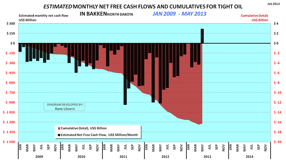
FIGURE 3: The chart above shows an estimate of cumulative net cash flows post CAPEX for tight oil from Bakken (ND) as from January 2009 and as of May 2013 (red area and rh scale) and estimated net cash flows post CAPEX for the same months (black columns and lh scale).
Assumptions for the chart are WTI oil price (realized price), average well cost starting at $8 Million in January 2009 and growing to $10 Million as from January 2011. All costs assumed incurred as the wells were reported starting to flow (this creates some backlog for cumulative costs as costs in reality are incurred continuously as the wells are manufactured) and the estimates do not include costs for completed non- flowing and dry wells.
Economic assumptions; royalties of 15%, production tax of 5%, extraction tax of 6.5%, OPEX at $4/Bbl, transport (from wellhead to refinery) $12/Bbl and interest of 5% on debt (before any corporate tax effects).
Estimates do not include any effects from hedging, dividend payouts, retained earnings and income from natural gas/NGPL sales (which now and on average grosses around $3/Bbl).
Estimates do not include investments in processing/transport facilities and other externalities like road upkeep etc.
As from January 2009 and through May 2013 an estimated $17-$20 billion is literally present as “capital in the ground”. There are now good reasons to believe that all this capital will be recovered and the investments will provide acceptable overall profits.
The chart may however raise questions about how much additional debt the companies are willing and/or capable to take on, and the prospects for continued debt access. Companies are normally aware that at some level their debt overhang could expose them to liquidity crunches in periods with lasting lowered oil prices.
An estimate for total CAPEX is obtained by adding an estimated total net cash flow of $30 billion from operations as from January 2009 through May 2013. This does not include capital spent for acreage acquisitions and investments in processing, gathering and transport systems for oil and natural gas.
A LITTLE ABOUT NPV/IRR AND DEBT
- What I found was that there are lots of financial considerations to be made about future developments in shale and the optimum financial solution appears to be about getting right the expectations for future developments in the oil price, quality of acreage (location, location, location), anticipations of future aggregate demand for goods and services for well manufacturing and thus cost developments, and not least the companies’ remaining capacities to take on additional debts.
The oil companies are in the tight/shale oil/gas business to make profits and grow their financial wealth by extracting oil and natural gas from the ground and selling it. The oil companies use several economic parameters in their planning processes which shape their development strategies.
The most important is Net Present Value (NPV, or the time value of money) or Internal Rate of Return (IRR).
The scale of present shale developments in Bakken (ND) require high CAPEX flows which so far have been met from growth in net cash flows from operations and at times an accelerating and growing use of debt and/or other outside sources for financing. The impression left from quarterly/annual reports showing high and growing profits may be somewhat deceptive if the external funding that has also has been used to make growth in tight oil production happen is not included. By looking at the financial statements for some companies it was found that growth in tight oil production had been facilitated by considerable growth in debt. A company can only take on so much debt before its financial resilience becomes threatened by even moderate declines in the oil price.
Even with lowered well costs the oil companies have to exercise strict budget controls.
By running several simulations for a generic oil company to find the best way (most profitable) to develop its remaining acreage, provided it holds its acreage by production, a somewhat interesting phenomenon was observed. Under equal assumptions the slightly more profitable strategy was a development with continued growth in production and debt.
However the differences between a continued growth and a plateau (provided the plateau had reached some size) development was not found to be significant enough to exclude any alternatives solely by using NPV. For that the NPV differences were too small considering all other uncertainties. In other words the alternatives were for all practical matters NPV neutral.
The growth strategy would also expose the company to growth in debt and sustain (or increase) the pressures in the delivery chains for goods and services for well manufacturing and thus contribute to cost inflation.
With the prospects that drilling for shale gas will pick up as the present North American oversupply in natural gas has been burnt through, this could further amplify cost inflation for well manufacturing sometime in the near future.
The plateau alternative offers the prospect of reducing aggregate demand for goods and services for well manufacturing and thus potentially contributes to reduced cost inflation and improved profitability.
The plateau alternative also offers the prospect for a faster and gradual reduction in total debt, which improves the companies’ financial resilience towards sustained lowered oil prices and lowers costs for debt services.
The oil price is the most important factor governing the shale developments. If expectations are for a higher future oil price, this would also favor the plateau development.
From what I found it looks as if NPV and DEBT also may be considered as the ”Red Queen’s” invisible helpers.
DISTRIBUTION OF WELLS AND DEVELOPMENTS IN PRODUCTIVITY
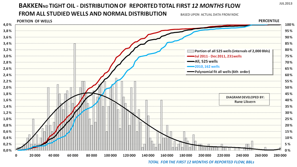
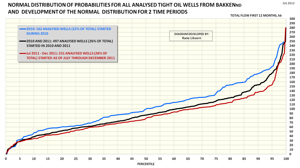
FIGURE 4: The chart above shows distribution and normal distribution of the first 12 months total flow for the 525 tight oil wells from Bakken (ND) subjected to full time series analysis. The intervals used for the distribution (grey columns, lh scale) in the chart are 2,000 Bbls and also shown is a polynomial fit of 6th order (black line, lh scale).
The chart also shows the normal distribution (plotted towards the rh scale) of the first 12 months total flow for the 525 wells (black line), the normal distribution for the first 12 months total flow for the studied wells for 2010 (162 wells, blue line rh scale) and the normal distribution of the first 12 months total flow for the studied wells started in H2 2011 (Jul 2011 – Dec 2011, 231 wells and red line, rh scale).
How to read the chart: The grey columns show the distribution of total first 12 months production for all 525 wells with full time series (lh scale).
The black line shows the normal distribution for all the studied wells, 50% had a first 12 months flow of around 86 kb or lower. Alternatively 50% of the wells had a first 12 months flow around 86 kb or higher.
Of the studied wells for 2010, 5% of the wells had a first 12 months flow around 193 kb or higher.
See also figure SD2 for an alternative presentation.
The chart shows the development in the normal distribution for well productivity (first 12 months total flow) and that the well productivity has declined (the lines for the normal distribution have moved to the left).
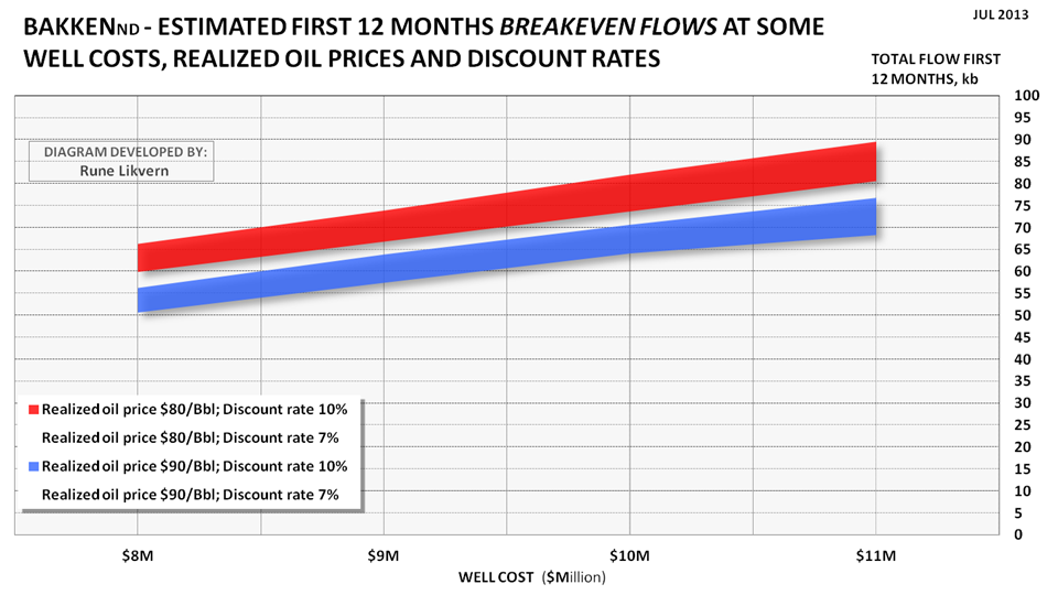
An alternative way to solve the equation for breakeven cost is to solve it for breakeven flow at some oil prices, discount rates and well costs. This was done and is shown in figure SD1. If the well cost is $9Million and (average) realized oil price is $90/Bbl, the commercial prognosis for the well appears acceptable with a first 12 months (year 1) total flow of around 60 kb and first 24 months (year 2) total flow around 100 kb.
From the chart in figure 4 it can be found that for 2010 around 20% of the wells had a first 12 months total flow at or below breakeven. For H2 2011 this portion had grown to 30%. Wells that are below breakeven and do not meet expectations to returns will have to be carried by the better wells.
The portion of the wells below breakeven does not represent a similar portion of total flow.
The movements of the lines for the normal distribution illustrates that tight oil with time has become tighter in another sense.
See also SUPPLEMENT DOCUMENTATION for more about studied wells with 12 and 24 months or more reported flows.
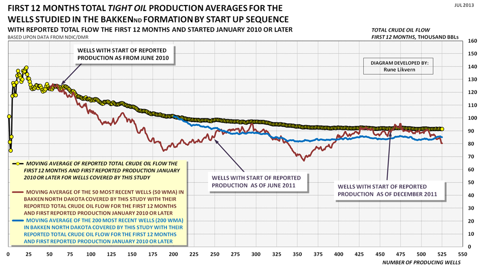
FIGURE 5: The chart above shows development in the sequential moving average of reported total flow for the first 12 months for wells studied and that was started as of January 2010 and through January 2012 (yellow circles connected by black line).
For 2010 and 2011 this represents around 26% of the wells started in the period.
The dark red line shows the sequential moving average of the most recent 50 wells (50 WMA; 50 Wells Moving Average). The blue line shows the sequential moving average of the most recent 200 wells (200 WMA; 200 Wells Moving Average).
The chart above documents that average well productivity has declined and stabilized at an average first 12 months total flow around 85 kb. Simulations with the reference well, (see also figure 2), now strongly suggests that the average well productivity has remained at this level through May 2013.
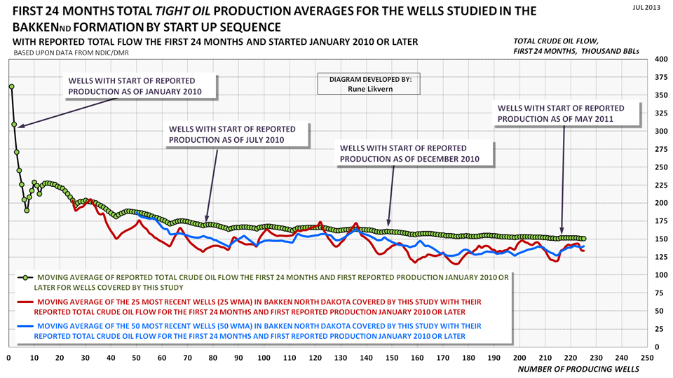
FIGURE 6: The chart above shows development in the sequential moving average of reported total flow for the first 24 months for the wells studied and that was started as of January 2010 and through May 2011 (green circles connected by black line). The dark red line shows the sequential moving average of the most recent 25 wells (25 WMA; 25 Wells Moving Average). The blue line shows the sequential moving average of the most recent 50 wells (50 WMA; 50 Wells Moving Average).
This represents around 21% of the wells started in the period.
After 2 years (24 months) of flow the pattern remains that of a general decline in total production for newer wells.
SUPPLEMENT DOCUMENTATION
All the wells studied have full time series with production data that was crosschecked against their totals by formation.
BREAKEVEN FLOWS
Breakeven costs may be a familiar term for most readers. However it is also possible to solve the equation to determine breakeven flows for shale/tight gas/oil wells.
FIGURE SD1: The chart above shows estimates from the equations solved on total number of barrels of oil for the first 12 months of flow to make breakeven at some well costs, realized oil prices and discount rates. Other economic assumptions as presented with figure 3.
How to read the chart: If the well cost is $9 Million and (average) realized oil price is $90/Bbl, the commercial prognosis for the well appears acceptable with a first 12 months total flow at 60 kb and above.
For the lower oil price of $80/Bbl (all other things remaining equal) the breakeven flow for the first 12 months moves up to around 70 kb.
Total early flow has the biggest influence on the NPV/IRR.
The chart above also illustrates how sensitive the commerciality of the well is to flow, oil price and well costs.
NORMAL DISTRIBUTION FOR ALL STUDIED WELLS
FIGURE SD2: The chart above is likely a more familiar representation for normal distribution of probabilities of productivity for the wells than what is shown in figure 4. The black line represents all the studied wells, the blue line shows the studied wells that started in 2010 and the red line the wells started H2 2011 (July – December 2011).
How to read the chart: The black line shows the normal distribution for all studied wells. It shows that 30% of all the wells had a first 12 months total flow of 60 kb or less. Alternatively 70% of the wells had a first 12 months total flow of 60 kb or more.
The chart documents how well productivity has declined from 2010 to H2 2011. Simulations with the reference well show that average well productivity has remained stable through May 2013 (see also figure 2).
WELLS WITH 24 MONTHS OF FLOW OR MORE
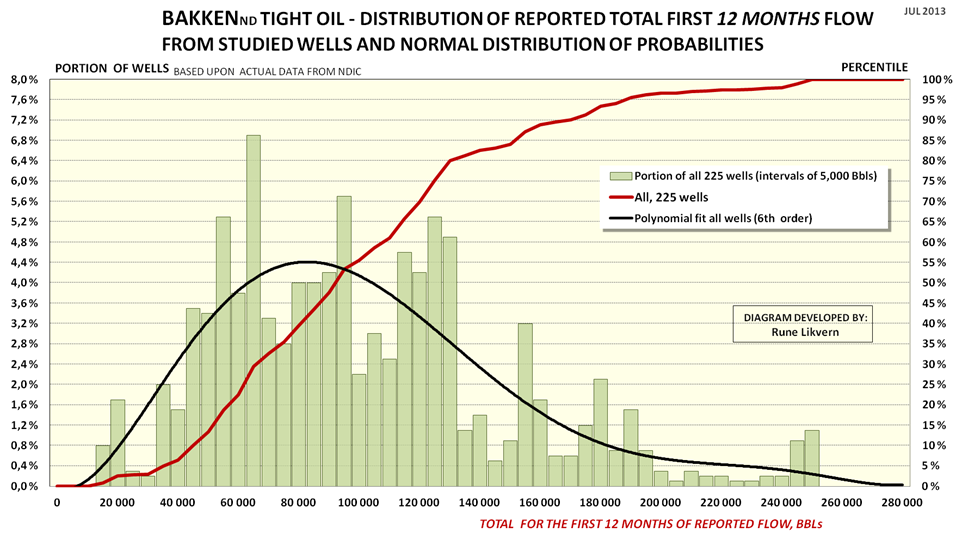
FIGURE SD3: The chart above shows distribution and normal distribution of the first 12 months total flow for the 225 tight oil wells in Bakken (ND) subjected to full time series analysis that as of April 2013 had 24 months or more of reported flow (these are wells started as from January 2010 through May 2011). The intervals used for the distribution (green columns, lh scale) in the chart are 5,000 Bbls and also shown is a polynomial fit of 6th order (black line, lh scale).
The chart also shows the normal distribution (plotted towards the rh scale) for the first 12 months total flow for the 225 wells (black line).
How to read the chart: The green columns show the distribution of first 12 months total production for all 225 wells (lh scale).
The black line shows the normal distribution of probabilities for the 225 studied wells, 50% had a first 12 months total flow around 86 kb or lower. Alternatively 50% of the wells had a first 12 months total flow around 86 kb or higher.
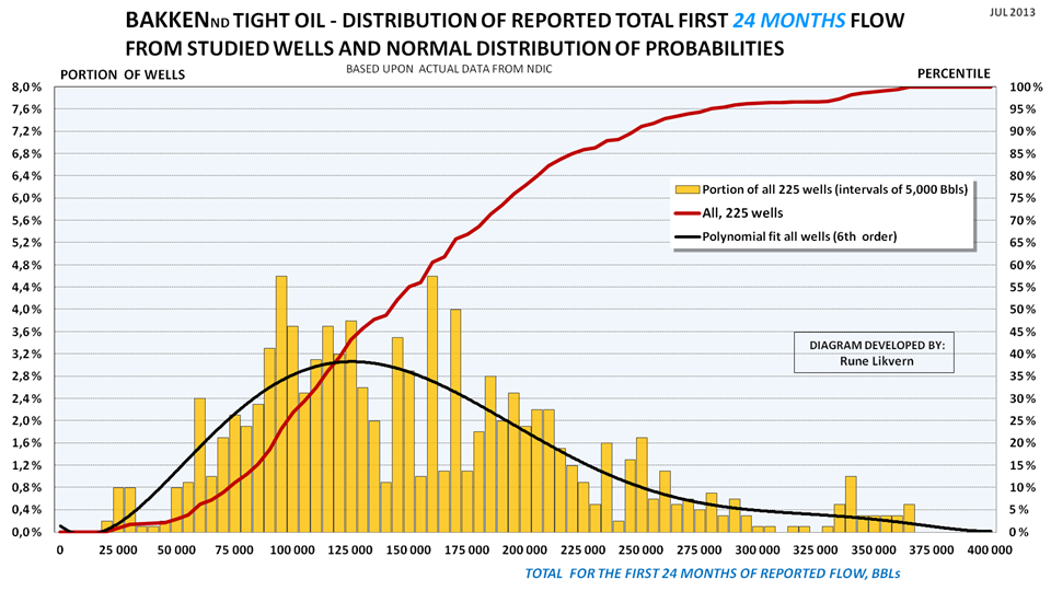
FIGURE SD4: The chart above shows distribution and normal distribution of the first 24 months total flow for the 225 tight oil wells (shown above in figure SD3) in Bakken (ND) subjected to full time series analysis that as of April 2013 had 24 months or more of reported flow (these are wells started as from January 2010 through May 2011). The intervals used for the distribution (orange columns, lh scale) in the chart are 5,000 Bbls and also shown is a polynomial fit of 6th order (black line, lh scale).
The chart also shows the normal distribution (plotted towards the rh scale) for the first 24 months total flow for the 225 wells (black line).
How to read the chart: Apply same principles as described with figure SD3.
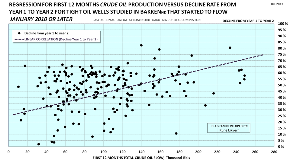
REGRESSION ANALYSIS OF DECLINE RATES FROM YEAR 1 TO YEAR 2
FIGURE SD5: The scatter chart shows decline rates with a linear regression for tight oil wells from year 1 to year 2 for 225 wells that started as from January 2010 and through May 2011 that had a history of 24 months of production or more as of April 2013.
A total of 1,070 wells started to produce during the abovementioned period that met the criteria.
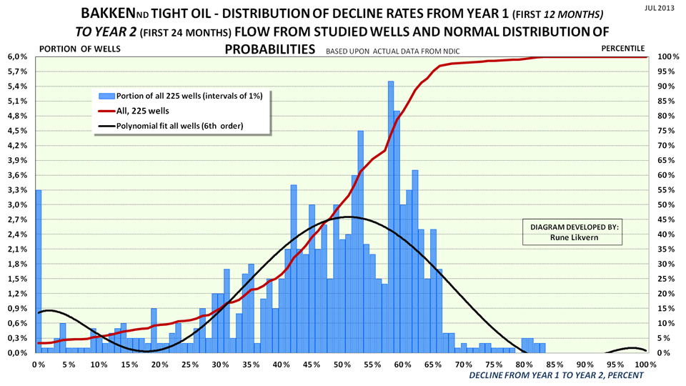
NORMAL DISTRIBUTION FOR DECLINE RATES FOR THE STUDIED WELLS
FIGURE SD6: Chart shows distribution of decline rates (blue columns, lh scale) from year 1 to year 2 at 1% intervals for the 225 wells (out of a total of 1,070) that was studied.
Also shown is the normal distribution of probabilities (red line) for decline rates from year 1 to year 2.
Note: a few wells (around 3%) had negative declines (growth) from year 1 to year 2.
Dry wells and wells shut in with less than 24 months flow are not included.
How to read the chart: 50% of the wells had decline rates (year 1 to year 2) at 50% or below, the other 50% had decline rates that ranged from 50% upwards to 85%.