
Peak Oil Projection Was Far Off? (Part 1)
Daniel Yergin, a Pulitzer Prize-winning historian and energy analyst, is one of the world’s greatest optimists about oil supplies. In “There Will Be Oil“—his article in the Wall Street Journal to plug his new book, The Quest—Yergin sums up a chapter of his book, the one about fears that the world will soon reach its peak of oil production. Yergin argues, however, that “on a global view, Hubbert’s Peak is still not in sight.”
 But the arguments in his article—and in his 800-page book—are full of gaping holes, so I’m going to dedicate a number of blog posts to sticking my head into a number of them. This post is the first in the series.
A bit of background: The idea of peak oil is that oil supplies are limited—they are not infinite, and not regenerating themselves anywhere near the speed at which we’re using them up—so production can’t go up and up forever. At some point, production will have to reach a peak, whether we like it or not. It’s possible that we would choose to give up on oil well before we hit any limits to supplies, but there’s no sign that’s happening.
So if we say that oil production could reach a peak despite our best intentions, the big question is: When would this happen? The timing of the peak is a huge issue, since it marks a turning point, from having more and more each year to coping with less and less. Having a way to predict when this will happen, even roughly, would be a huge benefit in planning where we’ll get more oil or alternatives. (Remember: oil is still the world’s top energy source, above coal and gas.)
The most prominent peak oil forecasts came from a geologist named M. King Hubbert, who worked at Shell for two decades, and who made a well-known prediction in 1956 that U.S. oil production would reach a peak around 1965 to 1970. This ran counter to what most of the industry was saying at the time, and many tried to shoot Hubbert down. But after the OPEC oil embargo of 1973, the U.S. fell into an energy crisis, and wasn’t able to boost its production back to earlier levels, even after furious drilling.
Yergin tells a version of this story about Hubbert’s prediction in his book, but doesn’t give Hubbert much credit for predicting the date of the peak. “Hubbert got the date right, but his projection on oil supply was far off,” Yergin writes on page 236.
But the numbers he states in the book unfairly make Hubbert’s prediction sound worse than it was. Yergin’s argument is undermined by his own company, CERA, in their 2006 report “Why the Peak Oil Theory Falls Down.” Here’s a graph from that report, comparing Hubbert’s prediction (made in 1956) and what actually happened.

(I pulled this graph from a blog post on a Chapel Hill, NC newspaper’s website, but I have seen the CERA report and can confirm that this same graph is in there.)
I’d say Hubbert’s prediction (the white triangles) seems pretty spot on, compared with the actual production for the lower 48 states (green squares)—especially considering he made the prediction in 1956, when production was still on the rise.
But CERA nitpicks, saying that actual production in 2005 was 66% higher than what Hubbert forecast—implying that Hubbert’s technique isn’t useful. That seems like bad enough hair-splitting.
In The Quest, though, Yergin goes a step further, comparing Hubbert’s prediction with the red line. The red line includes Alaska’s oil fields, which had yet to begin producing at the time of Hubbert’s forecast, so he intentionally left them out and stuck to the lower 48 states. Yet Yergin writes (p 236): “By 2010, U.S. production was four times higher than Hubbert had estimated.” This does make Hubbert sound far off the mark—but the graph above tells a completely different story.
Hubbert did get the overall shape and timing of the peak and decline correct, though, and I think he deserves a lot of credit for that—but Yergin seems to only begrudgingly accept this. He writes (p 235) that in the 1970s, “Hubbert appeared more than vindicated.”
But why did Hubbert only “appear” vindicated? Was his strikingly accurate forecast just luck? Yergin doesn’t say so directly, but he implies that he thinks it was luck, since he argues that Hubbert’s method doesn’t work in general. More on this in a later post.
One Giant Oil Field? (Part 2)
Daniel Yergin is a Pulitzer Prize-winning author and is “the prominent energy expert of our times,” according to a quote on the jacket of his new book, The Quest.
The book has already been hailed as “masterly” (Economist) and a “triumph” and “required reading” (Financial Times), and it’s on FT‘s short list for best business book of the year. All that praise makes it crucial to take a critical look at the book. Based on his reputation from having written the classic The Prize, I suspect many will likely take The Quest as gospel.
But in the new book has a chapter on peak oil—something The Prize barely touched on—but Yergin’s arguments are full of gaping holes and he gets many facts wrong—so many that it’s difficult to know where to start. So I’m breaking my critique into a series of blog posts; this is number two in the series. (See also “‘The Quest’ Questioned #1: Peak Oil Projection Was Far Off?“)
One of Yergin’s biggest blunders is that he thinks predictions of an approaching peak are based on an incredibly simplistic idea: that the whole world’s oil supplies can be treated as if they are in one huge oil field.
It seems ridiculous that anyone would think this was a useful way of trying to forecast oil production. And it is ridiculous. Yet that’s exactly how Yergin describes the work of M. King Hubbert, a geologist who worked for Shell oil for many years, and who is often called the “father of peak oil.”
In The Quest, Yergin writes: “Hubbert used a statistical approach to project the decline curve that one might encounter in some—but not all—oil fields, and then assume that the United States is one giant oil field.”
 This is completely wrong—and suggests that Yergin has never actually read the work by Hubbert that he cites in his book. Or perhaps he read it a long time ago and has since forgotten what Hubbert actually said—and all that was left in Yergin’s mind was a caricature of the idea.
Here’s a run-down of what Hubbert actually said in the 1956 paper that Yergin refers to, “Nuclear Power and the Fossil Fuels.”
In that paper, Hubbert never spoke of the production from individual fields, nor their decline rates. But he did go over the history of production from a couple of states—Ohio and Illinois—to show that smaller areas can have varied histories with ups and downs (see right).
Hubbert’s idea was that if you combine the production from a bunch of areas, despite these varied histories with their ups and downs, they would average out, adding up to give a fairly smooth curve. (A page from the Management School at the University of Liverpool, for example, has a nice graph that sums this up.)
In fact, at the time Hubbert made his 1956 prediction, it was easy to see that America’s oil production had been growing fairly smoothly throughout its history, despite the ups and downs of individual oil fields or particular states.
 As Hubbert showed in his paper, production had been soaring for decades (see graph at left). The two world wars don’t even show up in any obvious way. The Great Depression did put a dent in production, but only a small one, and after the first few years of the depression, the oil production picked up again at roughly its previous rate of growth.
To assume production will remain smooth and fairly predictable assumes, of course, no cataclysmic wars in the country you’re looking at, or other things that that which would disrupt oil production. But for the U.S., at Hubbert’s time, assuming that the future would continue in a smooth way was a fair assumption.
Hubbert then took widely accepted estimates of how much oil the country would produce over the long run, knowing that when oil did eventually run out, the production would have to drop to zero. And he knew the oil wouldn’t run out all of a sudden, like a car driven until its gas tank runs dry. Instead, as time went on, the country would have to go increasingly rely on oil fields that were smaller, deeper, and harder to access. And in that case, most likely the production would reach a maximum and then gradually taper off.
Given these general characteristics, Hubbert drew what he thought was the simplest kind of curve that would match the past, and that would encompass the oil the industry thought they had left to produce. That curve, below, was shaped like a bell. He never said that production had to follow this curve, but just that it was a good approximation for trying to roughly predict the future.
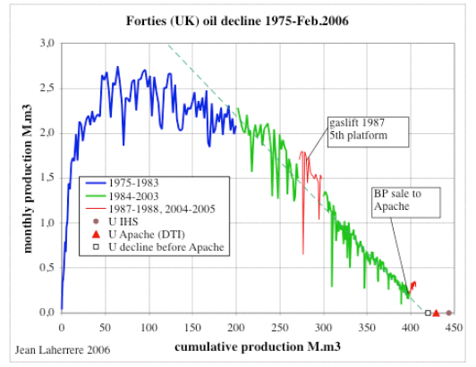
 Yet Yergin argues that Hubbert’s bell shaped curve is wrong, because that’s not the shape which most individual oil fields’ production curves. “Some oil fields do decline in this symmetrical fashion,” Yergin writes (p 238). “Most do not.” (Here’s a graph of the UK’s great Forties offshore oil field, for example, showing how production rose quickly, plateaued for a while, and then gradually declined.) So Yergin’s argument on this point is off-base; he’s attacking Hubbert for something he never said.
That aside, when we look at the history of U.S. production, it has actually been pretty symmetric, before and after the peak. Below is a graph from Yergin’s own company, CERA. (I pulled this graph from a blog post on a Chapel Hill, NC newspaper’s website under fair use—but I have seen the CERA report it comes from, so its legit.)
It shows that the production from the lower 48 states (the green line) has been very symmetrical. Even when you throw in Alaska to get the red line, it’s still fairly symmetrical. You could argue, I suppose, that there was a rough plateau for about 15 years, from 1970 to 1985. But even then, the rate of decline after the plateau has been roughly the same at the rate of increase before the peak.
 (By the way, in my previous post in this series on The Quest, I explained how Yergin nitpicks, and says that Hubbert was far off the mark. But I think the graph above—remember, it’s from Yergin’s own company—shows that Hubbert was amazingly close, especially considering he made his forecast in 1956, when production was still rising fast.)
So, to sum up, Yergin seems to have misunderstood one of the most basic things about how peak oil forecasters make their predictions, and misstated what Hubbert said. If Hubbert and his successors really did something as simplistic as what Yergin is suggesting, then it would be right to ridicule them. But given how badly Yergin mangles their ideas, it’s not clear he’s understood the ideas he’s trying to shoot down, so I don’t think his critique counts for much.
Michael Inman is a journalist who covers climate and energy issues. He regularly writes for National Geographic News, Nature Climate Change, and has a weekly column called The Climate Post. (Bio)

