


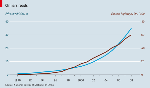
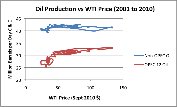
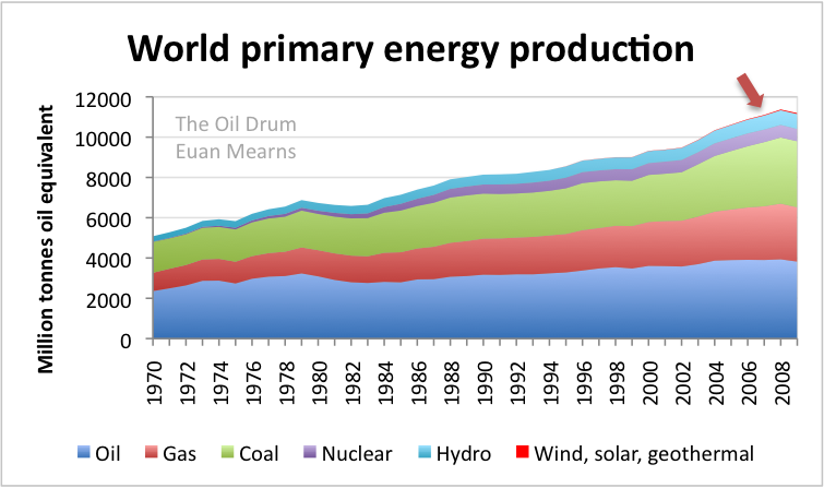
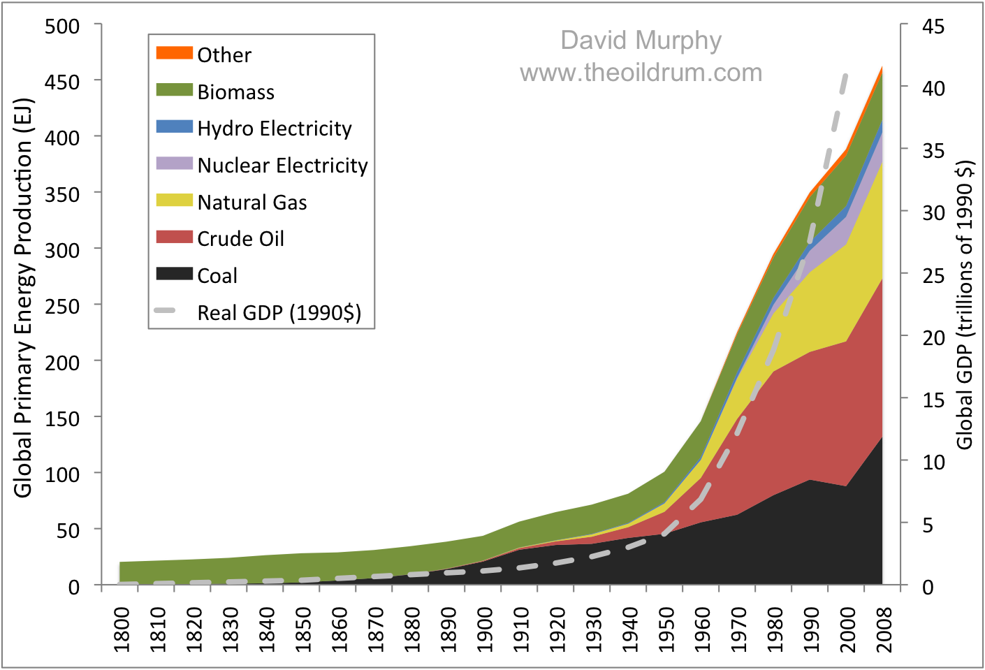
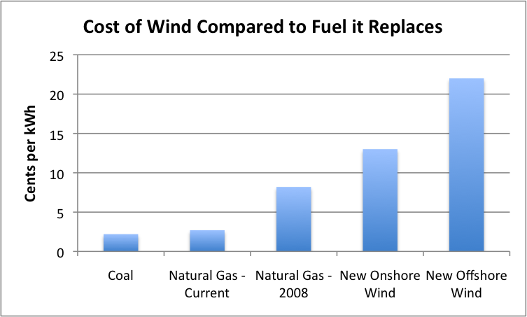
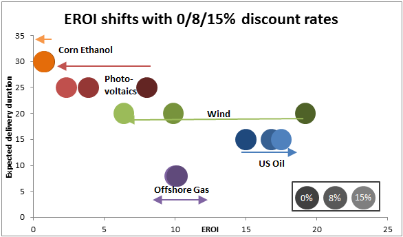
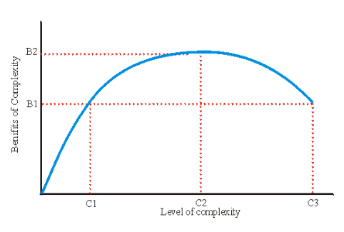
A picture says a thousand words. In this post you will find only charts and graphs conveying important points from the world of energy 2010.
Readers are invited to post their favorite charts from 2010 in the comments. Instructions are given at the end of this post. This is a charts only thread, no text at all (though posting links is OK), noncompliant posts will be deleted. An energy theme is preferred though other related themes such as economy, population, sustainability are acceptable. Climate charts that do not link directly to energy will be deleted.
Within a week or two TheOilDrum will host an open thread that will enable discussion of the charts posted, but today is New Year, discipline please – charts only. Thank you – and hopefully a happy 2011 to one and all.




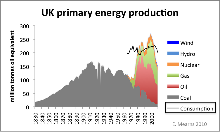

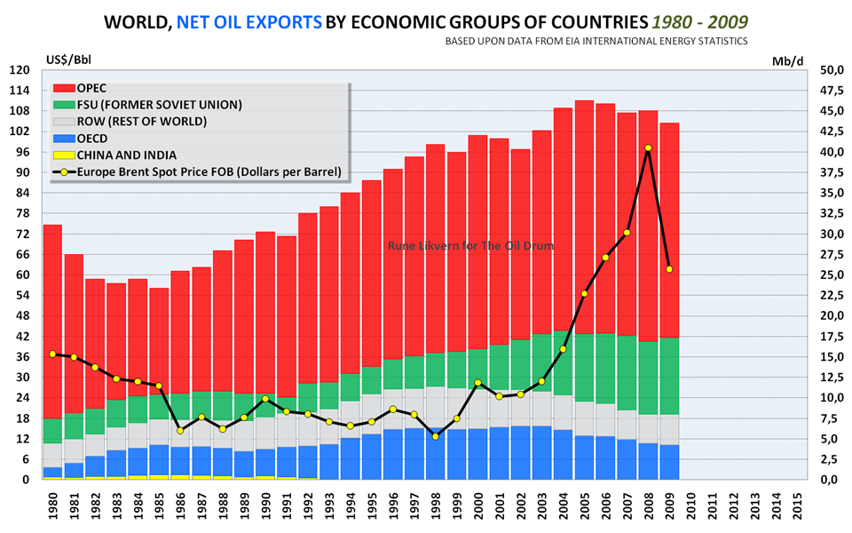
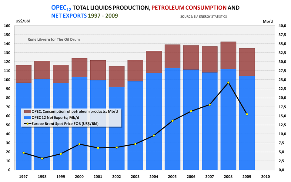
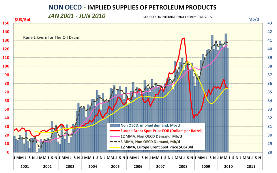



To add your own images, SEE INSTRUCTIONS AT ORIGINAL ARTICLE AT THE OIL DRUM



Comments
We changed commenting systems on September 10, 2026 as part of a site-wide functionality and security upgrade. Your past comments have not disappeared, and you can still log in with your old Disqus account credentials if you wish. Contact us with any questions.