
Sometimes considered a taboo subject, the issue of population runs as an undercurrent in virtually all discussions of modern challenges. Naturally, resource use, environmental pressures, climate change, food and water supply, and the health of the world’s fish and wildlife populations would all be non-issues if Earth enjoyed a human population of 100 million or less.
The subject is taboo for a few reasons. The suggestion that a smaller number would be nice begs the question of who we should eliminate, and who gets to decide such things. Also, the vast majority of people bring children into the world, and perhaps feel a personal sting when it is implied that such actions are part of the problem. I myself come from a long line of breeders, and perhaps you do too.
Recently, participating in a panel discussion in front of a room full of physics educators, I made the simple statement that “surplus energy grows babies.” This is motivated by my recognition that population growth bent upwards when widespread use of coal ushered in the Industrial Revolution and bent again when fossil fuels entered global agriculture in a big way during the Green Revolution. These are really just facets of the broader Fossil Fuel Revolution. I was challenged by a member of the audience with the glaringly obvious statement that population growth rates subside in energy-rich nations—the so-called demographic transition. How do these sentiments square against one another?
So in the spirit of looking at the numbers, let’s explore in particular various connections between population and energy. In the process I will expose the United States, rather than Africa, for instance, as the real problem when it comes to population growth.
A Brief Look at Population History
For many thousands of years following the end of the last Ice Age, human population rose steadily and slowly, at a rate of about 0.032% per year—translating into a leisurely doubling time of some 2000 years. About 3000 years ago, spreading agricultural practices led to a modest boost in growth rates. But the wild ride did not start in earnest until modern times.
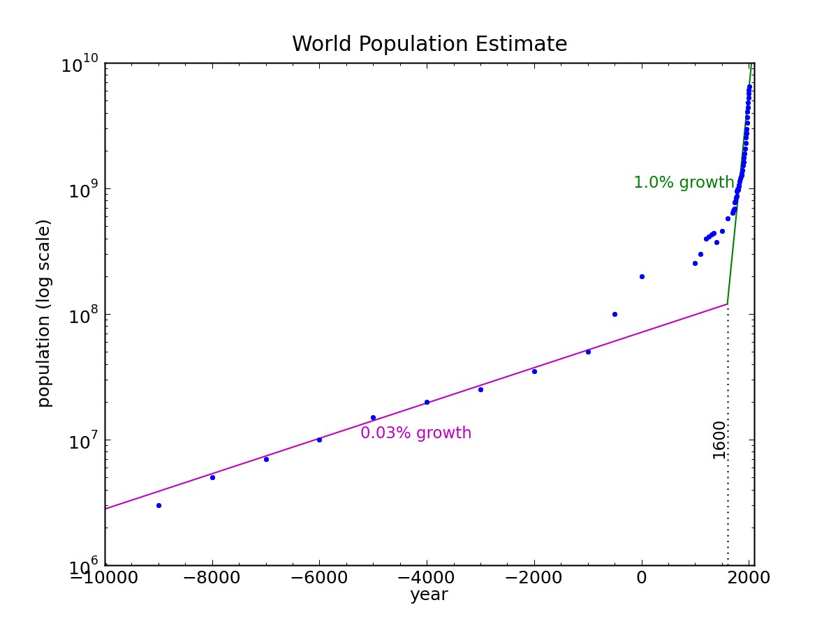
Lograithmic plot of historical world population, with two-segment exponential fit. Data from Wikipedia.
Even on a logarithmic plot—on which exponentials are tamed into straight lines—our population trend resembles the infamous “hockey stick” curve seen in so many domains (atmospheric CO2, global surface temperature, and practically any measure associated with human activity). A logarithmic hockey stick is truly scary. Because human impacts on the planet scale with population, it is not terribly surprising that a hockey-stick population curve should translate into hockey sticks everywhere. It is in this sense that population underlies nearly every issue and challenge of our times.
But what can we understand about population? What governs its rate? What accounts for the discontinuity in slope? Why did we leap into 1% growth and a 70 year doubling time in recent centuries?
One hint comes from a closer look at the recent history. Plotting global population in the last thousand years (below), we see a few breaks in the slope. For most of this period, we saw a modest 0.12% growth rate, amounting to a 600 year doubling time. Around 1700, the rate stepped up to 0.41%, doubling every 170 years. The next break happens around 1870, jumping to 0.82% and 85 years to double. Then around 1950, we see another factor-of-two rate jump to 1.7% and an impressively short 40 year doubling time.

Logarithmic plot of recent world population trend, broken into four exponential segments.
We can perhaps attribute the 1700 jump to the Renaissance and scientific progress. We learned to wash our hands after wrestling with our pigs, and that diseases were not caused by bad vapors conjured by impure thoughts. The jump around 1870 corresponds to the Industrial Revolution, in which coal transformed the production of steel (providing agricultural tools), rail transport of commodities, and began to mechanize agriculture in a limited way. 1950 marks the Green Revolution: full-scale petrolification of agriculture, accompanied by massive fertilizer campaigns using natural gas as the chemical feedstock.
This leads to a rather simple thesis: the surplus energy presented to us by fossil fuels allowed us to feed people more easily the world over. The bounty of fossil-fuel-turned-food encouraged an explosion in birth rates, as happens for virtually all organisms given similar circumstances. It’s so blindingly obvious that I am embarrassed to have belabored the point as long as I have.
Does Energy Grow Babies?
Surplus energy grows babies. That was my statement to the audience, based on the dots I connected above. So what about the astute comment that countries with the largest excesses display the weakest—and even negative—population growth rates? This statement also rings true, so how can we hold both thoughts in the head?
Before digging into data, I’ll share my intuitive response. Developing countries are recipients of food, medicine, and manufactured goods from the industrial nations of the world. Surplus energy “here” can grow babies “there.” Such redistribution seems plausible, in any case. But why energy rich nations slow down was less obvious to me, aside from increased education and greater autonomy of women.
Dump Truck of Data
Clear some space, because I’m about to back up a truck full of data and dump it on your lap. Mostly, it comes from the International Energy Agency’s Key World Energy Statistics, 2012. Ten pages in this publication contain tabular data on the world’s energy appetite, along with population, GDP, and CO2 emissions. A little cut-and-paste, editor magic, and Python parsing can turn this into a truckload of graphs. I added data on population growth rates, mostly from the CIA statistics. Spooky, yes, but these were the most up-to-date numbers on the Wikipedia page.
The IEA table includes 139 countries, but also aggregates several key groupings of countries in the world. Besides giving figures for the whole world, the seven groupings include:
- OECD (the Organization for Economic Cooperation and Development) includes the countries: Australia, Austria, Belgium, Canada, Chile, the Czech Republic, Denmark, Estonia, Finland, France, Germany, Greece, Hungary, Iceland, Ireland, Israel, Italy, Japan, Korea, Luxembourg, Mexico, the Netherlands, New Zealand, Norway, Poland, Portugal,the Slovak Republic, Slovenia, Spain, Sweden, Switzerland, Turkey, the United Kingdom and the United States.
- The Middle East includes: Bahrain, Islamic Republic of Iran, Iraq, Jordan, Kuwait, Lebanon, Oman, Qatar, Saudi Arabia, Syrian Arab Republic, United Arab Emirates and Yemen.
- Non-OECD Europe and Eurasia includes: Albania, Armenia, Azerbaijan, Belarus, Bosnia and Herzegovina, Bulgaria, Croatia, Cyprus, Georgia, Gibraltar, Kazakhstan, Kosovo, Kyrgyzstan, Latvia, Lithuania, the Former Yugoslav Republic of Macedonia, Malta, Republic of Moldova, Montenegro, Romania, Russian Federation, Serbia, Tajikistan, Turkmenistan, Ukraine and Uzbekistan.
- China includes mainland China and Hong Kong.
- Asia includes: Bangladesh, Brunei Darussalam, Cambodia, Chinese Taipei, India, Indonesia, Democratic People’s Republic of Korea, Malaysia, Mongolia, Myanmar, Nepal, Pakistan, Philippines, Singapore, Sri Lanka, Thailand, Vietnam and Other Asia.
- Non-OECD Americas captures: Argentina, Bolivia, Brazil, Colombia, Costa Rica, Cuba, Dominican Republic, Ecuador, El Salvador, Guatemala, Haiti, Honduras, Jamaica, Netherlands Antilles, Nicaragua, Panama, Paraguay, Peru, Trinidad and Tobago, Uruguay, Venezuela and Other Non-OECD Americas.
- Africa membership is self-evident.
Graph legends, in order to remain compact, leave off some of the qualifiers in the above list. Also, peripheral dots for individual countries are labeled in the graphs by an automated process. I did not make special effort to clean up unfortunate collisions between labels. I should also preface with a statement that the whole set of graphs to follow are not necessarily central to my main point. But I imagine they will be as interesting to many of you as they were to me, so why not make it an extravaganza?
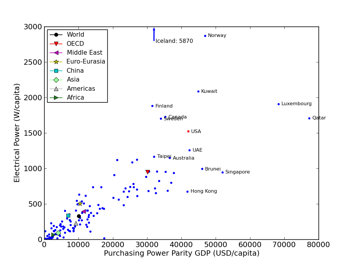
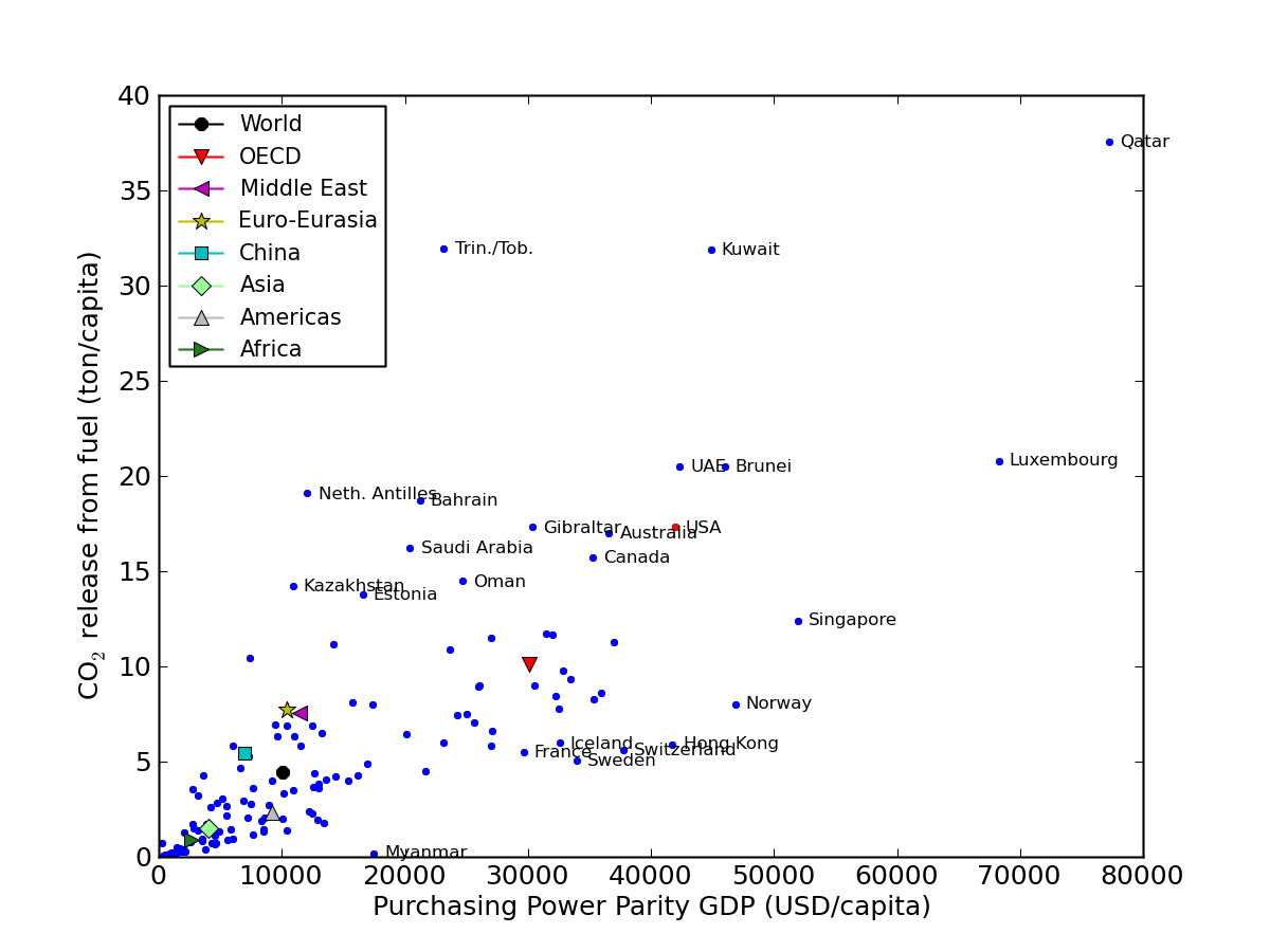
Let’s start with a look at a familiar plot of energy as a function of income (click to expand).

Rate of energy usage as a function of income for the world’s countries. Data from the IEA 2012 report.
I am using the purchasing power parity (PPP) flavor of GDP (gross domestic product), intended to put everyone on the same footing for meaningful income comparisons. I have converted the yearly per-capita energy into a power (Watts)—because that’s my favorite unit, and it gets away from “tons of oil equivalent,” as the original data are expressed. The trend is not at all surprising here: inhabitants of wealthy countries enjoy a greater rate of energy use, on average. Outliers are always interesting and instructive. The U.S. (always represented by a red dot on these plots) pushes well out from the pack in both dimensions, but not in an extreme way—ranking twelfth in total power per person and eighth in wealth. Some may recall from earlier posts the rule-of-thumb that Americans each run about 10 kW of power, equivalent to roughly 100 metabolic human (slave) equivalents.
Rate of delivered electricity as a function of income for the countries of the world.
Since it’s in the table, let’s look at what happens if we restrict our attention to energy in the form of electricity. Iceland was so outrageously high (about double the runner-up Norway) that I had to rescale the plot and indicate Iceland’s stratospheric datapoint. The U.S. ranks ninth in per-capita electricity usage. Note that the statistic is for delivered electrical power. The primary energy required to generate and deliver the electricity might run up to three times higher than the delivered rate, owing to typical 30–40% conversion efficiencies in power plants. For the U.S., electricity accounts for about 40% of primary energy, not 15% as a direct comparison of the previous two graphs might imply.
Before we circle back to population statistics, let’s take a look at how CO2 emissions stack up among the nations of the world.
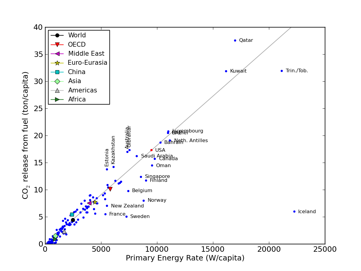
Per capita CO2 production as a function of energy usage rate for the countries of the world.
Most fundamental is the carbon intensity of energy production. Basic chemistry suggests that each gram of fossil fuel creates three grams of CO2 and delivers about 10 kcal, or 41840 J of energy. Running 10000 W for a year (3.155×10⁷ seconds) should therefore require 7.5 tons of fossil fuel, generating about 22 t of CO2. The graph above shows the typical U.S. citizen coming in at about 17.5 t of CO2 per year. This is short of our crude estimate because nuclear, hydroelectric, biomass, and other renewables account for almost 20% of the total energy, incurring effectively no carbon penalty (also, the U.S. comes in a little shy of 10 kW). Countries below the principal trend line have lower carbon intensities than the U.S. (1.82 t/yr per 1 kW of energy rate). Iceland is notable, getting abundant electrical power from geothermal sources.
CO2 production as a function of income for the countries of the world.
Now we pull income back into the mix to see how CO2 emission correlates to wealth. European OECD countries tend to appear on the “good” side of the correlation, while the Middle East tends to perform poorly by this measure.
Population Preview
Looking at the above graphs, we can learn something important about adding people to the planet. Adding a person in Africa has very little impact on energy use and (therefore) CO2 emissions compared to adding a person to the U.S., by a factor of 20. Picture an American baby 20 times bigger than an African baby. A Quatari towers 45 times higher than a typical African citizen when it comes to CO2. If one is inclined to think about where to limit population growth, the countries high on these graphs have their necks sticking out. Just sayin’.
Population Growth Correlations
So far, we’ve only looked at metrics present in the IEA Key World Energy Statistics publication. Now let’s add population growth rate and see how things stack up.
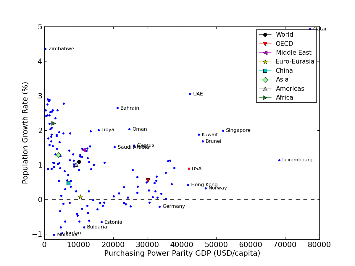
Population growth rates as a function of income.
First is the growth rate against average income. We have a clear correlation at the left edge: poorer countries have high growth rates, but rapidly dive to lower—and even negative—rates by about the time average earnings reach a quarter of those in the U.S. Then a funny thing happens: the cluster turns up again! This narrative-busting truth made me sit up straight, I’ll tell you. I fully expected a more-or-less smooth and gradual transition: rich means fewer offspring, according to the demographic transition idea. Granted, immigration plays a role here. It certainly is responsible for growth in the U.S. population. But it would be hard to convince me that the wholly lopsided statistics at higher incomes are all about immigration. Where are the rich nations with negative growth? After Germany, the negative growth countries are not to be found. Note that peeking out from behind the legend is Quatar, standing in open defiance of the “wealth reduces growth” mantra—boasting superlatives in both growth and income simultaneously.
Maybe this shouldn’t be too surprising from the perspective that economic powerhouses are dependent on growth, and a flagging population is a recipe for recession. A key ingredient for guaranteeing a bigger future is more working young people: in addition to providing labor, the growing youth enables pension systems and health insurance to function. Indeed, Germany is trying to battle its population decline, which imperils economic competitiveness. When I saw this article in the NYT, I lamented that the policy of protecting economic growth enslaves us to produce more children. I would rather humankind be the master of the economy, rather than the other way around. A quote from the article:
There is perhaps nowhere better than the German countryside to see the dawning impact of Europe’s plunge in fertility rates over the decades, a problem that has frightening implications for the economy and the psyche of the Continent.
How about the energy correlation, which I find more intrinsically interesting?

Population growth rates as a function of the rate of primary energy use.
Naturally, the existing correlation between energy and income sets us up to see a similar pattern emerge. And indeed we again see the fertility trough appear at modest energy rates. Aside from Trinidad and Tobago, no country with an energy usage rate higher than 7 kW cares to join the negative-growth club. If anything, I find this graph more compelling than the previous one: the U-shaped sweep is more apparent. Again, it is difficult to argue that increased availability of energy dials down the baby spigot.
And finally comes a plot that I found to be rather striking. The IEA statistics include measures of total energy production, consumption, and net imports/exports. So I looked at growth rate as a function of the fraction of a nation’s energy consumption that it produces.
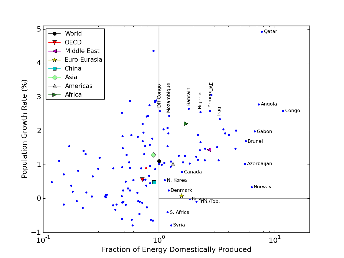
Population growth rates as a function of fractional energy produced by the country or region. Energy exporters are to the right of the vertical line.
I had to put the horizontal axis on a logarithmic scale to spread the points out reasonably. Many countries are cut off on the left-hand side (less than one-tenth of their energy consumption is domestically produced), but all net energy exporters are represented. We see that countries with surplus energy (the exporters) tend to be growers of population as well. To the left of the parity line (100 = 1 means balanced production and consumption), countries are far more likely to have lower or negative growth rates. Looking at the aggregate data points (colored shapes) perhaps reveals the correlation more strongly. Surplus energy tends to lead to surplus people, in our real world.
Collecting Thoughts
This is a complex topic. To do a thorough job I would have to disentangle immigration from domestic birthrates. But certainly the graphs above cast doubt on the intuitive story that nations rich in energy or money trend toward lower growth rates.
Why the U-shape tendency? The rapid downward slope is very likely due to improvements in education as nations have greater access to resources. Particularly important is the education of young women. Want to cut back on out-of-control pregnancy rates? Give the girls books. It’s much more than just educating women about birth control and reproduction, etc. Education empowers women to take jobs and make free choices. Lacking this, imported food financed by governments of industrial nations and by charities allows surplus to cross borders and provide the feedstock for new babies.
It makes me question the global benefit of increasing population by providing food assistance. I once contributed to such funds, but now find myself confused: what’s the plan, here? I get the humanitarian urge to support starving populations—really. This universal sympathy is part of human nature, but may become one of the forces that binds us to the railroad tracks leading to overpopulation and eventual collapse. That’s my concern. By supporting starving populations now, are we only doubling down so that the number of ultimate sufferers is larger? Is the bad news inevitable? Until I have a clearer picture, I’m somewhat paralyzed in my intrinsic desire to offer support.
In any case, it is easy enough to find reasons why the growth rate should plummet as energy/wealth break free from the bottom of the barrel. But why the reversal? One way to answer is to ask: why did the U.S. experience a baby boom after World War II? Significantly, the U.S. dominated oil production in this period: we were to the world then what the Middle East is now. Times were swell. We were full of hope and optimism, and believed we could do anything. That’s good baby-making weather, folks. We make decisions about what we can afford to support based on current conditions and some sense of the brightness of the future. Energy surplus, combined with a primal instinct for passing our genes and raising families, sets us up on a predictable path.
Where is the Real Population Problem?
We in the Western World tend to point the finger at developing countries as being the major culprit for population growth. And it is true that the fractional growth rates in such places is alarming, with doubling times of a few decades. We are justified in wondering how this population will be fed.
But we also saw that in terms of resource consumption, adding a Quatari is about 45 times worse than adding an average African. Adding a U.S. citizen is about 20 times worse. Yet what does it really matter how extravagant the life of an average Quatari, Kuwaiti, Trinidad & Tobagan, or Luxembourgian is? These are small countries. Shouldn’t our concern land on places like India or China? Couple large populations with aggressive development, and these countries stand to change the global calculus rather dramatically.
Given data on the population and growth rate, we easily compute the number of people added per year in each country. Now let’s assume that the added people share the average conditions of the nation as a whole. So we can multiply the number of people added by the national per-capita energy use to get a total amount of energy demand added to the planet because of population growth. Off to the graphs…

Annual absolute energy demand added as a result of population growth, as a function of the number of people added per year.
India adds about 15 million people per year (wow). China adds a little over 6 million. Nigeria is next, at about 4 million. Then we have the U.S., adding 3 million per year. But of those, the U.S. is the hungriest in energy terms. The graph shows how many petajoules (PJ) of demand are added each year per country due to population growth (other factors can also contribute to energy growth or decline; here we isolate the population portion). For reference, the entire world’s annual appetite is 530,000 PJ. What we see is that population growth in the U.S. is adding energy demand faster than any nation on Earth. China and India are also important (and in absolute terms they are certainly more important energy growers, due to a rapidly changing standard of living). But the answer to the question: who’s population growth is having the largest effect on global energy demand?—it’s the U.S.
One could easily argue that over the lifetimes of the newly added, ultimate energy additions due to China’s present population growth will outstrip those from America because of the changing standard of living. Firstly, it is not crystal clear how long the Chinese juggernaut will last against the unknown challenges of the future. But perhaps more important is that jostling for top position could obscure the glaring outcome evident in the graph. It’s the U.S., China, and India where population growth is driving global increase in resource demand—to the extent that energy is a proxy for generic resources. The rest of the world is of secondary importance on this score. Where is population growth putting the biggest squeeze on resources? It’s these three countries, with the U.S. presently well ahead of the others. Meanwhile, the Ukraine is doing the best job of removing demand from the world.

Annual electrical power capacity added as a result of population growth, as a function of the number of people added per year.
The electricity story is similar. Population growth in the U.S. is driving the addition of about 4 GW of annual electrical generation capacity. Again, China and India are on the map, with the rest of the world crowded into the lower-left corner.

Annual absolute CO2 added as a result of population growth, as a function of the number of people added per year.
Something moderately interesting happens when we cast the plot in terms of CO2. Because India and China use “dirtier” energy sources, in terms of CO2, the gap between the U.S. and China/India is reduced. The U.S. still stays on top, but less overwhelmingly so. Some Middle-Eastern countries are straining to break away from the pack as well—but not in a good way.
Child Free by Choice
The list of reasons for why my wife and I decided not to have kids is long (not to say that we did not also see benefits). This post gets at one of the facets. Adding a child in the U.S. has a disproportionately large impact on global resources, whose finite nature is becoming increasingly apparent. At some level, ours is an attempt to arrest the innate human drive to reproduce (which I do share), because this results in adding more people to the planet—perhaps not the wisest course at present. Parents readily portray our choice as selfish—probably because we have more freedom in how we spend our time. But selfish arguments are destined to fail: virtually all choices humans make involve self-consideration, and therefore have a selfish component. Flipping the argument around, by not having kids, we deprive ourselves of: the undeniable joys of parenthood (mixed with occasional exasperation); potential caretakers as we age and lose facilities; and a genetic link to the future. In part, I forfeit these advantages because I have trouble justifying why my personal needs should come at an outsized cost to a unprecedentedly challenged civilization. In this way, I can just as easily cast the decision to have kids as the selfish choice. Not popular with the breeding sort: people don’t appreciate being labeled as selfish. I expect a few howls.
Oil-Clouded Crystal Ball
I try to be careful not to convey certainty about the future—which I note is not a behavior i often witness from optimists. Rather, I try to point out distinct possibilities that we collectively tend to ignore or deny. Only via increased awareness to neglected issues can I ever hope to be proven wrong in my concern. That would be a lovely outcome, and in fact is the whole point for me.
We are in the midst of an unplanned experiment of unprecedented scale. We have 7 billion people on the planet, growing at almost three new (net) people per second. It’s an uncontrolled mad dash into the future. One could imagine metaphorical scenarios of crashing into a brick wall or running off a cliff, exhausting ourselves and stopping to catch our breath, or leaping into space to leave the planet. I certainly have my guesses, but I can’t spell out an unwritten future.
I dredge back up the single-most important graphic that informs my world-view. We know that fossil fuels have far-and-away dominated the scale of our energy use, and that these are finite resources. We can therefore make the following plot with some confidence. I am especially confident about the big question mark in the future.
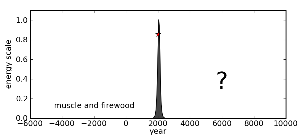
On the long view, the fossil fuel age is a blip, with a down side mirroring the (more fun) up side.
To the extent that surplus energy is responsible for the population boom, does the symmetry of the fossil fuel curve carry predictive power for population as well? These curves have been historically tied together. The burden of proof is on the optimists who presume that we can break the dependence. In a prior post, I emphasized the difficulties associated with breaking from this curve. Another post tabulates the relative superiority of fossil fuels over present-day alternatives, amplifying the challenge. It is not physically impossible, but supporting billions of people on this planet for the long haul is not something we are proving adept at doing. When the historical record is riddled with examples of civilizations peaking, overreaching, and collapsing, it becomes rather difficult to subscribe to the notion that this time is different, when faced with so many monumental and simultaneous challenges.
Population, as a reflection of human nature, may well be the mother of all challenges. Tightly bound to resource demands, the problem isn’t going to go away by ignoring our own personal roles and instead focusing attention on poor nations half-a-world away. Economic growth incentivizes population growth, which plays right into our biological desires. It would be refreshing to no longer be enslaved as victims to either of these forces. Otherwise we don’t really get to write our own future. And nature doesn’t care if we don’t understand.