 A short while back, I described my standalone (off-grid) urban photovoltaic (PV) energy system. At the time, I promised a follow-up piece evaluating the realized efficiency of the system. What was I thinking? The resulting analysis is a lot of work! But it was good for me, and hopefully it will be useful to some of you lot as well. I’ll go ahead and give you the final answer: 62%. So you could peel away now and risk using this number out of context, or you could come with me into the rabbit hole…
System Recap
I started small, with two panels and a handful of parts. Intent on learning the ropes, I built two independent systems—one for each panel. I described the initial system(s) in a 2008 article in Physics Today. The system has since evolved to the point that I now have eight 130 W panels and four golf-cart batteries providing 60% of my home electricity needs. Primarily, the system powers our refrigerator, attic fan, television and associated entertainment components, two laptop computers, the cable modem and wireless hub, and a printer. Occasionally I’ll throw something else on the PV (in much the same way an Australian might casually throw some shrimp on the “barbie”). The current system is described in an earlier post.
I now have two-and-a-half years of stable operation/configuration, and I collect data as impulsively as a squirrel collects nuts. I use the Pentametric system to measure three currents and two voltages in the system, which lets me monitor energy use, battery health, etc. I collect the data in five minute intervals (accumulated, not sampled), and have nearly uninterrupted data spanning years. Are you ready for me to unload it on you?
What’s Being Measured?
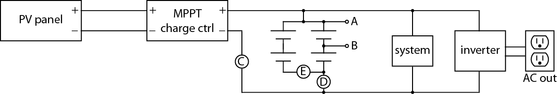
Placement of measurements within the system: three currents and two voltages. In practice, currents are measured on the negative (neutral) lead.
Almost all of the analysis to follow comes from the Pentametric dataset. Currently I have the system configured to monitor:
- VA: the battery bank voltage, across the 2×2 series/parallel arrangement of 12 V golf-cart batteries;
- VB: a mid-point voltage on one of the two battery chains, of secondary value;
- IC: the current supplied by the charge controller into the rest of the system;
- ID: the net current into/out-of the battery bank;
- IE: the net current through a single parallel chain of the battery bank.
VA times IC gives the power delivered by the charge controller. We’ll call this PMPPT, where MPPT stands for the maximum power-point tracker charge controller. VA times ID gives the net power going into or emerging from the battery, which we’ll call Pbatt. ID minus IE gives the current in the other (unmonitored) battery chain, for checking that one chain is not unequally splitting the workload. Once we account for any input current from the solar side, and the net current into the battery, the difference constitutes the total load. At night, when the solar current is zero, the story is simple: the battery must do all the work, so whatever current escapes is going to the load. In the daytime, the battery may or may not be receiving charge depending on whether the solar input exceeds load demand at that moment.
A Peek at the Data
So what kind of information can we get from the above data? The plot below represents a simplified version (leaving out the battery competition piece) of something I look at daily to check the system performance.
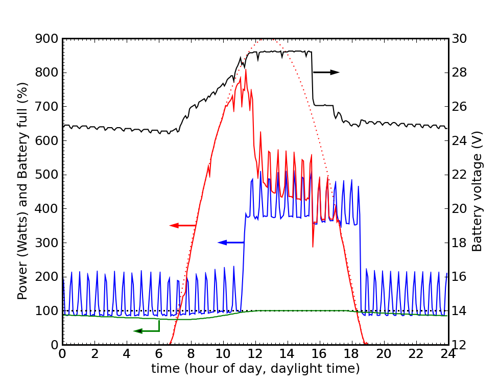
One day of PV generation in early May 2011. The red curve is the solar input, showing also a dotted line cosine function. The blue load curve is visually dominated by refrigerator cycles, showing also a large contribution from the attic fan in the afternoon. The black line is the battery, referenced to the scale on the right. Once the battery reaches is absorb-state voltage, the charge controller accepts a diminishing amount of solar input while holding the battery voltage steady. The green curve at bottom represents the battery state of charge, as computed by the Pentametric system.
Lots going on here. The red curve that starts out smooth and becomes jagged is the solar input (more exactly, the charge controller output, PMPPT). In a grid-tied system, without having to cater to a stuffed battery, the solar curve would resemble the dotted red curve in the absence of any clouds. The gap between the two red curves indicates the rejected solar resource: part of the cost of maintaining well-conditioned batteries.
The blue curve is the load. All the spikes are from the refrigerator, and the attic fan makes the big bulge mid-day. The attic fan begins demanding juice right about the time the battery is full and begins to refuse more food. This makes for a beautiful pairing: the attic fan only activates on sunny summer days, when the solar resource is abundant, and the batteries are mostly recharged by noon. The baseline is comprised of the constant load of modem/wireless, a 20 W TiVo (since eliminated), standby power of various devices, the inverter baseline power, and the power provided to PV system components (monitoring, communications, etc.). I can tell from the plot that no television activity took place that particular evening. Actually, we were in Seattle, so the house was pretty quiet.
The black curve is the battery voltage (right-hand scale). Every fridge cycle takes a small bite out of the voltage, until the battery reaches its “full” voltage, and transitions from “bulk” charging to “absorb state” charging. After some preset amount of absorb time (4 hours in my system), the battery is declared to be full, and put on a trickle diet called “float” stage. At this point, you can see the power supplied by solar (red) is barely higher than the load voltage (blue). It takes only about 10 W to maintain the float state. At about 5 PM, the solar input fell below the load demand (attic fan still on), and the battery voltage began to sag as it discharged—the system no longer rejecting incoming energy. When the attic fan shut off, the battery voltage recovered slightly before beginning its long nightly decline, scalloped by fridge bites.
Note also the declining amount of power needed to maintain absorb state, ultimately settling to a level a bit over 50 W. Each time the refrigerator comes on, more solar power is demanded, but always about 50 W more, so the battery sees the same net input. A clever load may be able to just match the difference between supply and demand. The attic fan approximates this function, but only crudely so. I do have some control, in that I can flip a switch and put the attic fan back on utility. In hot streaks, the attic fan can become a bit much for the PV system.
Finally, the green curve at bottom is the battery state of charge. It’s pegged at 100% for most of the afternoon, declining to about 70% by the end of the night. In warmer weather (in a non air-conditioned house), the refrigerator demands more power, so the battery sees more overnight drain. But in this sense, the supply and demand are somewhat matched. The refrigerator demands less energy in winter, when less solar energy is available.
Energy Produced
Before we talk efficiency, let’s just have a look at the energy haul over the last 30 months. Presto—we have a graph:
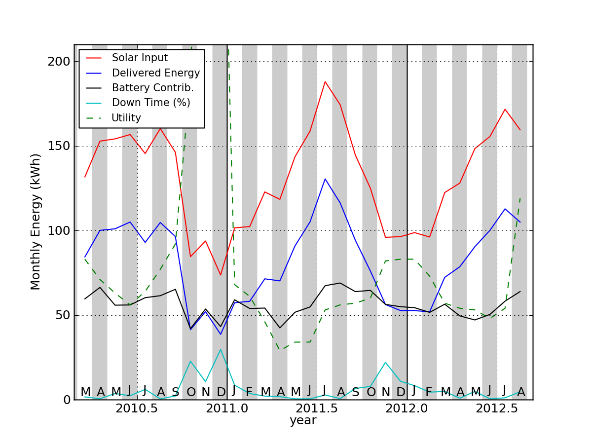
Energy scorecard for my system these past years, in monthly kWh. Utility electricity is shown for comparison, and the “down time” is in percent. The battery contribution should be compared to the solar input curve, rather than to blue curve. Alternating bars denote months, labeled across the bottom.
Obviously more solar energy is harnessed in the summer months. Various inefficiencies knock the energy down from the red curve to the blue curve by the time the energy is delivered indoors. The black curve is how much energy came out of the battery, but before inefficiencies are tallied. So it is best compared against the red curve (also pre-efficiency-cut) to get a sense for the role that batteries play throughout the year (more important in winter). The worst system down-time was December 2010, when clouds kept the system shut down for 220 hours, or 29% of the time, at one point being down for five days straight.
The green dashed curve representing utility power has three noteworthy anomalies. In the Fall of 2010, we had a housesitter, who used 190, 464, and 389 kWh in three months, blowing our typical 60 kWh out of the water. Second, we were away during the Spring of 2011, this time producing an anomalously low utility footprint. Finally, August 2012 featured a two day air-conditioning experiment featured in a recent Do the Math post. Yeah, that’s going to leave a mark. Look at the sacrifices I make for you folks!
System Efficiency
So how well does the system perform, after we account for all the nickel-and-dime tolls of inefficient components? To answer this, we need a model for the energy flow in the system.
We’ll start with the solar input. Sure, the PV panels convert about 16% of incident radiant energy into useful electrical power, and I lose something like 2% in the delivery wires. But let’s start our accounting where the wires meet the charge controller. We denote efficiencies by the Greek letter, eta (η). The power delivered by the MPPT charge controller is PMPPT = ηMPPTPsun, where Psun is the input solar power at the end of the delivery wire. So the MPPT (muppet) takes a little off the top.
The positive output terminal of the charge controller is common to the entire system: the battery, inverter, and any auxiliary devices are connected to this node. So power flows to the inverter, to the system components, and alternately to and from the battery from this point. The battery is not 100% efficient at storing energy, so more energy is put in than extracted, on balance. We can therefore imagine a net flow of power from the charge controller to all components.
What we care about at the end of the day is how much energy (or average power) is delivered to AC devices within the house. All of this must channel through the inverter (I use no DC appliances in my house).
The inverter takes some power in, and delivers less out. In practice, it looks like Pdeliv = ηinvPinv, where ηinv ˜ 0.885 for my system (measured numerous ways using Kill-A-Watt and Pentametric in tandem), and Pinv is the input power destined for delivery to an appliance. But that’s not the whole inverter story. The inverter takes an additional constant power draw, even to sit idle—another special “feature” of off-grid systems. For my inverter, this is a maddening 20 W! We’ll call this Pbase.
To round things out, we have net power going into the battery, Pbat (on a long time average, the battery is a net drain). And we have various devices, like the monitor, the display, the communication hub, the “Mate” display, and the terminal server for internet connectivity. These are DC devices that pull power directly from the DC system, bypassing the inverter. We’ll call power going to this amalgam Psys.
So are you ready? We end up with a power available for conversion at the inverter:
Pinv = PMPPT – Pbat – Psys – Pbase.
You with me? This just says that the charge controller is nice enough to provide energy to the system, but lots of hungry mouths just take and take, reducing the amount available for conversion to AC power. At least the battery regurgitates some of its intake when needed—but always keeping a little for itself.
So we can form an end-to-end expression by sticking in the efficiencies, ηMPPT and ηinv:
Pdeliv = (PsunηMPPT – Pbat – Psys – Pbase)ηinv.
Okay, so this is the master efficiency equation. Once we compute Pdeliv, we can compare this to Psun to get a total system efficiency: ηtot = Pdeliv/Psun.
Direct measurements from the Pentametric tell me PMPPT = ICVA and Pbatt = IDVA. I know that when the inverter determines that the batteries are low and switches to utility input, all that’s left loading the system is Psys, which I measure to be 9 W. I also know that when I unplug all devices from the AC delivery system, all that’s left is Psys + Pbase, from which I learn that Pbase = 20 W. In performing the computation, I must also be cognizant of when the inverter is on or off, so that Pbase is not always counted.
So we’re almost there. The last piece is ηMPPT, which I am not outfitted to measure directly (would need the Septametric, not yet marketed). Fortunately, the Outback company provides excellent data on their products, and they have a set of graphs for different configurations of their MX60 charge controller. For my setup, the curve they provide is reasonably fit by ηMPPT ˜ 0.991 – 13.5/PMPPT. This means that if I’m pulling 500 W through the charge controller, it’s expected to be 96.4% efficient, losing something like 18 W in the conversion.
Right. When we put it all together, my system over the last 30 months averages—you guessed it—ηtot = 62.2% efficient. Over this time, my system received an average of 4.3 kWh of input per day, and delivered an average 2.7 kWh into the house. Over the last 20 months (for which I have TED data), our average utility energy use is 1.8 kWh per day. That makes for a total daily electricity use of 4.5 kWh, 60% of which is from the PV system. The inverter was on 94% of the time, the other 6% spent rerouting utility power while waiting for the Sun’s return.
A Step Backward
Hold on. I have 8×130 W panels on the roof, for a total of 1040 W. According to the NREL database (see my exposition of this), San Diego should be getting about 5.7 kWh per day for each 1000 W of panel. I should be receiving 5.9 kWh per day, not 4.3 kWh. The implied mystery efficiency is around 75%.
Two things are happening here. The lesser evil is that my panels are not free of shading influences, especially in winter afternoons. But more important is that I have batteries. If the system is designed appropriately, batteries are periodically fully charged, and refuse some potential power. This is a practical inevitability with battery-based systems: if you want the batteries to properly charge, occasionally equalize, and thus live longer, you must be prepared to reject excess power sometimes.
Conveniently, some friends of mine have a ~2.6 kW grid-tied PV system (12×216 W panels) on a roof only a few miles (km) from my house. The system has excellent exposure, and an online database I can access. If I select sunny days when my batteries never reached absorb state (digging their way out of a deficit from days prior), and thus never rejected any incoming power, I can compare our systems and see that my friends reap about 2.65 times the energy that I do on these days. Armed with this conversion factor, I can now look at any and all days to learn how much energy I would expect to collect if my stupid batteries didn’t refuse extra juice. I find that on average my system accepts 87% of the energy that would nominally be available. Not terribly bad. On a monthly basis, the worst case is 72%. I’m not entirely accounting for my 25% shortfall of the NREL expectation, but I’ve closed the gap.

Above is a plot of the monthly system efficiency (the one that averages to 62%, weighted by energy, not by month), in black. Also plotted (in blue) is the fraction I capture relative to what I would expect from scaling my friends’ PV performance. The red dotted line is the combined effect. Incorporating this, I get a net performance compared to a grid-tied system of 55%.
One oddity of the plot above is a few months when my system appears to be getting nearly 100% of the available energy. This tends to happen in months plagued by a marine layer of clouds. The ragged clouds dissipate sooner the farther one lives from the ocean. My house is a bit farther from the ocean than my friends’ house, so I could easily believe that I’m receiving more direct sun on a number of these days, boosting my figures a bit. It is also true that the attic fan taxes the system in the summer, so I spend less time in absorb state rejecting power. I more efficiently grab solar energy, but at the expense of not fully satisfying the fussy batteries.
Component Efficiency
From before, we saw that my off-grid system converts 62% of the solar energy it accepts into energy we use in the house. Where does the other 38% go? We can reframe the problem into additive (subtractive) component contributions, fcomp, such that:
ηtot = (1 – fMPPT – finv – fbat – fsys – fbase).
We additionally stipulate that
(1 – fMPPT – finv) = ηMPPT×ηinv,
and that the ratio (1 – fMPPT)/(1 – finv) is equal to ηMPPT/ηinv.
Doing this, I get that fMPPT = 0.048; finv = 0.112; fbat = 0.080; fsys = 0.044; and fbase = 0.093. In other words, out of the missing 38%, inverter inefficiency takes the largest, 11.2% bite. The DC components in the system take a 4.4% bite, and so on. They add to 38%. A plot shows trends over time.
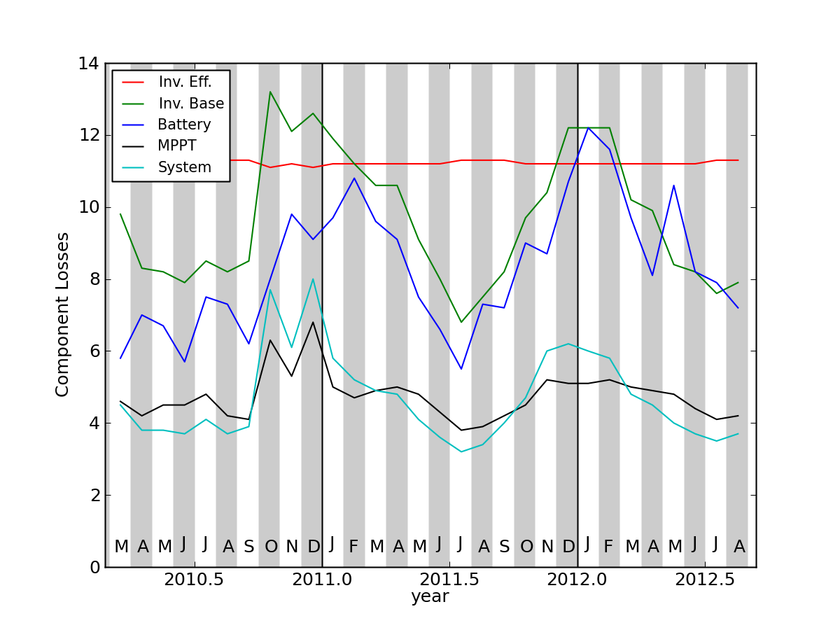
In the winter, when the attic fan does not blow, and the refrigerator cycles less frequently, the inverter baseload becomes a more prominent fractional draw. Long winter nights and winter storms also mean that the batteries spend more time contributing power, and at a lower average state of charge. More of the system energy goes into charging batteries during this time of year, increasing their contribution to inefficiency.
A Look at the Batteries
It’s a lot for one post, I know. But the battery part probably doesn’t justify a post of its own, and we’ve come this far. So one more bit of exploration…
We can monitor how much current runs into and out of the batteries. The current times voltage is the power in or out. If we just count current, the relevant metric is current times time, or amp-hours (Ah). A battery is rated for how many amp-hours it can provide. For my system, I see a 92% charge efficiency, meaning if I put 100 Ah into the battery, I’ll get 92 Ah back. Energy efficiency is not quite this good, because the battery is at a higher voltage when putting charge in (look at battery charge curve in the first graph). Putting 1 Ah into a battery at 27 V will cost 27 Wh. But pulling that same 1 Ah back out at 24 V will only deliver 24 Wh of energy. So it goes. I get 83% energy efficiency on the average. Not terrible, all things considered.
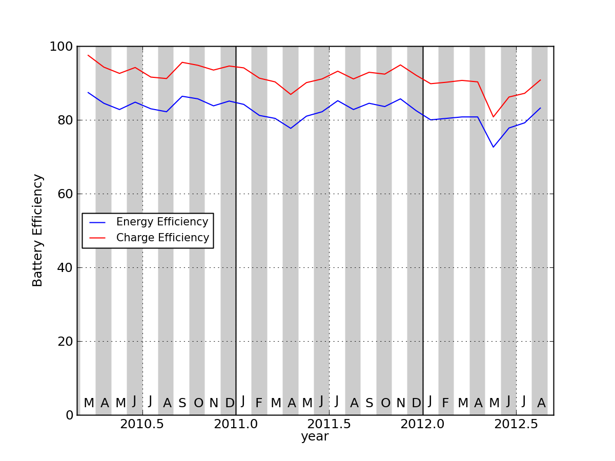
Above is a month-by month plot of the charge efficiency (red) and the energy efficiency (blue). Looks like perhaps a bit of decline with time.
If your wits have not been overly dulled by this long post, you might have caught yourself wondering how I can tell you that the batteries are 83% energy efficient, yet earlier computed fbat = 0.080, or an 8% effect. Why not 17%? What am I hiding?
The key is that the batteries do not supply all the energy to the inverter/system. Generally speaking, this happens at night. And generally nights comprise half the time. Also relevant is when the big loads are demanded. Our use of an attic fan shifts load demand to the daytime, so much of the energy input from the sun goes to directly driving appliances while the batteries are being charged in parallel. It so happens that over the last 30 months, I compute that 50.2% of the total system load has been sourced from the battery. If we had no night-time loads, this number would drop, and if we had only night-time loads, it would approach 100%. It’s almost coincidental that I land so close to 50%. But 50% of the 17% energy deficit is pretty close to our 8% decomposition.
Battery Health
I can also look at battery health in one other way. The Pentametric knows my battery amp-hour rating (though I lied to it and said they were 125 Ah, not 150 Ah batteries). As it watches current flow in and out, it keeps track of the state of charge, accounting for a nominal charge efficiency. When it senses a successful absorb condition (high voltage, low current demand), it resets to 100%. In practice, this dead-reckoning comes out pretty close to the mark, so that the 100% recalibration is hardly needed.
But as the battery wears down, its capacity diminishes, so the same energy withdrawal will leave the system more depleted, showing a lower voltage. The manufacturer of my batteries (Trojan T-1275) provided a table of numbers for state of charge (%) and associated voltage at zero current draw. It’s that last bit that really catches. An active PV system never has the batteries disconnected and seeing zero current (especially not for the recommended few hours before the voltage settles to a reliable value). What to do?
Well, if we can develop a relationship between voltage, state of charge, and power output of the battery, we can “correct” to zero power, yes? Looking only at times when it’s dark (so the battery is only in discharge), we can try to fit the observed voltage with a simple function like V = V0 + a×SOC + b×P, where V0 is the (unknown) voltage of a dead battery at zero load, SOC is the state of charge (%), and P is the load (negative), in Watts; a and b are coefficients to be discovered. The ideal fully charged voltage at zero load becomes Vfull = V0 + 100a.
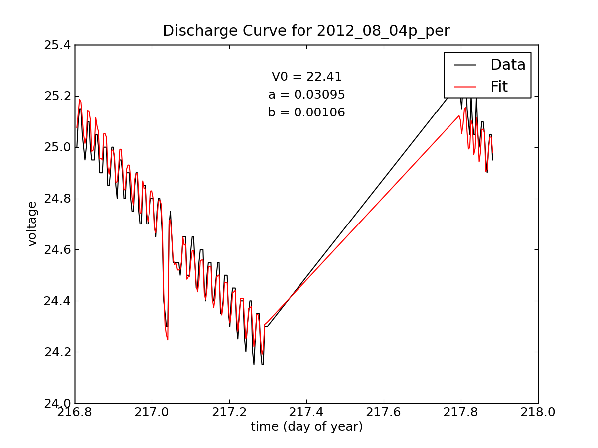
Above is an example fit for one “day” of data. Only nighttime points are used. The red fit line is not perfect, but does an okay job for such a simple, linear model. Note the defrost cycle just after midnight. For this example, we deduce the full-state voltage to be 25.51 V. The value a = 0.03095 means I drop 0.03 V for every percent reduction in SOC. We interpret b = 0.001 to mean that a 400 W load (like refrigerator defrost) will drop us 0.4 V.
Now what happens if we run this on a boatload of data, deriving individual fit parameters for each night? We get the following plot:

The thing that jumps out at me is the trend toward stability: the battery behaved a bit more erratically early on. The curves are tightening up of late, and pretty stable. But what do these parameters mean? I care most about the slope, representing parameter a in the fit. I care about it because I don’t want to see the battery lose voltage very fast. The SOC value is based on dead-reckoning of how much current has been drawn out. For a given withdrawal amount, the smaller the impact on voltage, the larger the effective capacity. So the fact that the slope is decreasing over time seems like great news!
The two measures are correlated by virtue of the fact that the “full-state” voltage is extrapolated to 100% SOC using—yup—the slope.
And one last trick. If I collect SOC values from the Pentametric and corresponding load-adjusted voltages based on the fits for each night, I can plot one against the other and make a best-fit line. The raw data are rather scattered, so I only plot the fit line for each of three years.
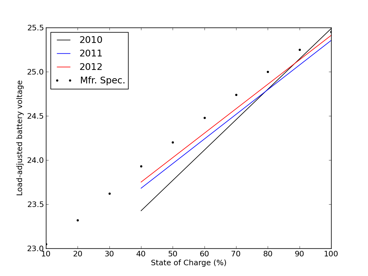
We see a similar pattern emerge here: the slope is softening (improving) over time. The manufacturer’s tabular values for this battery (the Trojan T-1275) are plotted as black points. Gee—the 2012 data comes the closest. Note that the SOC value is based on my de-rated battery capacity of 125 Ah: 83% of the advertised capacity. And it approximates the discharge curve pretty well from day one. I conclude that these batteries have never lived up to their 150 Ah promise. Batteries disappoint.
Do I think these batteries will continue to get better with age? Ha! Just this weekend I saw disappointing performance during equalization (required more current than I expected). And I haven’t seen absorb state settle down to sipping just 50 W for some time. My first set of batteries took a rapid nosedive after less than two years. This set appears to be doing better, but I’m not driving them quite as hard (safety in numbers: 4 is better than 2; new refrigerator is less jarring when it turns on and the defrost is half the power, so the batteries are not slammed as hard as a result).
Oh Battery: How Gently Must We Treat Thee?
Incidentally, it is well known that batteries will survive more cycles at lower depth of discharge. A useful graph from here shows this clearly:
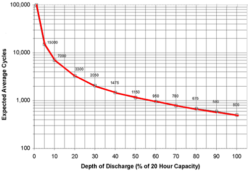
From www.mpoweruk.com
Based on the graph, we might expect a whopping 15,000 cycles at 5% depth of discharge, dropping to 1000 cycles at about 55% depth. But notice that if we multiply the number of cycles by depth of discharge—effectively a total lifetime energy—the effect is far less dramatic. 15,000 times 0.05 is 750, while 1000 times 0.55 is 550. So only a 25% decrease in lifetime energy by driving eleven times harder.
I could double the size of my battery bank, doubling the up-front investment at the same time, and slightly more than doubling the time before I have to replace them. But if I plan on doing monthly maintenance (equalizing, cleaning, etc.), then I have twice the work! So I’m not terribly timid about hitting the batteries a little hard. 50% depth of discharge is not unusual for my system. Perhaps I’m being foolish and will wise up one of these years. For now, I look at the graph above and say: meh…
On the economic side, taking the advertised capacity for a lead-acid battery at face value, I can get a Trojan T-1275 for $235, and if treated gently it will provide an energy outlay of 750 full-cycle-equivalent discharges. Each full discharge has 12 V times 150 Ah, or 1.8 kWh. This works out to $0.17 per kWh. If I instead cycle at 50% and get 575 full-cycle equivalent outlay at a de-rated 1.5 kWh/cycle, the cost is about $0.28/kWh. Since my system uses the battery for half its energy needs, the effective cost of electricity for battery replacement alone is about $0.14/kWh, which is pretty close to the utility rate in San Diego.
At this point, I have sourced 1686 kWh from my four batteries in 30 months, or 422 kWh each. At a de-rated 1.5 kWh per battery, I have gone through 281 full-depth equivalent cycles. In about 915 days, this means my average cycle depth is 31% and I might expect 2000 such cycles (5.5 years; 620 full-depth equivalent cycles) at this level. So judging by this, I’m almost halfway done. Luckily for you, we’re much more than halfway done with this post. Here’s the wrap-up…
So is 62% Good or Bad? Waffle time…
The primary result is that I only get to use 62% of the energy delivered by my panels. The comparable number for a grid-tied system is something like 87–90% (inverter efficiency). My system suffers an additional 87% efficiency factor due to its full-tummy effect. This is close to the grid-tied inverter efficiency, so we can say that a panel in a small-scale off-grid system will likely deliver only something like 60–65% as much total energy as a grid-tied panel.
Doesn’t seem so good. On top of this, batteries are costly, as demonstrated before. So why would anybody go this route?
In remote locations, the cost of running utility power lines can be prohibitively expensive, quickly tipping the scales in favor of off-grid PV (the sunk investment in panels, etc. can be less than that in utility installation, in which case the cost of batteries offsets the steady utility bill). And I must say I enjoyed having power during the San Diego blackout of 2011. Moreover, I get pleasure out of having my own power generation capability. It’s part hobby, part independence, part practical. All cool.
My experiences have certainly impacted my views on large-scale solar ambitions. Like many, I am wowed by the incredible scale solar power offers: it’s a super-abundant resource. But grid-tied systems are deceiving. The grid acts like a giant, always-hungry battery by virtue of the fact that the stored energy in the form of coal and gas can be released at any time to balance power. This only works seamlessly when solar (and/or wind) input is a small fraction of the total. I often see numbers like 10–20% renewable penetration before big problems arise, but I have not studied this personally. The bottom line is that we’re discharging the Earth’s natural energy storage battery (the fossil fuels) and must replace storage with storage, if we want to continue our journey.
In any case, storage is costly—in energy, resources, and economically speaking. I pointed out in one of the first Do the Math posts the daunting scale for building a lead-acid battery big enough to satisfy the whole nation (not enough lead in the world, and a total budget-breaker even if lead were available).
My waffling here reflects the mixed bag nature of the problem. Storage is what it is: not great, but at least it can work, at a cost. The main lesson is that we shouldn’t be flippant about the degree to which storage difficulties limit our future energy ambitions. I see it every day in my imperfect personal PV microcosm.