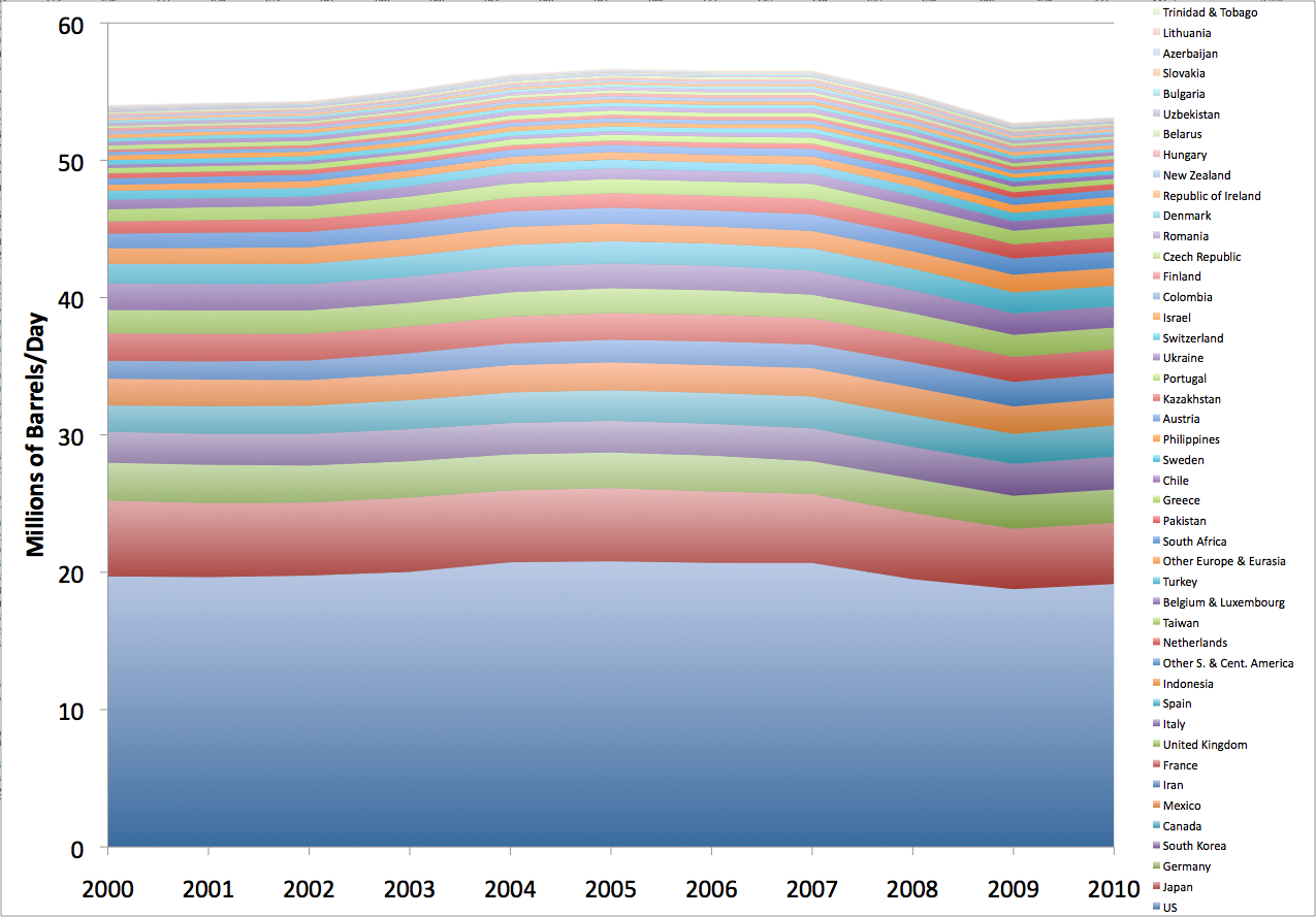
This morning, I took the oil consumption page of the BP spreadsheet, and applied a mechanical test to each country: was 2010 the highest year of consumption over the range 1990-2010? If this is true, let’s call the country an “advancer”, and if not, let’s call it a “decliner”. Here are all the advancers:
On this, and all the other graphs in this post, you can click to get a large version in a new window. You can see that the bulk of advancers are rapidly growing Asian or Middle Eastern countries, with a few other emerging markets from around the world thrown in. The only developed countries on this list are Norway and Australia – both big resource exporters. These countries in the aggregate account for a little over a third of global consumption.
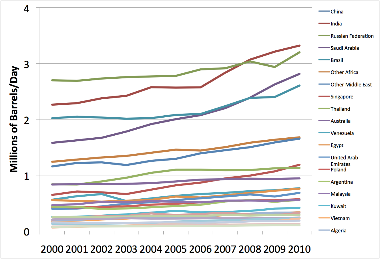
To see the individual countries better, here’s the same data as a line graph, instead of a stacked area graph:
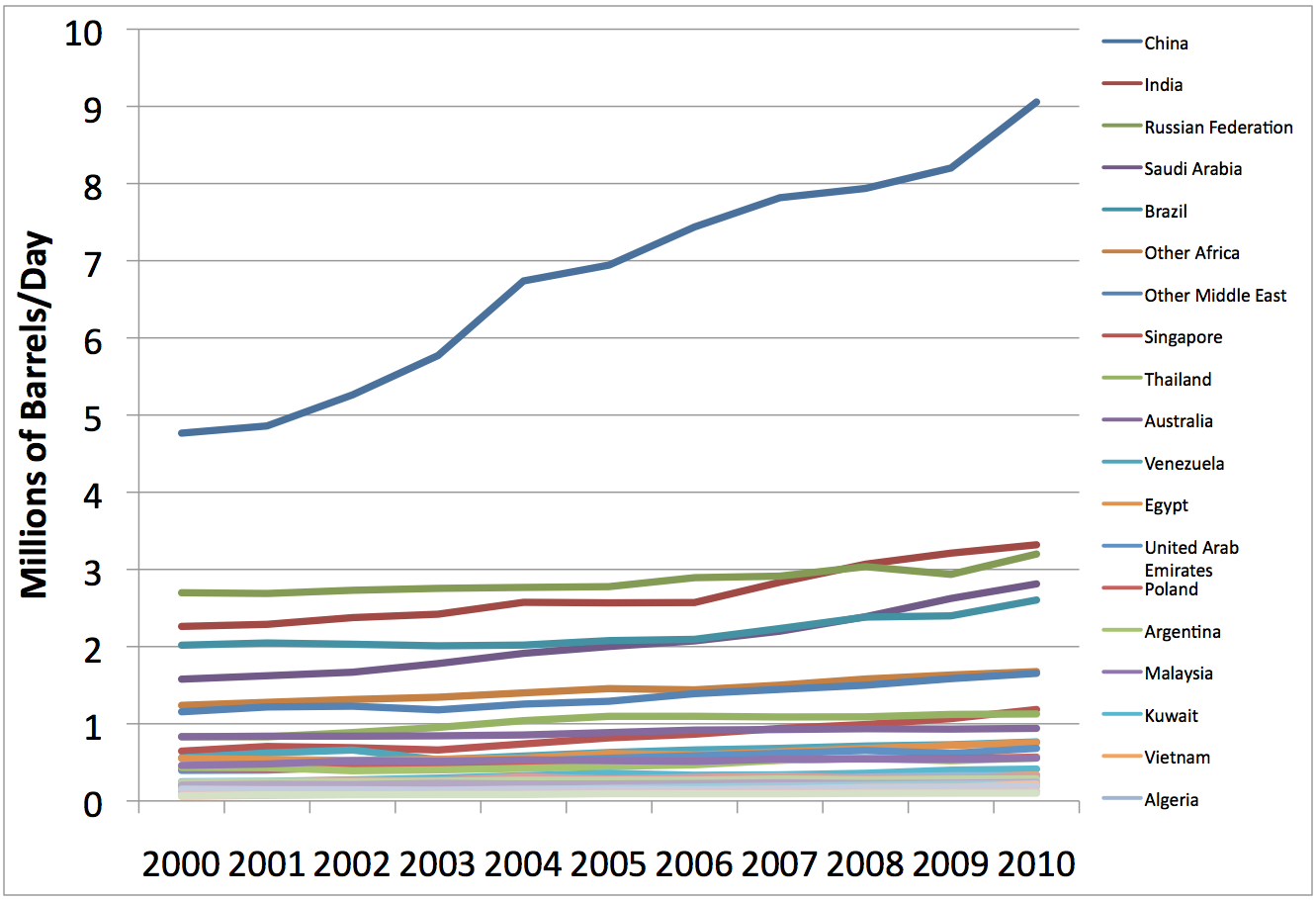
China really stands out. If we blow up the vertical scale so that we only go up to 4mbd (and thus exclude China), we get this:
Notice how few had significant contraction due to the great recession. Looking at it yet another way, here’s the ten year average growth rate plotted against 2010 consumption:
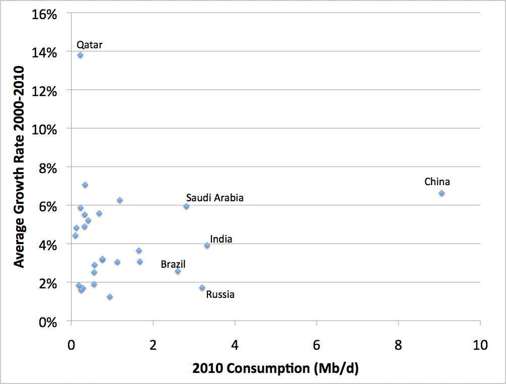
China is far and away the most important story, then Saudi Arabia, India, Brazil, and Russia. These countries have not reached their peak oil consumption, and probably won’t for some years to come.
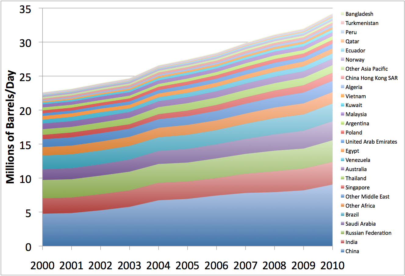
If we look at the countries where 2010 was not the highest consumption, in the aggregate we get this:
You’ll really need to click for the big version to read the legend, but basically most of the world’s developed countries are there, along with a few badly governed places like Mexico and Iran. The group as a whole peaked in about 2005.
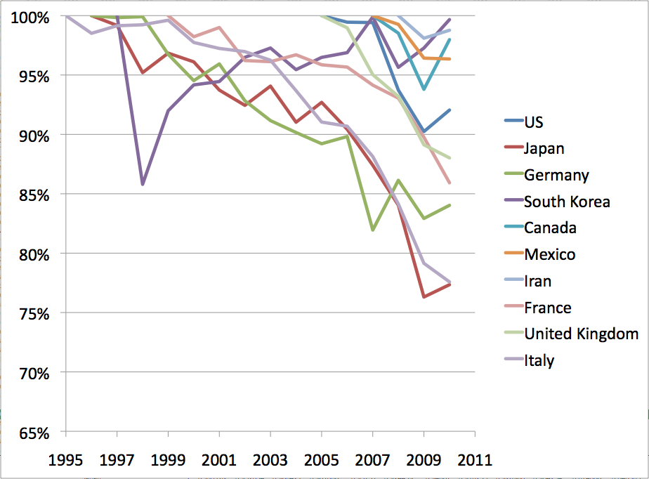
To get a clearer sense of what this means, it’s interesting to take the top ten largest decliners (by 2010 consumption) and plot their consumption post their respective peaks, as a percentage of that peak:
Two countries at least, South Korea and Canada, are likely on the list for temporary reasons and may yet exceed their former peaks. However, most of the rest have probably seen their greatest oil consumption and will need to further contract to make room for the still growing oil consumers.
The earliest to peak was Italy in 1995, with Japan and Germany not far behind. US consumption peaked in 2005. Obviously the story is a little different in each case. In Germany, this is mainly about getting more oil efficient, whereas in Japan there’s a strong component of economic stagnation. In the US, oil consumption only contracted on account of the 2005-2008 price spike and then the recent recession (but I don’t see how it can now exceed the 2005 peak given the overall supply and demand picture).
There are a few points worth emphasizing:
- Peak oil consumption arrives on a rolling basis at different times around the world. It very likely arrived in some places as early as 1995, and some countries will probably still be growing their oil consumption in 2020 or later. So it’s a multi-decadal event that we are somewhere in the middle of.
- 15 years after their oil consumption peaked, places like Italy, Germany, and Japan are pleasant and civilized countries to live in. So while peak oil certainly means higher oil prices, more economic weakness, and more stress on many individuals, it doesn’t have to mean the end of life as we know it.