
NOTE: Images in this archived article have been removed.
 A picture is worth a thousand words.
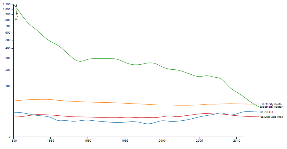
This graph compares the price history of solar energy to conventional energy sources. The comparison is striking. This is what a disruptive technology looks like. While conventional energy prices remained pretty flat in inflation adjusted terms, the cost of solar is dropping,fast, and is likely to continue doing so as technology and manufacturing processes improve.
First, about the graph. I recently published an article, Bitcoin Energy and the Future of Money, which explores the idea of using energy as the basis for money. One of the key concepts in this is to standardize the way energy commodities are measured, to measure them in terms of energy content rather than parochial units of measure (e.g. therms or cubic feet of natural gas, gallons of diesel, kilowatt hours of electricity, and so on). See also www.joulestandard.com for more information about this idea.
The graph above charts the inflation adjusted price of different types of energy, not in terms of gallons, but in terms of gigajoules of energy (a gigajoule is one billion Joules, the standard metric unit for energy). Pricing energy commodities in terms of their energy content makes it easier to compare the relative cost of different sources of energy.
Using data from the Energy Information Agency, I pulled together a history of retail prices for natural gas, crude oil, gasoline and residential electricity, all adjusted for inflation. For each energy source, I converted the prices to $/gigajoule, using conversion factors from engineering tables. (For example, a million cubic feet of natural gas contains 1.083 gigajoules of energy content).
Next, using data from the National Renewable Energy Laboratory and other sources, I looked up the price history for solar power, in terms of dollar per Watt of system capacity (a standard unit of measure for solar). With this data, I built a cost model to translate the cost of a solar cell into $/gigajoule. The basic idea is to amortize the system cost over its useful life, and divide this by the average amount of power it generates per month. This allows the cost of solar to be compared directly to other sources.
The comparison shows quite clearly that the cost effectiveness of solar power is increasing exponentially. In 1977, solar cells cost upwards of $70 per Watt of capacity. In 2013, that cost has dropped to $0.74 per Watt, a 100:1 improvement (source: The Economist). On average, solar power improves 14% per year in terms of energy production per dollar invested. Technological improvements are the primary driver of this trend, as manufacturers learn to produce panels using less energy and raw materials (the basic physics of solar panels are a century old), and to make systems easier to install.
While solar currently accounts for less than 1% of the energy supply, it is an exponentially improving technology, both in terms of price and pace of construction. Already it is approaching parity with other energy sources in the Western US. Assuming this trend continues for another 10 to 20 years, and there’s no reason not to, solar power will become 5 to 10 times more cost effective than it is today. This raises an interesting question. What happens if solar becomes an order of magnitude cheaper than other sources of power?
This is the nature of disruptive technology. It represents such an improvement that it renders existing industries obsolete. We saw waves of disruption take place as the Internet upended entire industries. Expect to see a lot of this in the coming years.
Solar panels image via shutterstock. Reproduced at Resilience.org with permission.