Falling energy use and surging offshore wind are among the trends revealed in the latest round of government figures on the energy flowing through the UK.
Renewables’ share of electricity generation reached another all-time high last year, accounting for a third of the mix while coal power slumped by a quarter.
The new iteration of the Digest of UK Energy Statistics (DUKES), published last week by the Department for Business, Energy and Industrial Strategy (BEIS), contains a wealth of information that tells the broader story of the nation’s energy transformation.
Here, Carbon Brief has created six charts that illustrate the changes that have been taking place in the energy mix over the past year.
New lows for energy
The nation’s primary energy use fell once again, taking it to its lowest level for decades, as demonstrated by the chart below. (In January, Carbon Brief reported that the amount of electricity generated in the UK last year had fallen to its lowest level since 1994.)
This was accompanied by the continued decline of fossil fuels as a source of energy. While they are still dominant, their contribution fell to 79%, another record low.
Top: UK primary energy use by source, millions of tonnes of oil equivalent (Mtoe), 1970-2018. Bottom: Shares of UK primary energy use (%). Note that this measure tends to exaggerate the contribution from fossil fuels, since much of the energy contained in coal, oil and gas is wasted as heat during combustion. Source: DUKES 2019 Table 1.1.1. Chart by Carbon Brief using Highcharts.
These primary energy use figures are not an entirely accurate depiction of the relative contributions made to fueling the nation. This is mainly because when burning fossil fuels, a lot of the energy they contain is wasted as heat during combustion, which therefore does not contribute to the final output of useful work.
This was the key factor behind the marginally lower energy demand observed in 2018, with reduced losses during the transformation process as renewables displaced coal.
Just 4% of the UK’s primary energy demand came from coal last year, compared to 16% at the turn of the century. Of the coal that remains, most is used for electricity generation, coke manufacture and in steel industry blast furnaces.
The observed trend in fossil fuels can be attributed largely to coal’s downward spiral. Last year saw overall coal consumption drop by 17%, and among major power producers– which take up the majority of coal demand – it dropped by 24%.
Eggborough power station joined the list of coal facilities shutting down in September last year, in line with the government’s plan to phase out unabated coal generation by 2025. Several others have already announced plans to close over the next eight months.
Record renewables
Last year saw records set for both renewable and low-carbon power in the UK, taking the country to 33% and 53% of generation respectively. This was matched by a dip in power being generated by gas and coal.
Top: UK electricity generation by source, terawatt hours (TWh), 1996-2018. Bottom: Shares of UK electricity generation (%). Source: DUKES 2019 Table 5.6. Chart by Carbon Brief using Highcharts
The expansion of renewable generation in 2018 can be partly attributed to weather conditions – specifically more hours of sunshine and slightly higher rainfall – as well as the increase in capacity.
While renewables saw a boost from 29% of generation the previous year to roughly a third in 2018, these gains in were moderated somewhat by a slight dip in nuclear generation. This fell from 21% to 20%, a result of outages and maintenance work taking place at UK plants.
Reactors at Dungeness B and Hunterston B, both run by EDF Energy, stopped operating in 2018 for repair and maintenance work. Cracks found in the graphite core during routine inspections at the Hunterston B site in Scotland raised safety concerns, which have yet to be fully resolved.
Transport rolls on
Despite a small increase in demand for air travel, energy consumption by transport showed a dip of 0.1% compared to the previous year, after four years of increase.
However, this tiny drop was not enough to knock transport from its leading position, and the sector still dominates the UK’s overall energy consumption.
UK energy use by sector (Mtoe), 1970-2018. Source: DUKES 2019 Table 1.1.5. Chart by Carbon Brief using Highcharts.
The nation’s final energy consumption increased by 1.5 million tonnes of oil equivalent (Mtoe), an increase of 1% compared to the previous year. The total figure was 151Mtoe, with transport and domestic use making up nearly two thirds of this.
This uptick can be linked to British homes increasing their energy use by 3% compared to 2017.
BEIS attributes this trend to the so-called “Beast from the East” weather system which led to plummeting temperatures in February and March and a subsequent surge in heating use. Adjusting for temperatures, therefore, revealed another small decrease in domestic energy use instead.
The rise of offshore wind
Despite wind speeds in 2018 being slower on average, this was massively offset by additional capacity coming online, leading to overall wind generation increasing by 15% to 57 terawatt hours (TWh).
Among renewables, the share generated by onshore and offshore wind currently stands at 28% and 24%, respectively, but this looks set to change as offshore continues to increase in prominence.
UK renewable electricity by source (TWh), 1990-2018. Source: DUKES 2019 Table 6.1.1. Chart by Carbon Brief using Highcharts.
Onshore wind increased by just 1.5TWh last year, while offshore increased by 5.8TWh. This means offshore wind generated more electricity than coal, at 16.8TWh, for the first time.
Among the new wind projects beginning operation in 2018 were the Walney Extensions off the coast of Cumbria, which stands as the world’s largest offshore windfarm. Several other large sites are due to come online this year, including the Galloper windfarm in Suffolk and Rampion off the coast of Sussex.
The relative lack of new onshore wind capacity coming online is a result of the well-documented withdrawal of government support for new installations – as well as tighter planning rules – which were first announced in 2015.
Meanwhile solar generation saw 12% growth, bringing it up to a record 12.9TWh, while hydro generation fell by 7% to 5.5TWh.
Fossil fuel extraction
Coal production fell to an all-time low of 2.6 million tonnes, less than a tenth of the quantity being extracted two decades ago.
Not only is coal-fired energy being generally phased out across the UK, one of the nation’s largest remaining mines, Nant Helen in Wales, was closed and remained under “care and maintenance” due to the fall in demand.
UK fossil fuel extraction by source (Mtoe). Source: DUKES 2019 Table 1.1-1.3. Chart by Carbon Brief using Highcharts.
Plans to extract coal at sites like Druridge Bay in Northumberland and Bradley in County Durham have triggered a backlash from environmental groups. Friends of the Earth found that government figures showed there was “more than enough” coal in stock at power stations to generate coal-fired electricity until the phaseout date in 2025 (although this did not take into account coal used in other processes, such as steel manufacture).
Both oil and gas extraction in the UK peaked around the turn of the century, and have since then been gradually declining.
However, both have also seen a gradual resurgence in recent years following new investment and new projects starting up, partly in response to tax relief announced by former chancellor George Osborne in 2015, rising prices and lower production costs.
Crude oil production increased by 9% last year, while natural gas production fell slightly by 3% after four years of increase.
The average size of gas fields beginning extraction last year was smaller than previous years, reflecting a decline since the early days of North Sea fossil fuel exploitation and improvements in technology that allow such fields to be targeted.
As 2019 began, the discovery of the “biggest gas field in a decade” by a Chinese-led consortium in the North Sea was greeted with dismay by environmental campaigners, but the company said it had found enough to satisfy 5% of the UK’s annual gas demand.
Energy flow
In Carbon Brief’s animation, below, the gradual decline of coal’s contribution to the UK’s energy system, and the growth of renewables, is clear. It shows the variety of inputs and outputs in the UK’s energy system, and how this has changed significantly over the past six years.
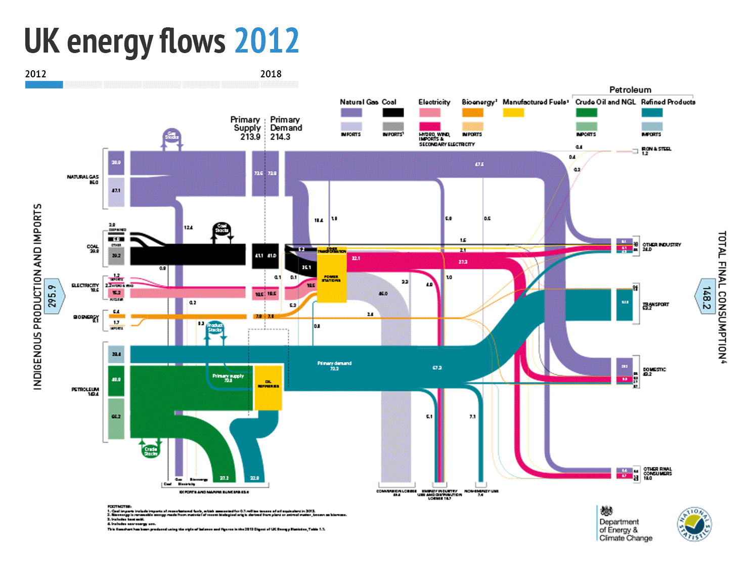
Source: DUKES 2019 Energy Flow Chart 2018. Animation by Carbon Brief.
Each bar consists of both domestic supplies and imports, with the lighter shades representing the latter. The exception is the pink bar, for which the lighter colour represents nuclear while the dark colour is for renewables and electricity imports.
The yellow box in the middle shows all the different sources of energy feeding into the UK’s power stations to generate electricity.
Also worth noting is the energy flowing out of the bottom of the chart. These strands represent the energy that is either exported, used in marine “bunkers” as ship fuel, used as raw materials for other applications – such as plastics production – or lost in the processes of conversion and distribution.
Teaser photo credit: By David Dixon, CC BY-SA 2.0