The US electricity system is often described as the world’s largest machine. It is also incredibly diverse, reflecting the policy preferences, needs and available natural resources of each state.
Carbon Brief has plotted the nation’s power stations in an interactive map (above) to show how and where the US generates electricity.
A few key messages can be gleaned from the map and associated data interactives below:
- The US electricity system has been changing rapidly over the past decade.
- This reflects not only federal policy, but also technologies, geographies, markets and state mandates.
- The average US coal plant is 40 years old and runs half the time. Some 15% are at least 50 years old, against an average retirement age of 52.
- Planned new power plants are almost exclusively gas, wind or solar.
Reading the map
Supplying electricity to a nation’s homes, business and industry is an almost uniquely challenging enterprise. For now, electrical energy is either expensive or inconvenient to store, meaning supply and demand must be balanced in real time. It is also easier to generate power close to home than to transport it over long distances.
The way electricity is generated fundamentally depends on the fuels and technologies available. The march of progress means this mix is changing – but natural resources and geographies are fixed. Moreover, US states have broad powers to influence the electricity systems within their borders.
Putting the US electricity system on a map offers visual confirmation of how important these factors are. Why is solar so prevalent in North Carolina, for example? Or coal in West Virginia?
You can use Carbon Brief’s interactive map, above, to view all the power plants in the US and their relative electricity generating capacities, which are proportional to the size of the bubbles. The dynamic chart in the sidebar summarises the makeup of the capacity mix. (See the notes, below, for full details on how the map was made.)
It’s important to note that the map and related charts, below, are based on electrical generating capacity. The electricity generated each year by each unit varies according to its load factor. US wind has a load factor of around 35% while solar is around 27%. These are lower load factors than for nuclear at around 90%. Coal and gas can, in theory, have similarly high load factors, but in practice both are at around 50% in the US. (See below for figures on electricity generation.)
Returning to the map, you can stick with the default nighttime background or switch to daytime satellite imagery, to see power stations close-up and in context with their surroundings. The nighttime satellite view shows the grid in relation to the towns and cities that light the night sky. There’s also a greyscale background if you prefer your maps plain.
You can also filter the map view to zoom in to each state, from Alabama through to Wyoming, or to focus on each fuel type in turn. There’s a filter for “high carbon” sources, which includes coal, oil and gas. You’ll find nuclear and renewables under “low carbon”.
Coal plants dominate in the mining regions of the Powder River Basin and the Appalachians. Gas is nearly ubiquitous, but is particularly prevalent close to major gasfields, such as the Gulf of Mexico. Nuclear is concentrated in the populous eastern and midwestern states.
One geographical quirk is that large thermal power plants often cluster along state boundaries. This is because they need water for cooling, drawn from the rivers that mark state lines.
Huge dams supply the bulk of power in the Pacific northwest. Wind is concentrated down the central Great Plains, while solar has bloomed where state policy supports its adoption. Meanwhile, the remote residents of Alaska and Hawaii often rely on oil, which is easy to transport and store.
Age of renewables
This picture is not static, having changed dramatically over the past decade. Thousands of old units have retired due to old age, amid markets shaken by the shale gas revolution and stirred by changing state and federal policy.
As hundreds of old coal and oil units have retired, wind and solar technologies have come of age and thousands of sites have sprung up across the country. Yet coal, along with an expanding gas fleet, still supplies most of the country’s electricity.
Carbon Brief analysis of data from the US Energy Information Administration (EIA) shows that 501 coal units have closed over the past 10 years, while 45 have opened. (Each power plant may have made up of multiple units that may use different fuels).
In total, the number of coal units has dropped 35% (black lines in the charts, below). Since older plants were smaller, coal capacity has only declined by 11% (36 gigawatts, GW). The story is similar for oil, where 757 units retired, 385 opened and net capacity fell by 21% (11GW).
Despite these retirements, the average oil or coal unit remains elderly, meaning many more are due to close simply because they are old. This is explored more fully below.
Left: The number of US electricity generating units by fuel, 10 years ago and today. Right: Electricity generating capacity 10 years ago and today. Hover over the datapoints to see the net change in number of units and capacity. Source: Carbon Brief analysis of US EIA data. Chart by Carbon Brief using Highcharts.
In contrast, the 878 mostly smaller gas units that have retired since 2007 have been replaced by 978 larger units. This means net gas capacity increased by 9% (44GW).
Meanwhile, wind and solar saw unprecedented expansion, adding more than 3,000 units and growing net capacity seven-fold to 122GW, thus eclipsing nuclear, hydro and oil.
You can see how the US electricity grid looked 10 years ago – at the start of 2008 – in the animated graphic, below. Note in particular the relative absence of wind and solar, compared to today.
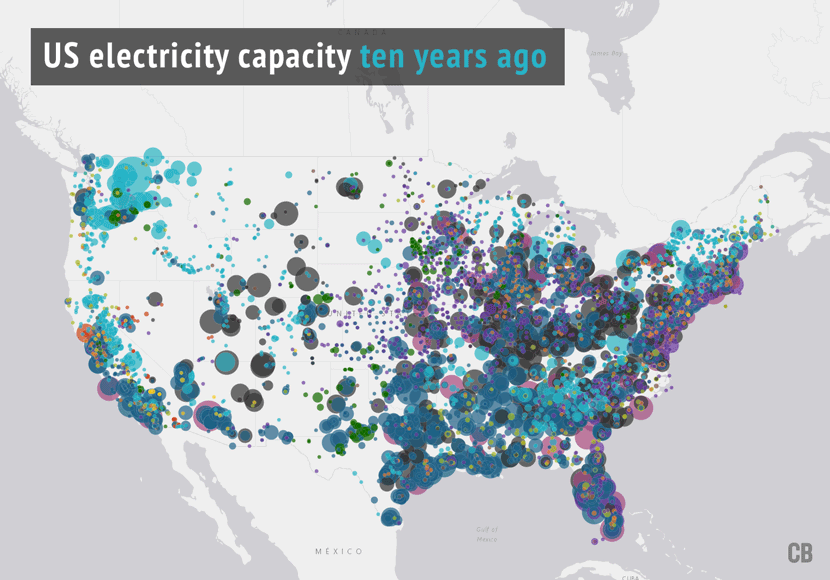
US electricity capacity 10 years ago and today. By Rosamund Pearce for Carbon Brief
Gas generation game
Total electricity output peaked in 2007 at 4,165 terawatt hours (TWh), before dipping after the financial crisis. It has remained below this 2007 peak, despite economic growth and a rising population, thanks in large part to improvements in energy efficiency.
Like capacity, the electricity generation mix has also changed dramatically over the past 10 years. Coal generation peaked in 2007 before plummeting 38% in a decade (see chart, below). It was replaced by gas as the US’s top source of electricity for the first time ever in 2016.
Gas has continued its rise, which began well before the shale gas revolution of the late 2000s. (This is discussed in more detail below). Oil-fired generation is down two-thirds in 10 years and the combined output from all three fossil fuels is now 14% lower than the 2007 peak.
Meanwhile, wind and solar have overtaken hydro as the fourth-largest source of electricity in the US, generating nearly four times as much as they did a decade earlier. Nuclear has held steady and still generates slightly more electricity than all renewables combined.
US electricity generation by fuel 1960-2017 (top panel) and shares of generation over the same period (bottom panel). Source: Carbon Brief analysis and US EIA. See notes below for further details. Chart by Carbon Brief using Highcharts.
Fossil fuels’ share of the US electricity mix is down 9 percentage points in 10 years, to 64%, a low for the modern era. Low carbon sources contribute 36%, with renewables’ share doubling to 17%.
(Note that while the low-carbon share is at record highs, renewables’ share of the mix remains slightly below where it was in 1960. This is due to the growth of overall electricity demand.)
Energy efficiency, coal-to-gas switching and renewables together explain three-quarters of the 14% decline in overall US CO2 emissions since 2005, according to previous analysis by Carbon Brief. Though electricity generation accounts for less than a third of total US emissions, there have been minimal CO2 reductions in other sectors such as heat and transport.
This analysis also showed that electricity sector CO2 emissions in 2016 were 46% lower than they would have been, had patterns of power consumption per capita and the fuel mix stayed the same.
As a result, near-term changes expected in the US electric sector will to a large extent determine the country’s progress towards its abandoned pledge to the Paris Agreementon climate change.
President Obama’s flagship Clean Power Plan was set to solidify and extend the trajectory of the past decade. Now it is facing repeal by the Trump administration.
This is despite the US being on track to meet the plan’s headline national target of a 32% cut below 2005 levels by 2030, according to analysts Rhodium Group. The repeal effort could take months and might end in the Supreme Court, according to the New York Times.
Old king coal
In this context, it’s worth inspecting the character of the US generating fleet more closely and what that might mean for the future – with or without the Clean Power Plan or a Trump team alternative.
Today, the average coal plant in the US is 40 years old and runs only half the time. This is old, particularly when the average retirement age for coal units is 52 years. Some 44GW of coal capacity in the US is at least 50 years old, equivalent to 15% of the total operating today. Another 109GW (38%) is at least 40 and 86% is more than 30 years old.
This suggests that many more coal closures are unavoidable, regardless of market conditions or public policy.
(The US Department of Energy is attempting to force the parts of the US that operate competitive electricity markets to subsidise coal and nuclear generation. This would “blow up” wholesale power markets, say experts talking to Utility Dive and is “incompatible with sound market economics”, according to the conservative R Street Institute thinktank. It would allow even the oldest coal units to receive a guaranteed rate of return on investments needed to remain open. Like the move to repeal the Clean Power Plan, this effort is likely to take many months and face legal roadblocks).
The age distribution of coal and other power plants is reflected in the charts, below, which show the amount of new capacity being built or retired each year. The charts extends back nearly 60 years to 1960, though note that data on retirements is only available back to 2002.
US electricity generating capacity separated by fuel and by year of opening. Capacity that is still operating today is shown in solid colours, whereas closed and planned capacity are faded out. The vertical scale is the same in each of the charts, allowing the relative capacities in GW to be directly compared. Note that capacity does not equal generation. Source: US EIA, International Atomic Energy Agency (IAEA) and Carbon Brief analysis. See notes below for further details. Chart by Carbon Brief using Highcharts
Looking at the top panel, for coal, above, you can see that most of the oldest plants – those built in the 1960s or earlier – have now retired. These units are shown in grey.
You can also see why the situation for coal has worsened since 2007 – when the average coal unit was 34 years old – because fewer new coal plants have been built than have retired. However, there is a notable bump in new coal capacity centred around 2010. How did this come about?
In the early 2000s, following the election of George W Bush, there was a surge in interest in building new coal plants. This was based on several drivers, which hold lessons for the future.
First, there was an expectation that the administration would move slowly, or not at all, to tighten environmental regulations. In fact, new regulations were adopted. Second, the prevailing wisdom at the time was of strong economic growth bringing healthy increases in electricity demand.
This, combined with retirements of older plant, meant new capacity would be needed and so around 240 new coal plants were planned. Only a handful of these were ever built.
As the chart above shows, the expected wave of coal retirements did arrive, partly in response to old age, partly because of new regulations – notably the Mercury and Air Toxics Standard (MATS), which entered force in 2015.
Contrary to expectations, however, rising demand failed to materialise. One reason for this is that 30 states have implemented their own energy efficiency targets, policies or standards. (These are a mixture of mandatory and voluntary goals).
Early 2000s: US electricity demand was expected to grow by ~20% within a decade. It didn’t happen.https://t.co/9ayLVzykbe pic.twitter.com/ZAhHxsgaH2
— Simon Evans (@DrSimEvans) September 7, 2017
Moreover, the shale gas revolution sent gas prices tumbling (along with wholesale electricity prices) and renewables grew faster than expected, eroding coal’s share of – and profits within – an over-supplied market.
Today, several new coal plants are theoretically in the pipeline (see chart, above and the map of planned new capacity, below).
A 320MW unit at Two Elk Generating Station in Wyoming is – according to EIA data – under construction and set to open in 2020. It has been stalled for two decades, only a concrete pad has been built and its permit has been revoked.
The developer has pleaded guilty to fraud charges over $8m in federal stimulus funds, intended for carbon capture and storage research, but spent on other costs, according to local media.
Meanwhile, the 850MW Plant Washington in Georgia, also in the works for years, has missed construction start deadlines set by its permit. It aimed to open in 2022, but is still not being built.
Both schemes “face long odds”, reports Climatewire, in an article exploring whether the US will ever build another big coal plant.
No nuclear renaissance
Returning to the capacity chart, above, it also is clear why nuclear power is set to decline in the US, with almost all currently operating reactors built during the 1970s and 1980s.
Nuclear expansion in this period was punctuated by new safety rules that slowed construction and raised costs, when they were brought in after Three Mile Island (1979) and Chernobyl (1986).
This is starkly illustrated by the 1,200MW Watts Bar 2 nuclear plant in Tennessee, where construction began in 1973. More than 40 years later, it opened in October 2016, after another delay to meet new safety rules – brought in after the 2011 Fukushima disaster.
Two nuclear plants remain under construction, totalling 4,400MW (pale pink on the chart, above). However, following the bankruptcy of Westinghouse, the firm that was building the reactors, the VC Summer plant in South Carolina has been cancelled mid-build. The Vogtle plant in Georgia, also under threat, has been offered $3.7bn in new federal loan guarantees.
These problems reflect wider issues facing the global nuclear industry, which, outside the state-controlled markets in China and South Korea, has struggled to build new reactors on time and to budget. EDF, which is building new the Hinkley C plant in the UK, has faced delays and cost overruns at schemes in France and Finland.
Meanwhile, the 99 nuclear reactors in the US are 36 years old on average. Although 84 have agreed lifetime extensions, allowing them to operate for up to 60 years, many could close well before then, due to the same unfavourable market conditions that are hurting coal plants.
Their profitability has been eroded by low wholesale power prices, primarily caused by cheap natural gas, while their operating costs can be relatively high – particularly for single-reactor sites. Five US nuclear plants have closed in the past five years and several more have plans to do so.
The Department of Energy’s subsidy plan, if successfully implemented, could keep nuclear capacity open, too. Alternatively, more states could adopt the zero-emissions credits brought in by New York and Illinois, to keep nuclear plants open and help meet state climate goals.
Growing pains for gas
For gas-fired power plants, the spread of ages and capacities in the chart, above, reflects the long history of US onshore extraction, as well as a series of growth spurts driven by changes in markets and technologies.
Widely available gas has been used to generate power in the US for decades. This is in contrast to the UK power system, where gas only became available after the North Sea industry developed.
In the 1960s, simple and relatively inefficient steam turbines made up most new gas capacity. In the 1970s, combined cycle gas units started to be built, making use of waste heat to boost efficiency. You can see a sort of technology adoption “s-curve” in the chart, below.
However, new gas capacity stopped being built after the Middle East oil shocks of the late 1970s, when gas prices increased, peak oil (and gas) loomed large and regulations were put in place to reserve gas for the highest-value uses – not including electricity generation.
Gas power made something of a comeback in the late 1980s as its use was deregulated, with a mixture of small combined cycle and peaking gas plant being built. But, in 2000, something remarkable happened. Over the course of five years, some 216GW of gas-fired electricity generating capacity was built in the US, of which two-thirds were large, combined cycle units.
New technologies have shaped gas-fired capacity in the US pic.twitter.com/7lAxuSyo8I
— Simon Evans (@DrSimEvans) October 10, 2017
This surge in new gas capacity was driven by new entrants to the deregulated electricity markets which proliferated during the late 1990s and early 2000s. Gas plants are relatively cheap to build, offering quick returns. (The Enron scandal in California is another symptom of this period).
Those new entrants were also chasing the new electricity demand that turned out to be illusory, as noted above. To make things worse, low gas prices gave way to increases, which rose through 2008 and put many of them out of business. This also meant that gas generation rose only slowly.
Once prices tumbled, with the global financial crisis and the shale gas revolution, this huge and underutilised gas generation capacity was ready and waiting to steal market share from coal.
Today, the balance between gas and coal generation depends on gas prices, which is why coal generation rose and gas dipped in the first part of 2017. Unlike previous cycles, however, the abundance of US shale gas sites and their short development cycles puts a lid on this price range.
From a climate perspective, this shift from coal to gas has been a mixed blessing. While it has helped cut CO2 emissions from the power sector, this may be offset to some extent by methane leaks during production and transport. It is also tying the US into continued use of fossil fuels.
Indeed, the lion’s share of planned new power capacity in the US comes from gas, as the map below shows.
Of 114GW in planned utility-scale capacity listed by the EIA, 63% is gas, 10% solar and 20% wind. A quarter of the gas projects are in Texas and another fifth in Pennsylvania. Note that this excludes small-scale projects below 1MW and so probably underestimates solar, as discussed below.
Renewables portfolios
There have been a series of stages in the development of US renewables capacity, shown in the chart above in light blue (hydro), green (wind) and yellow (solar) columns.
The 1960s and 1970s saw the culmination of the so-called “big dam” period, during which huge structures were built on the major rivers of the US. (The 6.5GW Grand Coulee dam in Washington state – not Arizona’s famous 1GW Hoover Dam – has by far the largest capacity of any single power installation in the US).
Following the 1970s oil crises, the federal government began offering tax credits for wind energy. This sparked a “wind rush” and the construction of windfarms, such as Altamont Pass in California.
(At one point, this area hosted thousands of 100 kilowatt turbines and became a battleground over migratory routes and turbine-related bird deaths. The old turbines – which were shut off at certain times of year to protect endangered birds – are now being dismantled and replaced with a smaller number of modern devices of at least 2,000 kilowatts each. These turbine towers are spaced more widely and their blades rotate more slowly. Initial studies suggest this reduces bird mortality).
Later, states began to adopt Renewable Portfolio Standards (RPS), requiring utilities to source a fixed amount or share of the electricity they supply from renewables. Perhaps surprisingly, it was Iowa that introduced the first RPS, with its 1983 Alternative Energy Production Law.
By 2000, 12 states had introduced an RPS and this was starting to filter through to a noticeable uptick in new wind capacity being built.
California did not adopt an RPS until 2002, though it now has one of the more ambitious targets of 50% renewable electricity by 2030. An effort to pass a 100% by 2045 standard failed in the California senate in September. This means Hawaii retains the highest ambition with its 100% by 2045 goal. In total, 29 of the 50 US states have adopted an RPS (see map below).
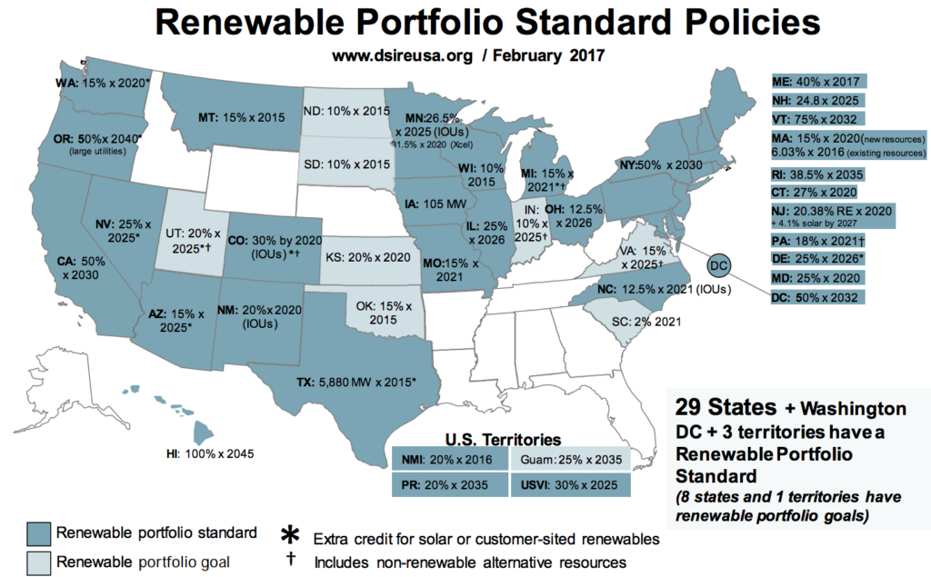
Renewable Portfolio Standards in the US. Source: Database of State Incentives for Renewables and Efficiency (DSIRE).
At the federal level, tax credits for wind and solar have had a noticeable impact on the rate of adoption. For example, in 2013, wind tax credits temporarily expired and installations fell 92%. For wind, these tax credits are now set to step down over time.
A range of other state and federal rules affect the adoption of renewables. These include “net metering” rules, starting in the late 1990s, that required utilities to buy electricity from homes with solar panels at the retail power price.
Net metering, along with innovative financing schemes brought in by the likes of Solar City has supported widespread and growing adoption home rooftop solar systems. Another, more esoteric rule, has driven the adoption of solar in North Carolina, despite its relative poor insolation rates.
On top of all of this, the cost of wind and solar has nosedived. In 2011, the National Renewable Energy Laboratory (NREL) set a goal for solar to become cost competitive by 2020. In September, it announced that its goal had been met three years early, after a 30% cost decline in a single year.
Wind costs have also declined steeply, according to the Lawrence Berkeley National Laboratory. The best onshore wind sites are now cheaper than gas, per megawatt hour of new generation, with solar set to join it early in the 2020s, according to Bloomberg New Energy Finance.
Future gazing
The current administration is hoping to hold back the tide of change sweeping across the map of US electricity capacity. But the changes that have already taken place over the past decade have been driven by many factors, only one of which is the federal government.
States have broad powers to influence the electricity mix within their borders – and many of them have joined together in a US Climate Alliance, aiming to meet US climate goals despite Trump.
Notably, the nation’s coal plants are old and getting older. Their average age of 40 years – with 44GW older than 50 – points to more change in future. The EIA lists 20GW of coal as planning to retire while others, such as the environmental NGO CoalSwarm, put the figure at 48GW by 2030.
As one energy executive told Bloomberg in June: “The administration can’t turn a 70-year-old coal plant into a 20-year-old coal plant.” What’s more, the Trump administration could fail in its efforts to turn back the clock on the electricity system.
Its move to repeal the Clean Power Plan faces a “legal and regulatory process that will grind on for many years, likely longer than Trump’s first term”, explains David Roberts at Vox, in an article that compares the effort to the ongoing healthcare repeal fiasco.
Even if it succeeds, this could be reversed again by a subsequent administration. For utility firms deciding where to put their money for the next few decades, this uncertainty is unlikely to be favourable to investments in coal, which faces the greatest risks from climate legislation.
That helps explain why 35% of planned new capacity is low carbon and another 63% gas.
Notes
The map is based on data published by the US Energy Information Administration in July 2017, containing data up to May 2017. This data only contains power plants with combined capacity of 1 megawatt (MW) or above, including where several smaller units are located at a single site.
The data covers a total of 1,183 gigawatts (GW), of which 26GW is currently out of service or used only for backup. This is the “nameplate capacity” of the plants. EIA also lists “net summer” and “net winter” capacity, which account for plant availability in those seasons.
EIA lists plants using a detailed set of energy source codes. These were combined, for example “coal” includes bituminous coal, lignite, synfuel, subbituminous coal and waste coal (BIT, LIG, SC, SUB and WC).
For the map, units were aggregated if they had a common “plant ID” and the same technology type. For example, the map has three bubbles for the Barry plant in Alabama: One for coal, one for gas combined cycle and one for peaking gas
For multi-unit sites, the capacity is the combined total and the “year opened” is the range from the first to the last unit to open.
The bubble sizes are only roughly proportional to the plant capacity in MW. There are eight bubble sizes, each representing a range of capacities, with thresholds when capacity doubles. This means there is no direct relationship between the area or diameter of the bubbles and a site’s capacity.
In addition to specific sites above 1MW, the map shows the total capacity of small-scale solar in each state, taken from a second EIA dataset. Again, this data is current through May 2017. The total capacity for each state is shown centred on the state’s geographical centre. Note that these small-scale solar figures are estimates.
The map of planned capacity includes all sites listed in the EIA data. This omits small sites below 1MW, which will be particularly significant for solar. It also excludes a few sites that are listed without location data, comprising 450MW of wind, 260MW of gas and 1.2MW of hydro capacity.
The map of capacity at the start of 2008 is a composite of data combining currently-operating and since-retired sites, which had already opened at that time. It excludes sites below 1MW, as does the map of retired capacity, which is based on the same EIA data.
Electricity generation data is from the EIA Annual Energy Review 2012, for pre-2007 data and Electric Power Monthly September 2017, for data through July 2017. Note that before 1989, the data excludes generation by independent power producers, commercial and industrial sites. This creates a discontinuity in the time series, particularly for fuels other than coal and nuclear.
Generation data shown as 2017 covers the most recent 12 months, through July 2017 at time of writing. “Other” includes non-biodegradable municipal waste, waste tyres and waste gases produced in industrial processes. “Oil” includes petroleum liquids and petroleum coke.