The usual assumption that economists, financial planners, and actuaries make is that future real GDP growth can be expected to be fairly similar to the average past growth rate for some historical time period. This assumption can take a number of forms–how much a portfolio can be expected to yield in a future period, or how high real (that is, net of inflation considerations) interest rates can be expected to be in the future, or what percentage of GDP the government of a country can safely borrow.
But what if this assumption is wrong, and expected growth in real GDP is really declining over time? Then pension funding estimates will prove to be too low, amounts financial planners are telling their clients that invested funds can expect to build to will be too high, and estimates of the amounts that governments of countries can safely borrow will be too high. Other statements may be off as well–such as how much it will cost to mitigate climate change, as a percentage of GDP–since these estimates too depend on GDP growth assumptions.
If we graph historical data, there is significant evidence that growth rates in real GDP are gradually decreasing. In Europe and the United States, expected GDP growth rates appear to be trending toward expected contraction, rather than growth. This could be evidence of Limits to Growth, of the type described in the 1972 book by that name, by Meadows et al.
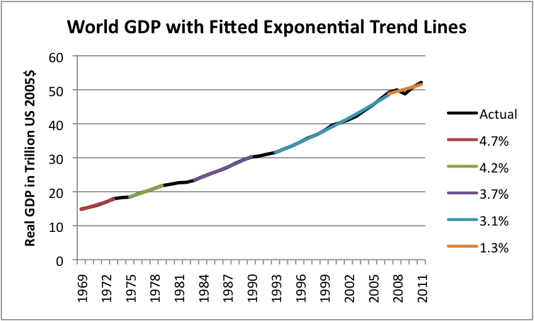
Figure 1. World Real GDP, with fitted exponential trend lines for selected time periods. World Real GDP from USDA Economic Research Service. Fitted periods are 1969-1973, 1975-1979, 1983-1990, 1993-2007, and 2007-2011.
Trend lines in Figure 1 were fitted to time periods based on oil supply growth patterns (described later in this post), because limited oil supply seems to be one critical factor in real GDP growth. It is important to note that over time, each fitted trend line shows less growth. For example, the earliest fitted period shows average growth of 4.7% per year, and the most recent fitted period shows 1.3% average growth.
In this post we will examine evidence regarding declining economic growth and discuss additional reasons why such a long-term decline in real GDP might be expected.
Connection of GDP Growth with Oil Supply Growth
It should not be surprising to find that there is a close tie between GDP growth and oil supply growth. Oil is used in many ways, from the manufacture of goods (synthetic cloth, pharmaceuticals, chemicals, asphalt for roads), to transport of goods and people, to food production (plowing, harvesting, weed killers, diesel irrigation), to operating construction equipment, to mining. While it is possible to substitute away from oil in some situations, or to find more efficient ways of using the oil, we have literally trillions of dollars of machinery in the world that uses oil right now. Because of this, the rate of substitution away from oil is necessarily very slow.
James Hamilton has shown that in the United States, 10 out of 11 post-World War II recessions were associated with oil price spikes. He has also published a paper specifically linking the recession of 2007-2008 with stagnating world oil production and the resulting spike in oil prices. I wrote an academic paper, Oil Supply Limits and the Continuing Financial Crisis, explaining some of the connections I see involved.
One connection between oil supply and the economy is the fact that when oil prices rise, indicating short supply, salaries don’t rise at the same time. Fuel for commuting and food (which is grown and transported using oil) are necessities, and their prices tend to rise as oil prices rise. Consumers cut back on buying discretionary goods and services, so as to have enough money for these necessities. This leads to people being laid off from work in “discretionary” industries, and a whole host of other effects we associate with recession.
Figure 2, below, shows world oil supply (broadly defined, including biofuels) with trend lines fitted to periods exhibiting similar growth patterns. It is these same time periods that I fit trend lines to in Figure 1, with one small exception. I had consistent real GDP data going back only to 1969, so stopped at 1969 rather than 1965 with GDP.

Figure 2. World oil supply with exponential trend lines fitted by author. Oil consumption data from BP 2012 Statistical Review of World Energy.
What we see in Figure 2 is a pattern of falling growth rates in oil supply rates, similar to the declining pattern we saw for real GDP in Figure 1. In Figure 2, the growth in oil supply falls from 7.8% per year in the first fitted period, to 0.4% per year in the last fitted period. The “gaps” that I didn’t fit lines to were periods of falling oil consumption. A glance up at Figure 1 shows that these periods where no line was fit (that is, the places where the black “actual” data shows through on Figure 1) correspond to relatively flat GDP periods–as a person would expect, if high prices/short supply are associated with recession.
A person wouldn’t expect the two types of growth rates (oil supply and real GDP growth) to be exactly the same. The GDP growth rate would likely be higher than the oil growth rate because the oil growth rate is theoretically depressed for several reasons: continued switching from oil to cheaper fuel (often electricity); improvements in energy efficiency; and a gradual change to more of a service economy. (Services use less energy per unit of GDP than the manufacturing of goods.)
If we compare the two fitted growth rates (world oil consumption and world real GDP), this is what the comparison looks like:
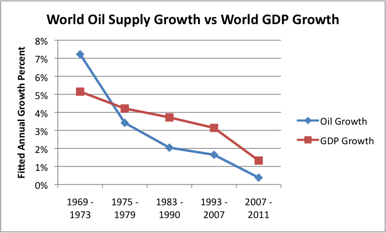
Figure 3. World Oil Supply Growth vs Growth in World GDP, based on exponential trend lines fitted to values for selected groups of years. World GDP based on USDA Economic Research Service data. Earliest time-period uses 1969 to 1973 for both oil and GDP for consistency.
Downtrend in Real GDP May Be Understated
The last thing governments want to do is to let their constituents know that the economy is currently doing less well than in the past. There are (at least) two ways that governments can increase real GDP:
1. Understate their inflation estimates. The way “real GDP” is calculated involves first figuring GDP based on how much goods and services increased during the period in question, and then “backing out” the amount of the GDP increase that was due to inflation. There is latitude in figuring out how much inflation to reflect. For example, in the early years, my understanding is that if the price of beef went up, it directly affected the calculation of the inflation rate; now, there is an implicit assumption that they buyer will be willing substitute chicken to some extent instead, keeping the inflation assumption lower and the real GDP increase (as calculated) higher. There are many other things that be manipulated as well–for example, how the cost of housing goes into the calculation. The site Shadowstats gives one view of how changes since 1983 distort reported US real GDP amounts.
2. Encourage lots of additional debt. Real GDP looks at the amount of goods and services are produced and sold, not how they are paid for. If the government sponsors a program to provide mortgages to people who have no chance of ever paying them back, and this results in the sale of more houses, this will help real GDP–at least until the borrowers start defaulting on their loans. Increases in other types of loans work to increase real GDP too, including auto loans, student loans, and government debt.
Besides increasing real GDP, increasing debt also acts to increase employment, since it takes workers to build the things that people who get the loans can now afford. In other worlds, the higher loan amounts increase employment of people who build new cars or new houses, or who teach at universities.
The problem with encouraging additional debt is that it at some point the amount of debt becomes too much for holders of the debt to service, and they start cutting back on other purchases. For example, recent graduates with a lot of debt are likely not to be in the market for new homes unless they have very high-paying jobs. So, at some point, additional debt becomes self-defeating, especially when the economy is not growing very quickly. Too much debt seems to be one of the limits, besides oil limits, we are reaching now.
Other Factors Holding Down Real GDP Growth
We live in a finite world, and this fact imposes limits. The amount of land suitable for cultivation is not expanding over time. There is limited fresh water for irrigation and other uses. In many areas, water tables are dropping. Ores are declining in quality because the highest quality ore tends to be extracted first.
Pollution, including carbon dioxide pollution, leads to attempted substitution by higher cost alternatives. It also leads to the addition of devices such as expensive filters. Both of these add costs, without increasing the amount of usable goods and services (in the usual definition) produced. Peoples’ funds for discretionary goods can be expected to drop as a result, (since funding through taxes or other approaches is mandatory) putting downward pressure on real GDP growth.
There is also the issue of how many new entrants are added to the paid labor force. If, for example, in the early years, many homemakers are being added to the paid labor force, their addition will tend to raise GDP growth, because the goods or services the homemaker creates will be added to real GDP, as well as the cost of daycare for her children, if this is purchased. Once homemakers have been pretty well absorbed into the labor force, that positive influence on real GDP will disappear. If the number of people employed starts declining (because of more retirees, or because people can’t find jobs), or fails to rise as quickly, this will tend to slow economic growth.
Oil Importers are Likely to Have Lower Economic Growth than Others
There are a couple of reasons why oil importers can be expected to have lower economic growth than other countries, especially when oil prices are high. First, oil importers have the problem of needing to pay exporters for crude oil or oil products. The revenue that is spent on higher priced crude oil could have been spent on discretionary expenditures. It is unlikely that the oil exporters will reinvest the money in the economy of the buyer of its oil–they are just as likely to reinvest it in their own country.
The second reason is that oil importers tend to be the countries like the United States and Europe that “developed their economies” early on. Since these countries have hired women in large numbers since World War II, most homemakers who want jobs already have them. If birth rates have slowed, these countries may be seeing disproportionate growth in the retiree population and fewer workers in ages where employment usually takes place.
In the United States, if we do curve fitting (of the type shown in Figures 1 and 2) to the reported number of non-farm workers employed in the United States (from the Bureau of Labor Statistics), and compare these employment trend rates with the corresponding trend rate in US GDP growth, we find a high correlation:
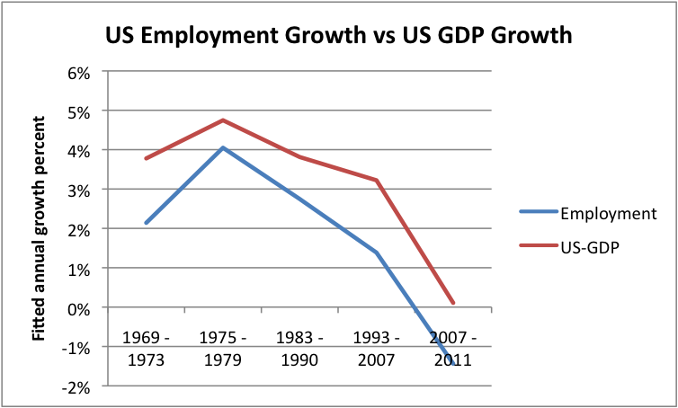
Figure 4. US growth in number of non-farm workers versus growth in real GDP. US real GDP from US Bureau of Economic Activity; Non-Farm Employment from US Bureau of Labor Statistics. Fitted periods are 1969-1973, 1975-1979, 1983-1990, 1993-2007, and 2007-2011.
Note that decreased growth in the number of employees could be taking place for any number of reasons–less growth in illegal immigrants, fewer homemakers going back to work, more people going to college, or more people retiring or taking disability coverage, or just generally discouraged.
It is my observation that the number of workers in the US today seems to depend on the number of jobs available. If jobs in some fields are being increasingly shipped to lower-cost countries–the ones we will see in Figure 7 are now using a disproportionate share of the world’s oil–these jobs will not be available, no matter how many workers might be willing to take them, if they were available.
If we look at the trend in real GDP growth for three major areas (United States, European Union-27, and Remainder = World minus the US and EU-27) , we discover that indeed, all three of the areas show a downward trend in real GDP over time (Figure 4, above). The GDP growth of the EU-27 and the US start from a lower level, and drop off more in the 2007-2011 period, (when the price of oil imports was more of an issue) than the “Remainder” grouping.
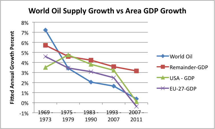
Figure 5. Annual growth in world oil supply compared to annual growth in real GDP, both based on exponential trend fits to values for selected years. Oil supply data from BP oil consumption data in 2012 Statistical Review of World Energy; real GDP from USDA Economic Research Service.
One reason why the Remainder-GDP may be doing better than the others is that heavy manufacturing, and the jobs that go with heavy manufacturing, are finding their way to lower cost countries. High oil prices may also be discouraging oil importers from purchasing oil. If we look at oil consumption for the three groups, this is what we see:
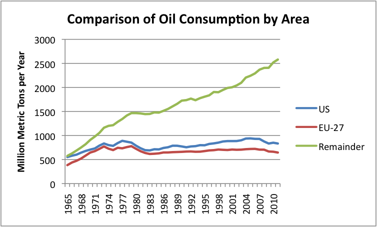
Figure 6. Comparison of oil consumption by area (United States, European Union -27, and rest of the world), based on BP’s 2012 Statistical Review of World Energy
Much of heavy manufacturing has been moved out of the United States and the European Union. Figure 7 below shows that the rest of the world is now using well over half of the world’s oil:
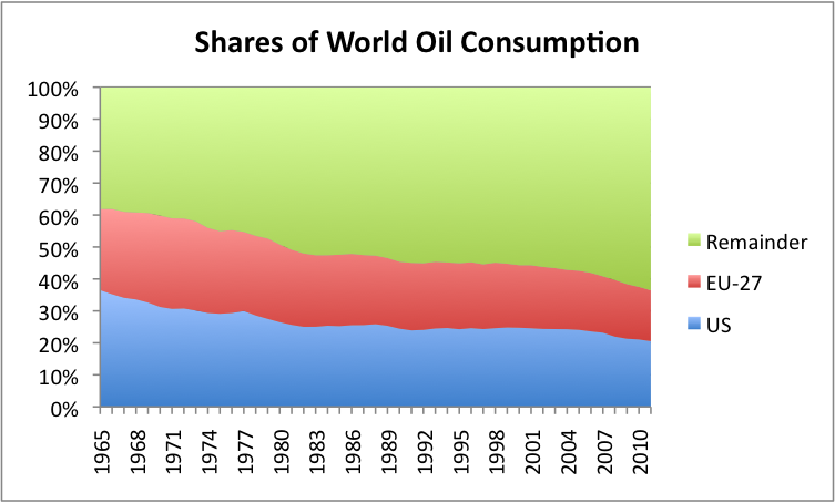
Figure 7. Percentage shares of world oil consumption based on BP’s 2012 Statistical Review of World Energy.
Going Forward
We have seen (Figure 5, above) that all three grouping shown (United States, EU-27, and the rest of the world) are showing declining real GDP patterns, similar to the world pattern. GDP growth rates of the United States and EU-27 are both at lower levels than the World and Remainder, for reasons explained.
It is hard to see why current trends wouldn’t continue, with growth in real GDP continuing to decrease for all three groups. Regardless of the hoopla in the United States press about supposed growth in oil supply, the fact remains that growth in world oil supply has been worrisome for many for roughly 40 years, since US oil production started decreasing in 1970. It is hard to believe that the latest “fix” is going to turn things around. The typical pattern in oil supply is for extraction in an area to hit a maximum (or perhaps a plateau) and then decline.

Figure 8. Crude oil production in the US 48 states (excluding Alaska and Federal Offshore), Canada, and Europe, based on data of the US Energy Information Administration.
Figure 8 shows (among other things) how steep the US drop in oil production in the contiguous 48 states was starting in 1970. This decline set the stage for the 1973 Arab Oil Embargo, since oil-producing countries now had the upper hand. Production in Alaska and in the Gulf of Mexico eventually helped offset part of the drop, but the Alaska production (not shown) is now declining as well. Change in the balance of power regarding oil production following the decline in US production, and recognition that increased imports would cause balance of payments problems, seem to have influenced the US and Europe’s decision to focus on service industries and on industries with little oil usage, holding their oil usage down (Figure 6).
Figure 8 also shows how new onshore techniques–fracking and other enhanced oil recovery–are affecting US crude oil production. While US-48 states crude oil production has shown a 25% increase since 2006, this production is still only 39% of the 1970 amount, and about equal to 1942 production. Oil production in Canada (which includes the oil sands) is rising, but not very rapidly, from a low base. It is hard for small increases such as those of Canada and the US-48 to make up for major declines in production occurring in Europe and elsewhere. World oil supply would be increasing by more than a fraction of 1% per year if changes frequently noted in the US press were really making an important difference in world supply.
Analysis of Annual Change Percentages for Oil and Real GDP:
It is also possible to look at annual percentage changes, corresponding to the ranges analyzed above. (Some people may be more familiar with this approach.) In this approach, we “lose a year.” For example, the first range is five years, 1969 to 1973. But if we use annual percentage increases, the first percentage increase occurs in 1970, and there are only four percentage changes in total, 1970 to 1973. To calculate some sort of an indication (similar to, but not equivalent, to that above), we calculate the simple average of the four increases. The resulting graphs are as follows:
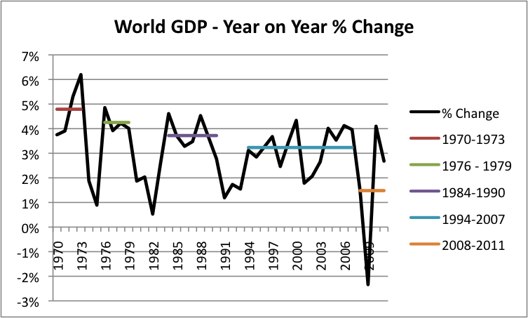
Figure 9. Annual percentage increases in world real GDP with simple averages for the ranges indicated, corresponding to Figure 1.
Note that percentage changes are slightly different, but follow the same pattern as in Figure 1.

Figure 10. Annual percentage increases in world oil supply with simple averages for the ranges indicated, corresponding to Figure 2. (except 1966 to 1969 us omitted to correspond to GDP ratios and amounts shown on Figure 3.)
Here again, we note a very similar pattern. Thus, the analysis on this basis seems to be similar to that using the fitted exponential trend lines.
Tentative Indications for the Future
We can use the relationships between the individual year changes in oil supply and real GDP to build a simple model showing how much of an increase in GDP can be expected to take place for a given increase in oil supply.
If we graph the annual percentage changes in real GDP versus the annual percent changes, what we see is the following:
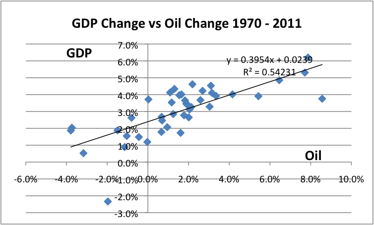
Figure 11. An “X Y” graph showing the percentage changes in world real GDP that correspond to percentage changes in world oil supply, for the years 1970 to 2011.
It is clear in looking at the data that the pattern in the earliest part of the period is different from that in the later periods. In the very earliest period (1970 to 1973), oil use increased more rapidly than GDP. Once we realized we had a problem, there was a mad dash to try to reduce usage. If we look at only the period since 1983, when there was more of a sustained attempt to transfer to lower priced fuel, this is what the graph looks like.
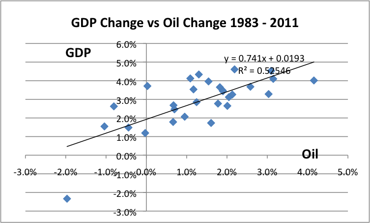
Figure 12. An “X Y” graph showing the percentage changes in world real GDP that correspond to percentage changes in world oil supply, for the years 1983 to 2011.
Using only the recent data, the R2 is similar (.53 for 1983-2011 data vs. .52 for 1970 to 2011), but the slope of the line is a little steeper. While at R2 of .52 or .53 is not exceptionally high, it does explain a significant portion of the total variance, so let’s look at what the indications of the trend lines are.
If the annual percent change in oil supply is 0.4% (as it seems to be now), the predicted annual increase in world real GDP is 2.5% per year using the 1970-2011 fit, or 2.2% using the 1983-2011 fit. Thus, both fits suggest that with the small increases we are seeing in oil supply currently (about 0.4% per year), we are already at a point where world real GDP can be expected to be much lower than most economists would prefer (2.2% or 2.5% per year).
The Figure 12 fit (using 1983 to 2011 data) would seem to be slightly better for predictive purposes, since it is more representative of the current situation.
If we want world real GDP to grow by 4.0% per year, the fit from Figure 12 (based on the equation y = 0.741 x + 0.0193) would suggest that world oil supply needs to rise by 2.8% per year. If we want world real GDP to grow by 3.0% per year, we need oil supply to grow by 1.4% per year.
We can also look at what theoretically would happen if world oil supply starts declining (but here we are on shakier ground, because of many follow-on effects). If oil supply declines by 1.0% per year, the regression line in Figure 12 would suggest that world real GDP can be expected still be expected to increase, but by only 1.2% per year. If world oil supply declines by 2.0% per year, the model would suggest world GDP can be expected to increase by only 0.4% per year. If world oil supply declines by 4.0% per year, the model would suggest that world real GDP can be expected to decline by 1.0% per year.
These are very tentative amounts. Clearly, if world oil supply or world real GDP starts decreasing, there will be many follow on effects, including political changes, and these may have effects of their own. Also, if it is clear that we again have a serious oil problem, there will be a mad dash to eliminate unnecessary use, and this may have a favorable impact on real world GDP.
But it is clear from these calculated amounts that we are entering a very challenging period.
This post combines two Our Finite World posts: Evidence that Oil LImits are Leading to Declining Economic Growth and How Much Oil Growth do We Need to Support World GDP Growth?