We know oil prices peaked in the third quarter of 2008–in fact in July 2008. But what else peaked about the same time? It turns out when you look at the data, lots of things:
It seems to me that the current crisis is credit driven, which is why it is so widespread. I had expected a credit crisis to result from the rising price of oil, because the rising price of price would choke back growth, and this would likely lead to debt defaults. But as I look at the data, I discover other relationships I didn’t really expect.
Total Employee Compensation, from the US Bureau of Economic Analysis
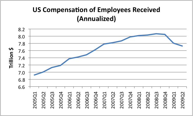
It turns out that total US employee compensation peaked in the third quarter of 2008 (I don’t have the data by month), so it peaked at the same time as peak oil. As I look at the breakdown of this, I find the government employee compensation has continued to rise since the peak.
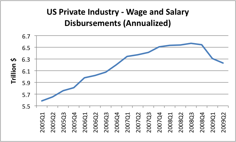
What has really fallen since the peak is private industry wages. The above data also peaks in the third quarter of 2008. The amounts shown are annualized quarterly amounts (seasonally adjusted). In some sense, private industry wages drive everything, since without these, people would have difficulty buying anything, or paying taxes, or paying back debt. The fact that these are as small as these are– only $6.6 trillion a year at their peak; now down to $6.2 trillion in the second quarter of 2009 is concerning.
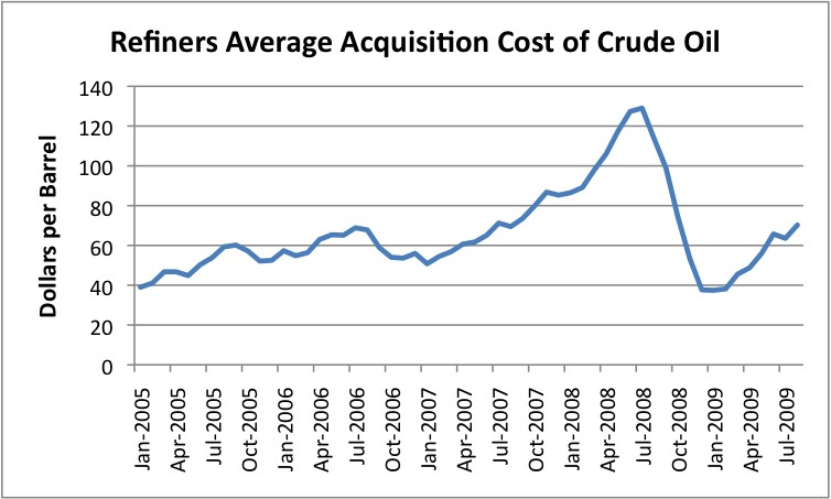
We know that oil prices peaked. This is how the prices refiners paid for oil (including US produced and imports were affected). Prices dropped a lot, but it turns out they only dropped to about the price that was being paid at the beginning of 2005.
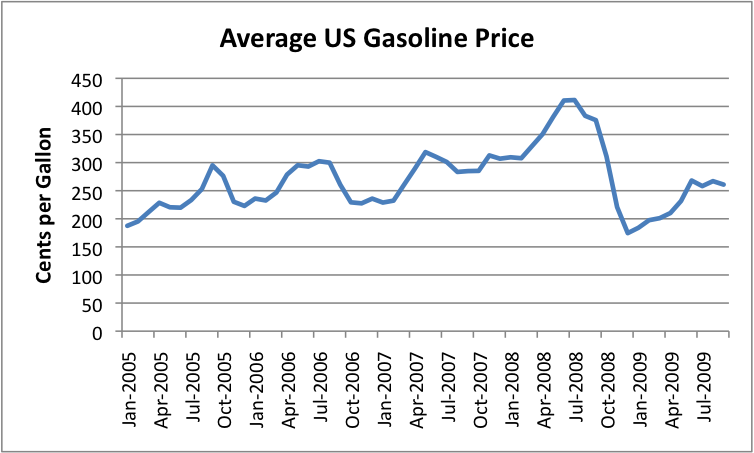
Gasoline prices rose, but they didn’t rise nearly as much as did the price of oil. This is to be expected, because part of the price of gasoline is people’s wages, and fixed expenses, and these did not rise nearly as much as the price of oil.
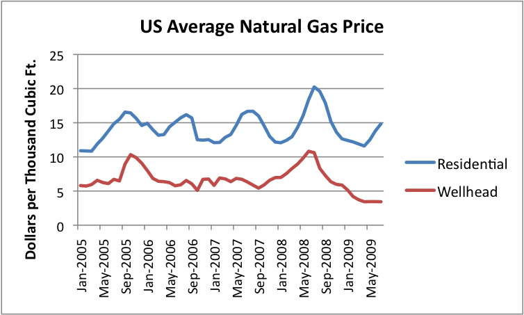
Natural gas prices hit their peak at about the same time. What is striking to me is the huge difference between what producers are paid at the well head and what residential customers pay. The peak gas price, from a residential point of view was about $20 per 1000 cubic feet. It is now down to $15 per 1000 cubic feet. But the price at the wellhead reached a peak of $11 per 1000 cubic feet, and dropped to something in the $3 to $4 range.
We hear that natural gas is selling at a low price per Btu relative to oil, and it is, at the wellhead. But for a residential customer, the price still isn’t very low. There are a lot of costs in the production of natural gas, beyond wellhead costs. It seems to me that at least some of these costs are thanks to “deregulation”.
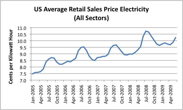
One thing I had not expected was the extent to which electricity prices have been rising over time, and the fact that their prices, too, peaked in the summer of 2008. Electricity prices tend to be higher in the summer each year, because more natural gas is used in summer, and it tends to be more expensive than coal.
One of the things that is concerning to me is the rise of electricity prices over time that the above graph shows. In the paper Accounting for Growth, the Role of Physical Work by Robert U. Ayres and Benjamin Warr, Structural Change and Economic Dynamics, February, 2004), Ayres and Warr show a model that indicates that growing energy efficiency, together with greater energy inputs, explain most of the rise in GDP between 1900 and 1998.
In the same paper, they indicate that the declining real cost of energy, particularly electricity, and the rising use of the much cheaper electricity, fed economic growth in the 1900 to 1998 period. The problem we have now is that we are getting to precisely the opposite of this situation–electricity prices are now rising, and use falling. This is not normally a formula for economic growth.
There are no doubt several reasons for the rise in electrical prices:
• Deregulation. With many more players, each trying to make a profit, prices didn’t go down, as many had thought they would.
• Rise in oil prices. Oil is used to transport coal, so as oil prices rise, electricity from coal can be expected to increase in price.
• Law changes to reduce coal pollution In order to reduce sulphur emissions, electricity producers bought lower quality coal that needed to be shipped longer distances. This reduced the efficiency of the electrical plants and increased transportation costs.
• Shift in mix. The shift in mix of electrical production has shifted to more natural gas and to more wind. These tend to be higher cost, and thus raise costs.
Going forward, there may be additional reasons for cost rises as well:
• Cap and trade laws. These will add costs and shift toward higher cost sources of generation.
• Cost of grid improvements These are badly needed, especially if wind is added.
• Declining demand. There are still huge overhead costs to cover, even as demand declines, as it has recently.
While the rise in electrical price may be inevitable, it can be expected to have a negative impact on economic growth, just as a rise in oil prices above a certain level stifles economic growth.
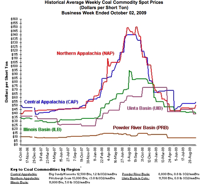
I might also note that coal prices (used in electricity production) peaked during the same period. On an annual basis, using actual sales prices (including contract prices), the EIA indicates the following average prices:
• 2005 $23.59
• 2006 $25.16
• 2007 $26.20
• 2008 $32.59
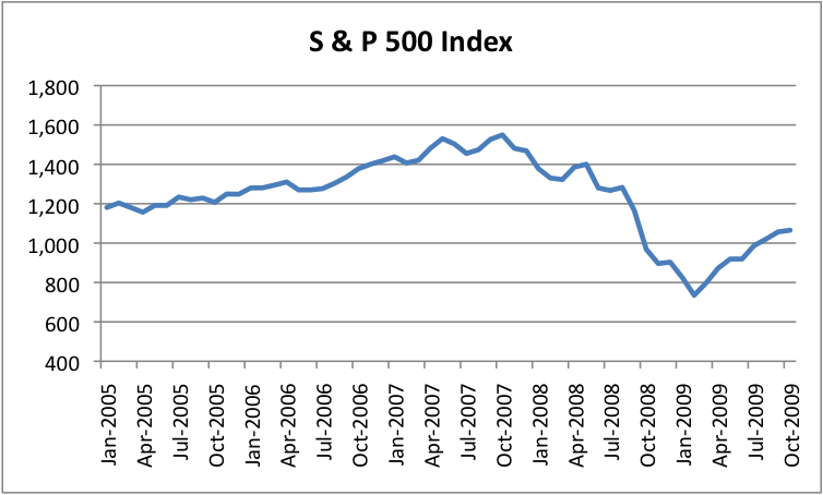
As everyone knows, stock market prices also declined in the same period, but their peak came earlier–back in 2007.
I haven’t figured out a way to look at how people’s incomes were affected by the many changes affecting them–falling stock markets, falling housing prices, declining debt availability, and declining wages. I did figure out a way to look at a couple of these things simultaneously–debt and income.
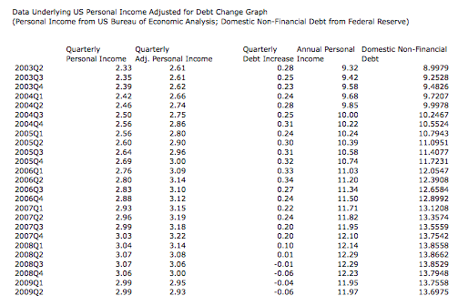
The Federal Reserve shows information on US domestic non-financial debt. This would seem to include mortgage debt, credit card debt, auto debt, and most other individual debt, but not debt used for, say, purchasing stocks and bonds, or debt of businesses or governments. It seems to me the increase in domestic non-financial debt gives a sense of how well off people feel they are. As the amount of debt increases, people can buy more and more “stuff”. If we add the change in this debt to the amount of personal income, it gives a rough measure of how much a person had to spend in a year. (Of course, the number of workers was going up slightly during this period, so the per capita changes are a little lower.)
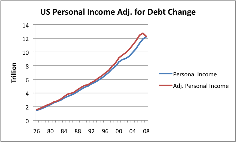
Looking over the long term, the growth in debt tended to increase funds available to the US population. The amount of debt added got larger and larger during the early 2000s, but then decreased in 2008.
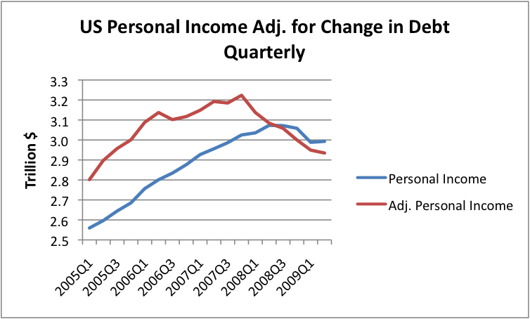
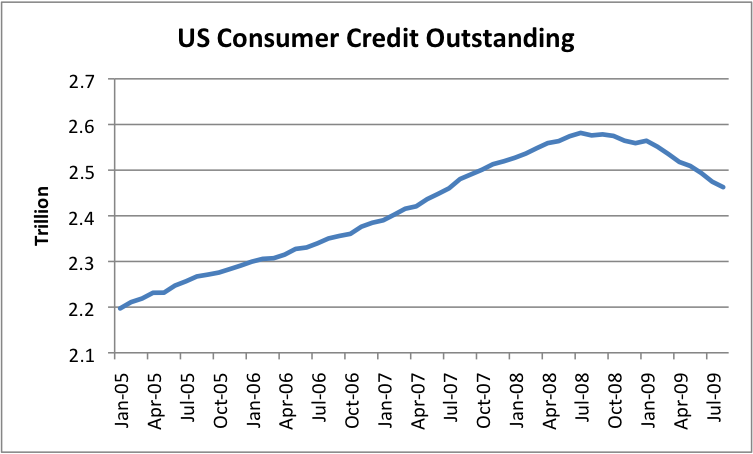
If we look at recent quarterly data, one can see how the decline in personal income has combined with the reduction in debt to provide a “double whammy” to the individual. While personal income hit a peak in the summer of 2008, personal income adjusted for debt reached a peak earlier–back in the fourth quarter of 2007. As mortgage debt started to contract (lead partly by falling housing prices), this started to affect homeowners even before the drop in consumer credit (auto loans and credit card debt). So this graph helps show why people started feeling poor, even earlier. Of course, the drop in the S&P 500 didn’t help either.