
Last week the U.S. Federal Reserve closed a chapter on the experiment with quantitative easing, just as the Bank of Japan opened a new one. Seems like a good time to comment on some of what we’ve learned so far.
The conventional way that monetary policy was used to provide more stimulus to a weak economy was to lower the short-term interest rate. The Federal Reserve brought the fed funds rate essentially to zero at the end of 2008, but the economy continued to worsen. So the Fed tried to see what it could accomplish by buying huge quantities of longer-term securities. One theory was that by taking enough of the supply of these assets out of the hands of private investors, the price might be driven up and the long-term interest rate would come down, providing some stimulus to investment and borrowing.
The Federal Reserve’s large-scale purchases of long-term securities came in three distinct phases, popularly described as QE1, 2, and 3. During QE1, the Fed increased its holdings of Treasury, agency, and mortgage-backed securities from $584 B on March 11, 2009 to $2,012 B by March 24, 2010. Those holdings still stood at $2,033 B on October 27 of that year, but rose under QE2 to $2,626 by June 22 of 2011. After another pause, the Fed resumed large-scale purchases with QE3, under which its net holdings increased on average by $20B a week between November 2012 and December 2013. At that point the Fed announced its dreaded “taper”, initially a barely perceptible decrease in the rate at which the Fed would continue to add to its holdings, but which finally brought net new purchases down to zero with the Fed’s announcement last week. I’ve associated the start of the taper in the graph below with April 30 of this year, the date by which net purchases had fallen to about half the pace of 2013.
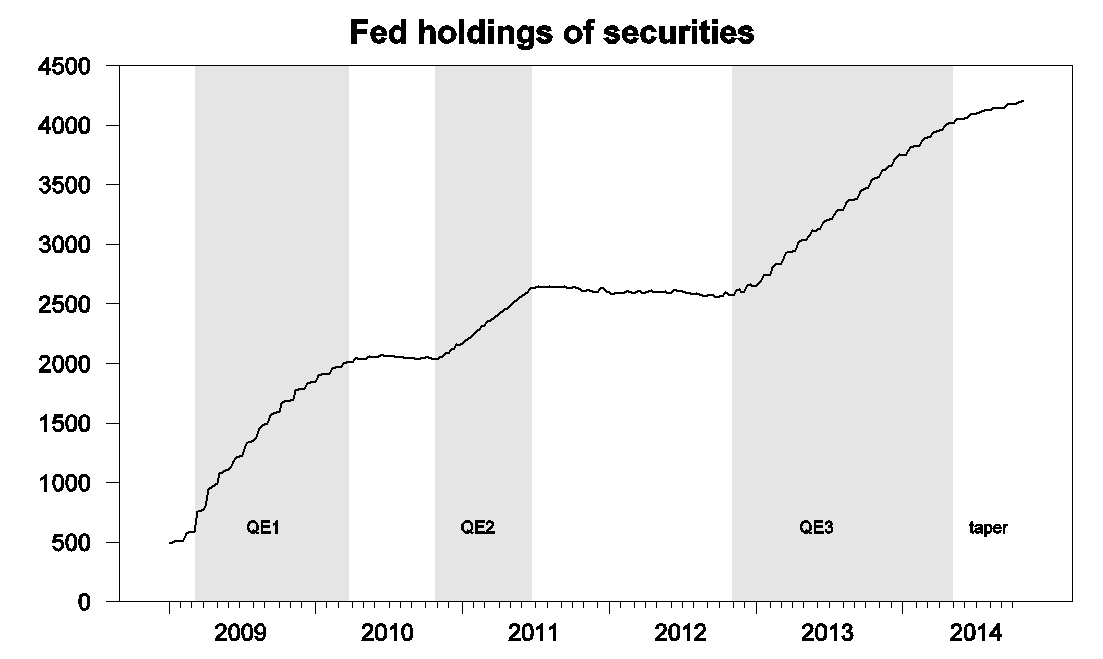
Figure 1. Federal Reserve holdings of Treasury, agency, and mortgage-backed securities, weekly, Jan 7, 2009 to Oct 29, 2014. Excludes inflation compensation and unamortized premiums or discounts. Data source: H41.
A number of research papers have attempted to measure the effects of these policies. The graph below illustrates the kind of evidence on which many of these studies relied. On March 18, 2009 the Fed announced that it would purchase up to $1,150 additional securities. Within minutes of the announcement, the yield on 10-year bonds had fallen by 40 basis points.
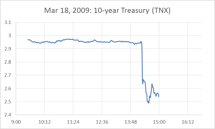
Figure 2. Yield on 10-year U.S. Treasury securities on March 18, 2009, as measured by the price of the TNX contract.
But over the next few days, the yield started climbing back up. By the end of April, the 10-year yield was higher than it had been before the Fed’s announcement. Columbia Professor Michael Woodford invited us to take a longer-term perspective on the effects of these policies. I’ve updated the idea behind one of his graphs using the above designation of the three policy regimes. On balance the 10-year yield rose during QE1, and only fell when the Fed stopped trying to do anything. Yields rose again during QE2, and again fell when the Fed stopped adding to its purchases. Yields also rose during QE3, only to decline as the dreaded taper unfolded.
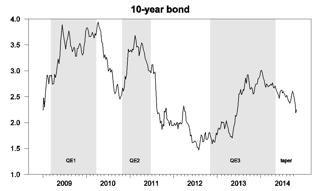
Figure 3. Yield on 10-year government bonds, weekly, Jan 2, 2009 to Oct 24, 2014, from FRED.
Possibly the large-scale asset purchases had effects through other mechanisms. One theory is that the Fed’s asset purchases could have raised inflation expectations so that, even if the nominal interest rate rose, the real interest rate could still have been driven down. A quick measure of real rates is provided by the yield on 10-year Treasury Inflation Protected Securities. The tendency to rise during QE2 and 3 and to fall during the periods when the Fed did nothing is if anything even more dramatic in real yields than it was for nominal.
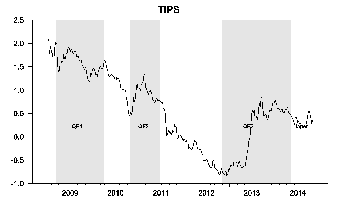
Figure 4. Yield on 10-year TIPS, weekly, Jan 2, 2009 to Oct 24, 2014.
Perhaps the measures affected the economy through other channels, a theory that one analyst described to me as “immaculate conception.” Here’s a graph of initial claims for unemployment insurance. New claims dropped dramatically as the recession ended, and that coincided with the period when QE1 was still in effect. But if you can see an impact of QE beyond that, your eyes are sharper than mine.
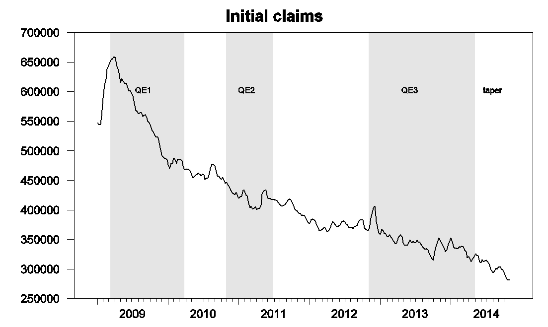
Figure 5. Initial claims for unemployment insurance, weekly, Jan 3, 2009 to Oct 24, 2014.
Personally I am persuaded that the Fed’s actions did have some effect. It’s impossible to look at Figure 2 above and claim otherwise, and there are a number of studies that use methods other than the event-study approach in Figure 2 that support the conclusion that these policies can have some effects. But it seems to me that the fair conclusion to draw from Figure 3 is that, whatever these effects may have been, other developments beyond the control of the Federal Reserve have likely been more important in determining what happened to long-term bond yields over the last 5 years.
Fortunately from the point of view of economic research, the Bank of Japan has decided to provide us with some more data. The BoJ announced on Friday massive new asset-purchase plans, intending not only to buy government debt at twice the rate it is being issued by the Japanese treasury, but also to buy stocks and real estate funds directly. Japanese stocks rallied immediately in response to the news.
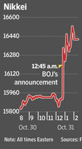
Source: Wall Street Journal.
But what I’ll be interested in seeing is how long the effect turns out to last.