This is a guest post by Dave Rutledge. Professor Rutledge is the Tomiyasu Professor of Electrical Engineering at Caltech, and a former Chair of the Division of Engineering and Applied Science there. This post originally appeared on Judy Curry’s Climate Etc. blog here.
– Euan Mearns (The Oil Drum)
In this post, I consider the limited impacts of climate policy on fossil-fuel production and discuss estimates of fossil-fuel production in the long run. Since this is a cross post, with the original aimed at an audience with a climate interest, it includes introductory material that will be familiar to most Oil Drum readers. I would like to acknowledge the comments on my two earlier TOD posts, The Coal Question and Climate Change and The Coal Question, Revisited, that have helped me in writing this post.
1. Climate Policy and Fossil-Fuel Production
I will start with the notion that the response of carbon dioxide in the atmosphere has slow components that will dominate over time, like the exchange with the deep ocean and weathering of rocks. David Archer expressed this vividly, “A better approximation of the lifetime of fossil fuel CO2 for public discussion might be 300 years, plus 25% that lasts forever.” This means that from a climate perspective, it really does not matter whether we burn a particular ton of coal now or at the beginning of the Industrial Revolution—what counts is the total that the world burns in the long run.
This has several consequences. First, a national policy to reduce fossil-fuel consumption, like mileage standards for cars, will have little climate impact if it does not change world consumption in the long run. Actually, because oil is traded in a world market, mileage standards may have no effect on world oil consumption even in the short run. Figure 1 shows a plot of annual production versus price. Except for the years around the 1979 Iranian revolution, production increased steadily, and the price stayed below $50 per barrel in today’s money. However, starting in 2004, the plot went vertical, with a price range of more than 2:1, but with production varying by only 2%. If this is the case, when the United States reduces consumption, it will be offset by increased consumption elsewhere.
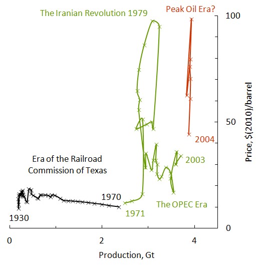
Figure 1. Supply vs price for world oil. Gt means billions of metric tons. This figure is an extension of one published in 2009 by Euan Mearns at The Oil Drum. Data are from the BP Statistical Review and from Brian Mitchell, 2007, International Historical Statistics, Palgrave-MacMillan.
Second, a new fossil-fuel resource resulting from improved technology like shale gas adds to long-term fossil-fuel production, increasing any climate effects. This is true even if the shale gas reduces carbon-dioxide emissions temporarily by partially displacing coal in electricity production.
The final implication is that resources must be walled off from future production to have an effect on climate. My favorite example of this, not least because of the political skill involved, was the creation of the Grand Staircase-Escalante National Monument in Utah by the Clinton Administration. This area contains most of the Kaiparowits Plateau coal field, which is a big one. The Utah Geological Survey estimated the minable coal at 11Gt. For comparison, annual US coal production is about 1Gt. The action was not popular in Republican Utah, which might have gotten $30 per ton for the coal. President Clinton, a Democrat, made his announcement across the border in swing-state Arizona, which he carried in the election two months later. Even though we can acknowledge President Clinton’s political ability, we should be cautious in crediting him with a full 11-Gt reduction in future production because it is not clear how much production would have taken place without National Monument status. Past production only comes to 40,000 tons, with none since the 70′s. It is worth noting that the US Geological Survey estimate for the recoverable coal was 4Gt, much less than Utah’s.
Can climate policy significantly reduce world fossil-fuel production in the long run? At the G8 meeting in L’Aquila, Italy, in 2009, our leaders pledged an 80% reduction in greenhouse-gas emissions by 2050. This proclamation is certainly meant to encourage the countries of the world to commit to this reduction, but so far only the UK has passed the legislation for it.
For perspective, it is worth looking at the historical record before and after the Kyoto Agreement was signed in 1997. Figure 2 shows world fossil-fuel carbon-dioxide emissions, taken from the BP Statistical Review. Do you see a decrease in emissions after the agreement was signed? I don’t either; if anything, emissions accelerated. It is worth noting that the EU and the US show the same percentage decline in emissions, 0.4%/y over the last 10 years, even though the EU countries all ratified the Kyoto Agreement and the US did not.
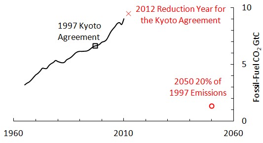
Figure 2. Annual world fossil-fuel carbon-dioxide emissions. 2012 is the year countries are judged on whether they have met their Kyoto commitments. The 2012 marker is an extrapolation, based on the average growth rate over the past ten years.
The figure also shows where an 80% reduction in 2050 would take us. It is not easy to convey the enormity of what our leaders agreed to. One comparison we can make is to the collapse of the Soviet Union. From 1990-1999, fossil-fuel emissions fell 40% there, and this was no one’s idea of a good time. To get to 80%, the entire world need to do this four times, voluntarily. Not going to happen. What were they smoking?
What about policy impacts at the local level? My home state of California has implemented an ambitious renewable-energy policy through a series of laws, starting with Assembly Bill 1078 in 2002 and culminating in Senate Bill 2 in 2011. These commit the state to a 20% renewable share for electricity in 2010, and a 33% renewables share in 2020. In California-speak, renewables means no large hydro and no nukes. In his signing letter for Senate Bill 2, Governor Jerry Brown wrote, “With the amount of renewable resources coming on-line, and prices dropping, I think 40%, at reasonable cost, is well within our grasp in the near future.”
Well, we are half-way from 2002 to 2020 now. How is California doing? You can judge the progress in Figure 3. The in-state renewables share has actually fallen during this period. California missed its 2010 goal badly, but it appears that the only result of this was to set an even more unrealistic goal for 2020. Governor Brown seems to be smoking something also.

Figure 3. Renewable shares in Californa. The data for the figure come from the California Energy Almanac. Incidentally, if you like plans, this web site is great. But if you want data….
It is hard for me to think of a bigger disconnect between the politics and the reality. What is going on here? Table 1 shows the renewables shares by source. The biggest is geothermal, which peaked in 1992. Biomass is stuck because pollution rules make it is difficult to get permits to build an incinerator in California. Small hydro is no longer favored and it shows. The one bright spot is wind from Oregon and Washington, but wind imports are not going to get us anywhere near 33% by 2020. Most surprising is that the solar share has been flat for ten years, even though California’s solar resources are stupendous.
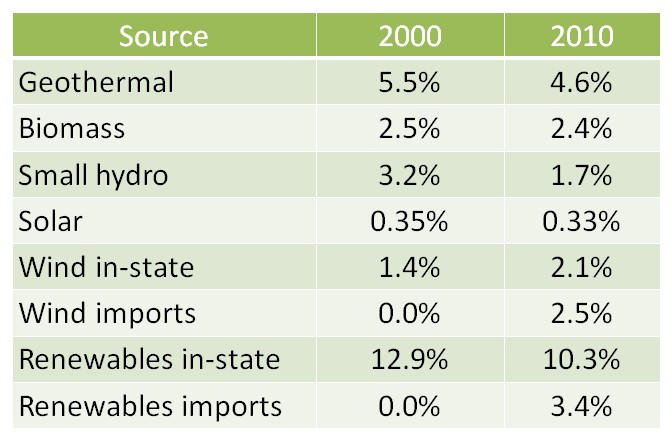
Table 1. Renewables shares for California electricity in 2010 and 2010. I have broken out in-state and imports for wind, but the total is shown for the other sources.
What this tells us is that there is no magic climate-policy wand that will let us set the total fossil-fuel production in the long run to a particular number. This is not to say that climate policy does not have short-term effects. The EPA’s proposals for carbon-dioxide emissions limits certainly discourage utilities from building new coal plants. If I were a Kentucky coal miner who lost his job this year I would likely blame the EPA. However, the current coal plants could be operated for generations to come, so the coal can be consumed eventually. In addition, even if American customers are lost, an offsetting export market may develop because American coal mining costs are low. Wyoming miners can make money selling coal at $10 per ton, while the price in the main export market, East Asia, is over $100 per ton. This depends on being able to ship the coal to East Asia at a cost that would meet the market price there.
2. Reserves vs. Resources
So, independently of climate policy, how can we estimate production of oil, gas, and coal in the long run? Economists have shown surprisingly little interest in this problem, but many geologists and engineers have been fascinated by it.
First we need to distinguish two terms, reserves and resources:
Reserves refers to oil, gas, and coal that have been discovered and characterized (proved), and that one could produce and sell at a profit now. People distinguish between the oil (or gas or coal) in place, and recoverable reserves that make an allowance for what is left behind when production is finished. Proved, recoverable reserves for oil, gas, and coal have been tracked at the national level for many years.
Resources refers to oil, gas, and coal that are of economic interest. This is a broader term than reserves. At the national level, resources are not well defined or tracked, and they are subject to political winds. In practice, resources means whatever a speaker wants it to mean. As a result, the statement in the President’s recent State-of-the-Union Address, “We have a supply of natural gas that can last America nearly 100 years,”conveys little information.
The boundary between the reserves and resources is not fixed. New technology and higher prices can cause resources to shift to the reserves category. For one example, because of new horizontal drilling and hydrofracturing technology, some shale gas can now be counted as reserves rather than resources. As another example, high oil prices have enabled production from the Canadian tar sands, and Canadian oil reserves are now 3rd largest in the world.
Perhaps surprisingly, reserves can also shift to resources. In 1913, US coal reserves were 4Tt (trillion metric tons). A hundred years later after 60Gt of production, American coal reserves are now 240Gt. The early reserves criteria were too optimistic—seams as thin as 1 foot down to a depth of 4,000 feet down were counted. However, this coal was not mined a hundred years ago, and it is not mined now. Over time, as it has became clear that the criteria were too optimistic, the US Geological Survey tightened up the rules, and other countries followed their lead.
We will develop estimates first for coal, and then for oil and gas together. At this point, future production for other sources like methane clathrates and oil shales is speculative, and they will not be considered.
3. Coal Production in the Long Run
In energy terms, world coal production is 95% of world oil production, and coal is on track to pass oil this decade. Coal markets are regional—85% of coal is consumed in the country it was mined. This means we need a regional analysis. I have given one in a paper in the Journal of Coal Geology that considers the world in 14 regions. I will only summarize the results here. The approach in the paper is to fit an s-curve (logistic or cumulative normal) to the cumulative production history, and to use the top of the s-curve as an estimate of the total production in the long run. Coal has a long production history that we can use to test our ideas. Several regions are very late in the production cycle, with a current annual production that is a thousand times less than the cumulative production. The results for these mature regions are summarized in Table 2 below.
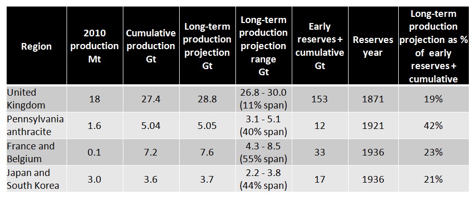
Table 2. Production for four mature coal regions. This table is an updated version of one that appeared in my Coal Geology paper.
One way to estimate the long-term production is to add reserves to the cumulative production. Early reserves and production history are available for each of the regions. Surprisingly, this approach gives numbers that are too high. For example, Japan and South Korea have produced only 21% of the early reserves plus cumulative production. The other regions also show this pattern. Across the four regions, the average is only 26%.
The results of the s-curve fits are given in the “Long-term production projection” and “Long-term production projection range” columns. “Long-term production projection” gives the current estimate, and the range column indicates how the projections have evolved since 1900 (since 1950 for Japan and South Korea). The average range in percentage terms is 38%, so this gives the uncertainty in the estimate. It is interesting that in each case, it appears that the range will include the actual long-term production. However, we cannot be sure of this until the last mine in each region shuts down.
How should we interpret these results? None of the mature regions has come close to producting its reserves, so for coal at least, we might take the reserves as an upper bound on future production. It is interesting that the IPCC in its scenarios assumes that a multiple of the reserves could be produced. However, there is no historical precedent for this in any of the mature regions. On the other hand, the s-curve fitting ranges do appear to predict the long-term production correctly, with an error of about plus or minus 20%.
We can estimate the long-term production for the entire world by adding the results for the 14 regions. The latest world reserves at year-end 2008 were 861Gt and the world cumulative production at that time was 303Gt. This gives a total of 1,164Gt. The s-curve fits updated for the 2010 production give a long-term production of 723Gt, 62% of the reserves plus cumulative production. Thus, the pattern of underproducing reserves that we saw in the mature regions appears to be repeating.
The analysis also indicates that the world reaches 90% of the eventual long-term production in about 60 years. This result should be viewed as a current trend, rather than a projection with uncertainties, because historical shocks that changed the production rate. For example, production slowed after the collapse of the Soviet Union. For the mature regions the production at the 90% point had fallen to about 40% of the peak production. So at that point you would need a Plan B or use less.
4. Oil and Gas Production in the Long Run
In contrast to coal, about half of world oil and gas is exported, and we can consider a world analysis. Usually oil and gas are considered separately, but there is really not a clear distinction. They often come out of the same wells and some products like propane are sold pressurized as liquids and burned as gases. Figure 4 shows the production history.
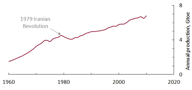
Figure 4. Production history for world oil and gas, taken from the BP Statistical Review. Here toe stands for metric ton of oil equivalent. It is an energy unit equal to 42GJ.
Notice that the world shifted to a slower pace after the 1989 Iranian Revolution. For this reason, I will start the curve fits a few years after the revolution. The approach I use here was popularized by Ken Deffeyes in two very interesting books, Hubbert’s Peak and Beyond Oil. The technique is called Hubbert linearization, in honor of the geophysicist King Hubbert, who first used it for this purpose. In Hubbert linearization, the cumulative production is plotted on the x-axis, and the growth rate for the cumulative is plotted on the y-axis (Figure 5). Algebraically, the growth rate can be expressed as p/q, where p is the annual production and q is the cumulative production. This kind of plot linearizes a logistic function. The chief advantage of Hubbert linearization is that it gives one an excellent way to visualize the fit. There are some disadvantages that are discussed in my Coal Geology paper.
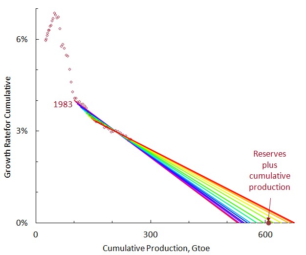
Figure 5. Hubbert linearization for world oil and gas. This is same data as Figure 4, but replotted with different axesw. The point for the reserves plus cumulative production is calculated from various editions of the BP Statistical Review.
In the Hubbert linearization, the x-intercept gives the estimate for the long-term production. In the figure, I vary the starting point from 1983 to 1995 to give a sense of the uncertainty. The range is 530-680Gtoe. This range contains the reserves plus cumulative production, 608Gtoe. This is different from coal, where countries under-produced reserves. This agreement is fortuitous; it is easy to identify factors that might bias oil and gas reserves high and low. US oil reserves have historically been close to ten years of future production, which clearly makes them too low as an estimate for total future production. On the other hand, OPEC oil reserves have often been criticized for arbitrary increases and lack of outside auditing, and may be biased high.
I will not give the analysis here, but it turns out the curve fits indicate that the world reaches 90% of the long-term oil and gas production around 2070, just like coal. Again, this does not mean that production would cease by then, but it is likely to be half the peak value and dropping. And as for coal, we would either need to use less or replace the energy from a different source.
5. Discussion
Oil and gas are really quite different from coal, and we should not expect their reserves to necessarily have the same relationship to long-term production. Oil and gas are usually hidden in geological traps, and they are difficult to find. Once found, however, oil and gas are relatively easy to produce—the pressure helps. Governments can even arrange turn-key concessions, and the money starts rolling in. On the other hand, coal is a rock, and it is easy to identify most of the major coal fields at outcrops. But there is nothing easy about mining coal underground. To get a sense for this, watch Michael Glawoggen’s documentary on Ukrainian coal miners. I am sure most of us would prefer to get our electricity from solar panels in our yard to manually hewing coal underground if we could afford it. However, coal provided the first rung on the energy ladder for many of the world’s economies, and our society reflects the scientific, technical, and social experience of underground coal mining. And coal has a similar importance in many countries that are on their way up today.
Table 3 summarizes the results. For coal, I use the curve fits, because they have proved more reliable in the mature regions than reserves. For oil and gas, the curve fits are consistent with reserves, and reserves are used. The current world production is also shown for comparison.
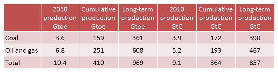
Table 3. Summary of results, expressed both in energy terms as Gtoe and as carbon dioxide emission as CtC, billions of metric tons of carbon content in the emitted carbon dioxide. At the world level the energy content of a ton of coal in the BP Statistical Review has historically averaged half that of a ton of oil. For these carbon-dioxide calculations, I have used the carbon coefficients in the BP Statistical Review. It should be kept in mind that the long-term production includes the current cumulative production. To estimate the total future production, you would need to take the difference of the two.
How do these emissions compare with the IPCC numbers? The forthcoming 5th Assessment Report uses representative concentration pathways, RCPs for short. The total carbon-dioxide emissions here, 857GtC, fall between RCP2.6 (peaking around 660GtC in 2070) and RCP4 (1,100GtC and rising in 2100). However, these RCPs assume an effective climate policy. They start with a prescribed top-of-atmosphere forcing and work backwards to a published scenario. It would be more appropriate to compare the emissions here to RCP8.5. This is the only RCP that is unconstrained by climate policy and it might be said, even by geology, with cumulative emissions of 5600GtC in 2500.
For people in the renewables business, what are the implications of a 60-year time frame for reaching 90% of the eventual long-term production? I do not know, but I will guess. You will be facing economic headwinds for decades, and competing with rent seekers who are better at securing favorable rules than they are at actually producing energy. You will be dependent on subsidies and renewables targets, in other words, on other people’s money. But as the Iron Lady observed, other people’s money runs out.