This is a guest post by George Mobus. George is an Associate Professor of Computing and Software Systems at the University of Washington, Tacoma. His blog is Question Everything.
There seems to be an on-going debate among peak oilers and many economists as to which came first, the chicken (peak supply flow) or the egg (peak demand). The first is attributed to the classical peak oil theory that when about half of the oil in the ground is pumped out, extraction rates start to go into deceleration and eventually peak, thereafter going into decline. The oil price spike of 2009 was quickly interpreted in this vein, the price of oil reflecting the fact that peak had come at last and oil was just going to get more expensive with declining supplies. There were dire fears that oil at that price would trigger a recession, which seems to have been the case. But then the price fell precipitously leading other analysts to conclude that the spike might have been an anomaly set off by speculation and that the subsequent reduction in oil flow rates was due to demand destruction owing to the effects of a global recession.
The problem with these kinds of interpretations is that they often look for a prime cause in a linear chain of cause and effect. In this case the prime cause would have been peak oil and all else follows. A general truth behind this explanation is that oil is depleting and will indeed, if not already, become so expensive, both in monetary and energy terms, to extract that our production rates will begin to decline and less and less oil will flow over time. But the economic system that is dependent on oil is far more complex and no linear model can really explain what we have been witnessing in terms of oil prices and economic activity (the general so-called health of the economy).
Feedback, Mutual Causation, and Dynamic Systems
Real life dynamic systems are dominated by complex feedback loops, most of which operate over different scales of time. This latter fact is very hard to represent in typical systems dynamics models since the latter tend to provide only one size of time increment (Δt) for a time step and to represent much longer time scale phenomena. It is necessary to use extremely small time constants in your equations – and hope the precision is OK – and run your model for excessively many iterations.
But it is this mixture of short and long time scale phenomena with mutual feedback that cause system variables to behave seemingly erratically. In an attempt to try and grasp what is happening in the oil industry at a macro scale, I have employed two approaches to linking the many variables involved in the oil markets and the general economy in causal diagrams that might help shed some light on the interactions and subsequent seemingly unpredictable behavior of the whole system.
The first method is to show the large scale feedback loops in two domains: the consumer economy, and the debt-based (financial) economy to show the relations between the variables. These diagrams are based on outlines provided by Gail Tverberg (personal communications) from her financial markets perspective.
The second approach is to put together a systems dynamic model which attempts to combine several short and long-term loops that may help explain the seeming dichotomy between peak oil and peak demand and why the price system doesn’t seem to operate in the classic, and direct, economic supply-demand fashion we would expect. This article provides a first look at the developing model in an attempt to gather useful feedback from readers to help improve it.
Going Through the Loops
I’ll start with a simple loop diagram to show the long-term feedback between oil supply fluctuations, prices, effects on consumers and the economy, and how these eventually feedback to cause an opposite effect on supplies. This feedback loop is surprisingly similar to the phenomenon of homeostasis found in biological systems. Lowering supplies, possibly from diminishing extraction rates put upward pressure on oil prices, but that has an impact on consumers’ discretionary spending.
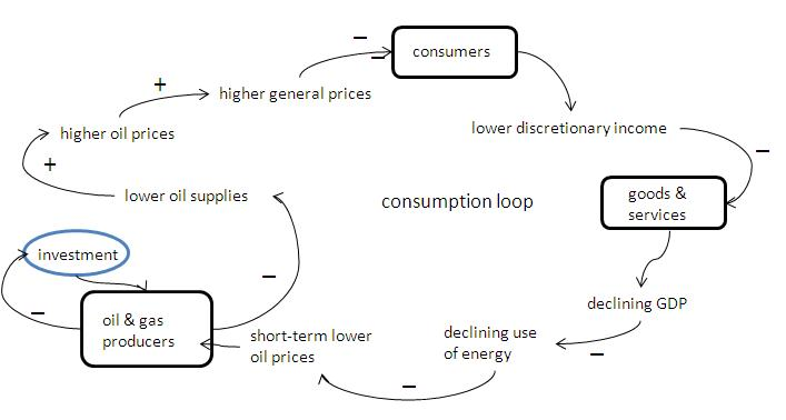
Figure 1. Oscillatory-like behavior results from long-term feedback through the consumer-based economic system to counter the direction of oil supplies and prices.
Consumers buy less stuff resulting in a softening of the economy. But that, in turn, means less work and hence less energy consumption. Lower demand puts downward pressure on prices causing producers to reduce their short-term production. And that, in time, drives the price of oil back upward. The time constants for this loop are probably measured in weeks or months with the severity of the swings based on shorter-term factors. For example, one could add a smaller loop to the above diagram in which oil investors (speculators?) monitor the supply on a weekly or even daily basis and try to anticipate the future with bids they think will make them a profit in the future. This, aside from often being inaccurate, at best, acts as an amplifier that drives the swings upward and downward more than simple supply/demand pressures would do.
A somewhat more complicated picture emerges when we include the business world as consumers of energy and suppliers of jobs, and the banking role played in lending operating and investment funds to both consumers and businesses. Figure 2 shows these additional factors and how they may affect the overall cycle.
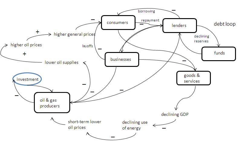
Figure 2. Businesses and consumers (who are also workers) borrow money from lending institutions to cover operating and capital costs with the intent of paying back the loans when work picks up. Due to the long-term average declining supply of oil, however, less work can be done making it difficult for both borrowers to service their debts. This additional negative feedback loop adds more difficulty to the supply loop since oil producers must rely on debt financing to expand their extraction efforts.
Oil supplies, relative to demand, are determined by the extraction rate supported by global producers. In the short-run producers (like Saudi Arabia) can up or down modulate their flow rates in order to adjust the supplies on a short time scale. However, in the long term, producers need to invest more capital and exploration costs to hopefully expand their production. They will do so only if for some period of time there appears to be a comfortable floor price for oil. They perform analysis of their returns on investment (ROI) just as any other business would to see if the investment today would pay off at some future (perhaps ten years off) time. In both figures above, the blue oval represents this investment time delay which introduces even more uncertainty into the problem.
However, there is one undeniable fact that can be shown to, in the long run, continue to drive supply relative to demand lower, and keep upward pressure on prices and that is the peaking and subsequent decline of oil extraction. The tendency for prices to inch upward acts like a speed governor damping demand and continuing to push the economy downward as less work gets done. Workers who lose their jobs, furthermore, will be buying less and thus acting to keep a consumption-based economy subdued (recession or worse).
Building a Simple Model
The second approach I am taking is to build a simple model of the dynamical system that impacts oil prices using feedback loops from both the supply and demand sides.
Below is a causal loop diagram of some of the major factors playing in the dynamics of oil and economic activity. I have explicitly left out players such as oil market speculators, financial institutions, and governments since these, in my opinion, act more like noise generators than meaningful feedback actors (except for my remarks about debt financing above). Perhaps a later, more refined model could incorporate them, but I think this version gets the major ideas across.
Oil price is the single most visible variable that people attend to in trying to get an understanding of the oil market. In the diagram, just above the Oil Price variable I show three different time scales of price tracking. The actual scale is not as important as is the shapes of the curves. When tracked on a weekly basis (for example as seen in the right-hand column of an Oil Drum page), the price appears quite variable. Lately the variability has been over a range of three or four dollars per barrel and monthly tracks put the range between $70 and $80 per barrel. This is fairly volatile by historical standards.
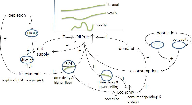
Figure 3. A causal loop model of oil price and economic activity dynamics. The arrows represent directions of influence. Positive signs attached to arrows means that the influence is in a numerically positive direction. Negative signs have the opposite meaning. The blue ovals represent various kinds of time delays or longer-term acting feedbacks.
Looked at over longer time scales such as a year or ten years we see the definite trend lines tending upward as various economic and physical factors create downward pressures on the net supply (i.e. EROEI is trending downward). In the longer term, it would appear that oil prices do follow the law of supply and demand as reflected in prices (assumed here to be held in constant dollars to avoid complications due to things like fiat money inflation).
Why then do we find periods when the price of oil is depressed by comparison with the trend? We are now prone to chalk it up to demand destruction which leads to an oversupply and thus downward pressure on price. Let me go through the various loops to see if we can see the pattern of supply crunch followed by price hikes, followed by demand destruction, followed by price deflation, but more importantly see these in the context of the overall economic activity and what it means to the health of the economy.
Starting on the left-hand side of the diagram, note that the variable ‘net supply’ has a direct positive impact on oil prices, but to generally drive them down. That is, the greater the net supply of oil, the lower the price should be, all other things being constant. The reason I chose net supply and not gross (which is the numbers most people attend to) is because of energy return on energy invested (EROEI). The time delay oval in the diagram represents a longer time-scale phenomenon in which EROEI is declining thus meaning that it takes more oil (or equivalent energy form) out of the production stream to produce the next increment of energy in oil. The net supply is what is left to supply the economy.
EROEI is driven most strongly by the physical realities of depletion of a fixed finite resource under the Best First principle and the sheer force of gravity. The only way to boost net supply against the ravages of EROEI is by increasing investment in new exploration and development, both of which take time (blue oval) before they begin to impact the net supply, and then only if depletion rates in already producing fields have not yet overwhelmed the new project production capacity. Investment, however, also hastens depletion (some shorter term developments like enhanced recovery may accelerate depletion).
Thus the net supply is a balance between on-going extraction from existing investments added to by new investments but countered by use rates in the economy. Oil companies make their investment decisions just like any other business based on the perceived return on investment (ROI), their profit prospects. ROI considerations are also made over time scales similar to development rates so the oil companies need to see some price stability that appears to provide a sufficient floor assuring their minimum ROI over the life of the new projects. If prices remain stable over this time scale, oil companies are willing to invest. But as the energy costs (and monetary costs reflecting that) reflected in EROEI continue to rise, especially if greater than anticipated, this can have an overall dampening effect on the process, generally reflected in putting a higher premium on future revenue streams as a kind of insurance.
The demand side of the diagram is influenced most by the rate of overall consumption in the economy. In the OECD nations, economies have largely moved to a consumer-based model which means that the more people spend the more the gross domestic product rises. Today we live with this myth that a growing GDP is a sign of a healthy economy.
But the caveat is that all economic activity, services, manufacturing, waste disposal, everything requires energy to do the work. As the price of oil has increased this has had a dampening effect on the economy in terms of general upward pressure on prices of everything. Labor is an example. People, especially in the US, live lifestyles that are extremely energy intensive. This isn’t just the energy they use directly to drive their cars or heat their houses. It includes all of the embodied energy in every product they purchase, every service they obtain, and every plastic package they put in the dump. Consumption is the big energy use driver in the developed world. This is as opposed to energy used to manufacture more energy efficient tools and appliances, which over their lives would help reduce the total energy demand rather than simply push it upward.
As one would expect, when demand exceeds supply oil prices do go upward (and that has been the long-term trend). This in turn leads to higher prices that help dampen consumption. We see this most effectively in the price of gasoline, but also in the price of foods that need to be shipped long distances. The oil price-consumption-demand feedback loop is the closest thing we have to a market-based regulation mechanism. The demand destruction, however, isn’t just left to consumers alone. When they start buying less, businesses that would ordinarily sell to them start to pull back. Economic activity in general declines, leading to a possible recession. It then takes time for this general reduction in energy demand to work its way back to the oil price variable. And all the while, the supply side resulting from prior years’ investments has pushed up the net supply (or at least its potential) so that once again prices are pushed downward from the overall trend.
The arrow looping back directly from oil price to net supply represents the shorter-term response of the oil industry to price declines or rises – the so-called spare capacity that can be turned on or off like a spigot. Since that is a generally small percentage of total maximum extraction capacity its impact on overall movement may not be that great.
The overall behavior of this system with respect to oil prices is similar to a final wave form in a superposition of various frequencies and amplitudes but with a generally upward trend. It is probably not possible to tell exactly what factor will cause the final ‘peak’ of energy flow in the classical Hubbert sense. But in a way it doesn’t much matter. The flow will peak and then decline and without a suitable substitute, the economic activity will follow suit. That much is certain.
Figure 4 is a hypothetical graph of several of the variables as a time series. This is just a hand-drawn output from the above causal diagram and should not be taken too seriously. Consider it instead as a form of hypothesis. Once the above model is built and running, we might expect the output to look like this.
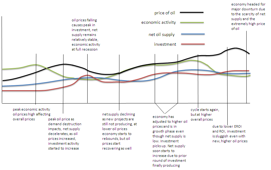
Figure 4. A hypothetical time series showing lead and lag times between the major variables in the above model. Representative conditions are marked to give some idea how the various factors play around one another over time. This might be representative of our current situation with the end of the graph representing a possible “double dip” recession (green line).
Impacts of the Financial System
Another factor that further complicates the picture and which I have not tried to explicitly include in the above model is the role of financing investment and consumption from debt instruments (as shown in Fig. 2). Debt financing is feasible when the economy is growing, because what that means, in terms of the above model, is that more energy is flowing per unit time. It means that as far as anyone can tell, there will be so much more work accomplished in some future period that resources allocated now will be more than paid for later, i.e. the debt will be repaid with interest and the future profits will be realized.
The OECD and major developing countries had built an elaborate and complex infrastructure of debt financing, including systems for betting that the debts will be paid off (derivatives), that essentially burst when the pin prick of $100+ oil poked it. The resulting debt unwind has had a very negative effect on further financing of new projects and so could accelerate the effects of depletion in a much shorter time than we had originally thought.
Couple that with the recent debacle in the Gulf of Mexico, Deepwater Horizon and the oil gusher, and we have an even more dubious picture. In all likelihood there will be considerable increases in regulation costs, technology for prevention, and insurance premiums against cleanup costs. All of these should realistically be counted as more energy costs and further declining EROEI.
Conclusion
Oil extraction and delivery rates, so-called production, and oil prices have dominated the focus of attention as causal variables in understanding our high energy economy, its growth or decline. But the system is significantly more complex than can be understood just by tracking these variables. Many factors interact over multiple time scales to produce the behavior of the economy and prices of energy commodities like oil. This paper has attempted to sketch out a causal loop model involving some of the most, but not all potentially, relevant factors that play against one another to produce the dynamics we observe. What this model suggests, as a kind of hypothesis, is that the overall long-term trend toward diminishing net oil supply (due to peak oil) will have an overall upward pressure on oil prices as changes in demand lag behind.
Once the price of oil reaches a critical threshold it creates a drag on the economy that results in a downward trend and possible recession. That, in turn can have a negative impact on the price of oil as producers attempt to compensate by producing less. The longer term impacts of decisions to invest in additional capacity (and exploration) can respond to oil prices only so long as there is a general steady-state between economic activity, related demand, and a floor support for oil prices. But these investments take years to pay off, and in the meantime, other short-time scale events may diminish the expected ROI, further putting a dampening effect on producers’ willingness to invest in the future.
All along the decreasing EROEI resulting from having to find and extract increasingly energy expensive oil (also reflected in the monetary costs of new, exotic projects) puts a downward pressure on net oil supply to the general economy meaning that the cost of everything experiences upward pressures. Eventually price increases will propagate through the consumer economy and result in lowered purchasing power for everyone but this effect creeps at a slower rate that is hard to detect.
This model can be tested with real data to see if the correlations fit the predictions of the causal model. As always, more research is needed.